
illustration process
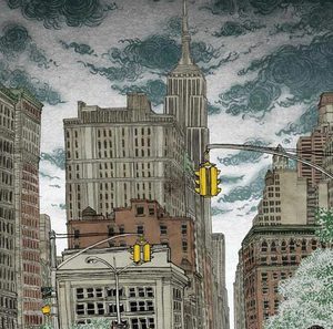 location drawing (virtually) on Google Map
July 1
I use Google Maps all the time. You do too, right? I just used it yesterday to find out where exactly was the West...
location drawing (virtually) on Google Map
July 1
I use Google Maps all the time. You do too, right? I just used it yesterday to find out where exactly was the West...
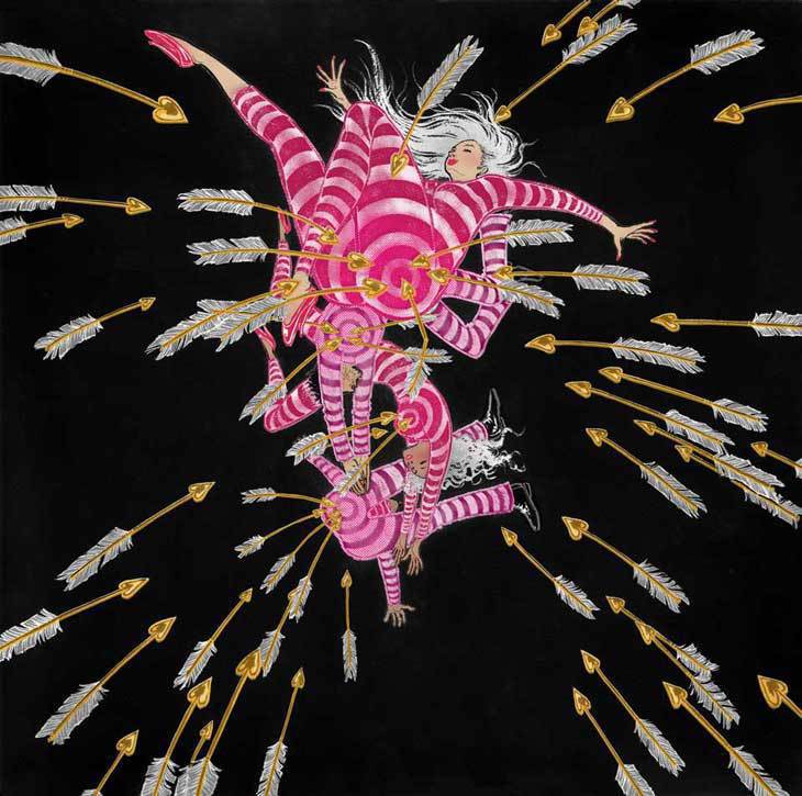 Happy Valentine's Day
February 13
This is a full page editorial illustration that ended up not getting printed. These things happen. It was for a...
Happy Valentine's Day
February 13
This is a full page editorial illustration that ended up not getting printed. These things happen. It was for a...
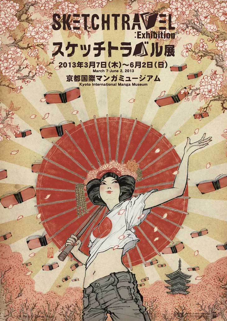 Sketchtravel Goes to Kyoto
January 29
You may, or may not know about Sketchtravel. But, let me tell you that this is quite an amazing project...
Sketchtravel Goes to Kyoto
January 29
You may, or may not know about Sketchtravel. But, let me tell you that this is quite an amazing project...
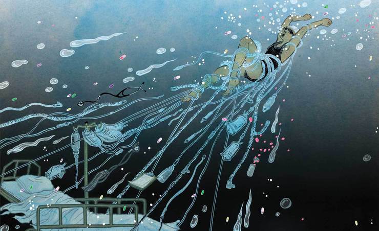 illustration and fear of water
December 19
I believe many of you who are reading my blog are aspiring illustrators. If you are, here is something you may want...
illustration and fear of water
December 19
I believe many of you who are reading my blog are aspiring illustrators. If you are, here is something you may want...
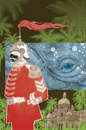
 how the hell I finished the most complicated illustration ever.
August 22
FastCompany is one of my favorite magazines. Once I said that to an illustrator friend, he looked very...
how the hell I finished the most complicated illustration ever.
August 22
FastCompany is one of my favorite magazines. Once I said that to an illustrator friend, he looked very...
 posting on Facebook realtime (and talking to strangers while I work).
August 6
One time a friend jokingly said that I have a 'full time position at Facebook'. What she meant...
posting on Facebook realtime (and talking to strangers while I work).
August 6
One time a friend jokingly said that I have a 'full time position at Facebook'. What she meant...
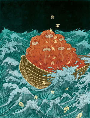
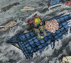 The Man Who Sailed His House
April 26
Dear Yuko,
I really enjoyed reading your postings on Drawger (as a lawyer who'd rather be an illustrator it is...
The Man Who Sailed His House
April 26
Dear Yuko,
I really enjoyed reading your postings on Drawger (as a lawyer who'd rather be an illustrator it is...
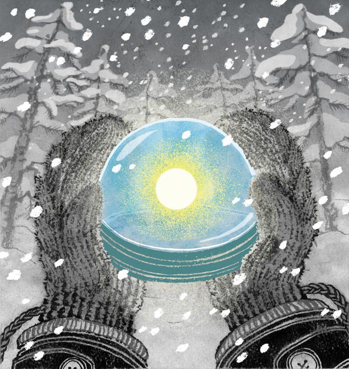 Happy Winter Solstice.
December 22
I don't like it when day light savings time ends, and day gets shorter and shorter. I get the annual winter...
Happy Winter Solstice.
December 22
I don't like it when day light savings time ends, and day gets shorter and shorter. I get the annual winter...
 Killed Job of the Year 2011
December 1
It's December. This is the time of the year when I look back and give the light of the day to the sadly killed...
Killed Job of the Year 2011
December 1
It's December. This is the time of the year when I look back and give the light of the day to the sadly killed...
 The Influentials
September 7
Tomorrow evening at The Visual Arts Gallery is an opening for a show The Influentials. It is a show of SVA female...
The Influentials
September 7
Tomorrow evening at The Visual Arts Gallery is an opening for a show The Influentials. It is a show of SVA female...
 San Diego Comic-Con
July 22
I am not at Comic-Con.
Many people asked if I was going, including my DC Comics Vertigo editor Karen Berger, with...
San Diego Comic-Con
July 22
I am not at Comic-Con.
Many people asked if I was going, including my DC Comics Vertigo editor Karen Berger, with...
 buy art for a good cause.
June 2
Weather in New York is finally neither boiling hot or cold. So, come out to SOHO this Saturday afternoon, and buy...
buy art for a good cause.
June 2
Weather in New York is finally neither boiling hot or cold. So, come out to SOHO this Saturday afternoon, and buy...
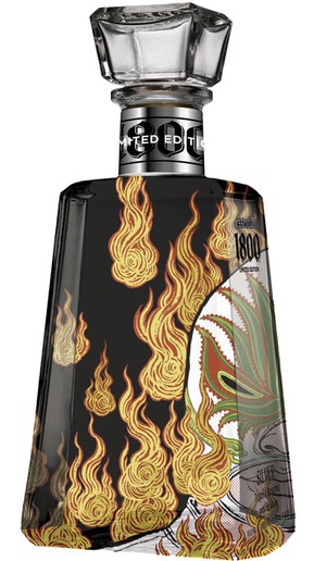 Tequila!
May 10
Many of my drawings appear on the pages of magazines and newspapers. They get read, and go into recycles in a week,...
Tequila!
May 10
Many of my drawings appear on the pages of magazines and newspapers. They get read, and go into recycles in a week,...
 13 Assassins
April 21
Japanese people take "new year" very seriously and are superstitious about "first" anything to...
13 Assassins
April 21
Japanese people take "new year" very seriously and are superstitious about "first" anything to...
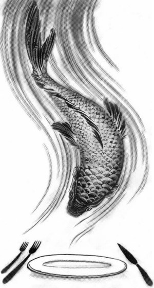 Quick Fish.
April 15
Many of the jobs I do, it takes hours and hours, sometimes days and days of drawing. It was not my original...
Quick Fish.
April 15
Many of the jobs I do, it takes hours and hours, sometimes days and days of drawing. It was not my original...
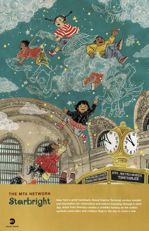 Grand Central Terminal
March 3
It will be a while till you will start seeing them at subway stations in New York, but I just got my copy of the...
Grand Central Terminal
March 3
It will be a while till you will start seeing them at subway stations in New York, but I just got my copy of the...
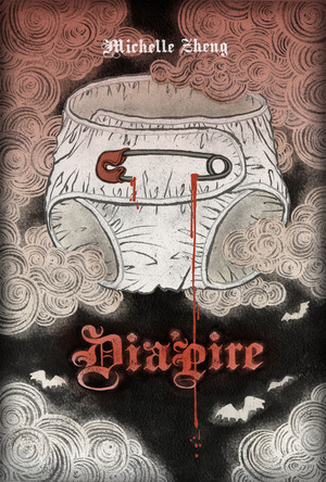 vampires & diapers.
December 1
I totally judge books by their covers.
Let's be honest, we all do. I can be categorized as a book-worm, but...
vampires & diapers.
December 1
I totally judge books by their covers.
Let's be honest, we all do. I can be categorized as a book-worm, but...
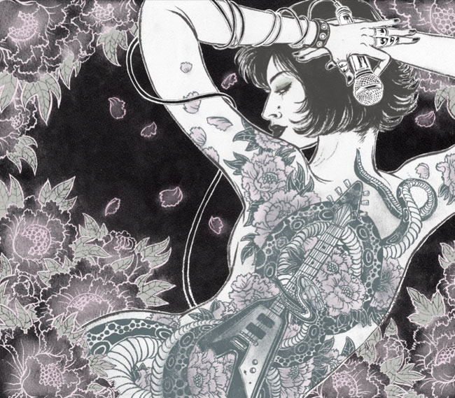
 "life" according to Keith Richards
November 19
People often ask me: "what was your very favorite assignment?". Now, this one is hard to answer. Every...
"life" according to Keith Richards
November 19
People often ask me: "what was your very favorite assignment?". Now, this one is hard to answer. Every...
 Blow Up opens.
September 1
Blow Up, a show of works by Tomer Hanuka, Sam Weber and myself, opened today at the Society of Illustrators (NYC)....
Blow Up opens.
September 1
Blow Up, a show of works by Tomer Hanuka, Sam Weber and myself, opened today at the Society of Illustrators (NYC)....
 Simple. Bold. And Graphic.
August 5
I have to confess. I LOVE drawing small details.
Like every single lines in the waves, and those textures in...
Simple. Bold. And Graphic.
August 5
I have to confess. I LOVE drawing small details.
Like every single lines in the waves, and those textures in...
 back to Mexico! part 1
July 28
I work with WNYC radio on all day long. At least once a day or two, there is a news about Mexico. Usually it is...
back to Mexico! part 1
July 28
I work with WNYC radio on all day long. At least once a day or two, there is a news about Mexico. Usually it is...
 Does this print well?
June 24
Illustration job does not end when I send out my finals. Actually the real result, or more like the judgment day,...
Does this print well?
June 24
Illustration job does not end when I send out my finals. Actually the real result, or more like the judgment day,...
 Personal Work to Job Work.
June 17
People often ask me if I have time to do some personal work in between illustration jobs. While a lot of my peers...
Personal Work to Job Work.
June 17
People often ask me if I have time to do some personal work in between illustration jobs. While a lot of my peers...
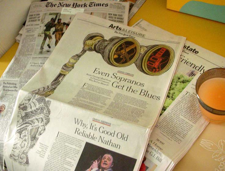 No Matter How Long.....
June 1
No matter how long I have worked in this occupation, I get so excited when a drawing I did is on the cover of The...
No Matter How Long.....
June 1
No matter how long I have worked in this occupation, I get so excited when a drawing I did is on the cover of The...
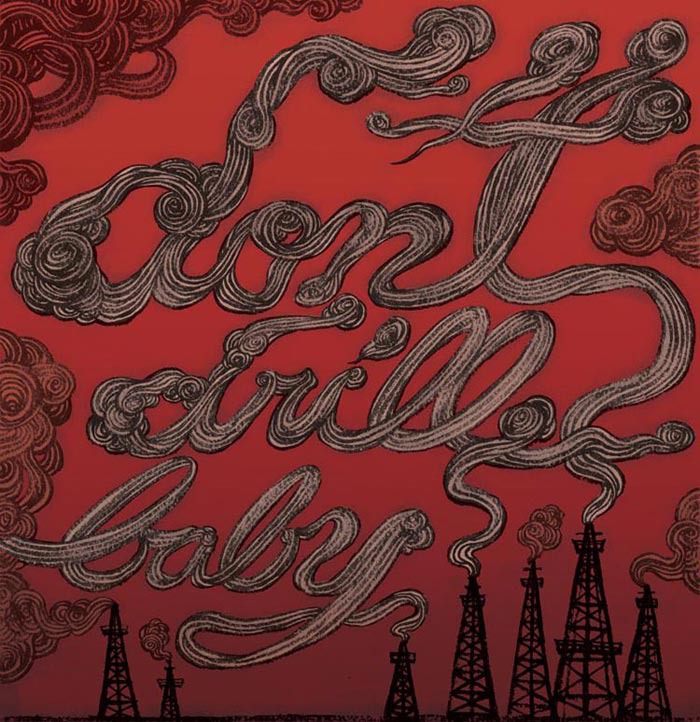 Don't Drill, Baby.
May 18
I listen to WNYC from the moment I wake up in the morning, then stream from internet all day and evening at the...
Don't Drill, Baby.
May 18
I listen to WNYC from the moment I wake up in the morning, then stream from internet all day and evening at the...
 Spring, SPRING!
April 12
Bye bye winter blues. Hello SPRING! Ah, I have been in such good mood recently. Although I get stuck in my studio...
Spring, SPRING!
April 12
Bye bye winter blues. Hello SPRING! Ah, I have been in such good mood recently. Although I get stuck in my studio...
 One More Blizzard before April
March 31
All of a sudden, it is SPRING! And I am loving it. I don't mind cold weather, but having less light makes me...
One More Blizzard before April
March 31
All of a sudden, it is SPRING! And I am loving it. I don't mind cold weather, but having less light makes me...
 33 album covers.
March 9
The Society of Illustrators annual show of advertising and institutional category just opened last week here in New...
33 album covers.
March 9
The Society of Illustrators annual show of advertising and institutional category just opened last week here in New...
 Pink Slip
March 2
Great Recession continues. And, every one of us know at least a few close people in our lives who have lost their...
Pink Slip
March 2
Great Recession continues. And, every one of us know at least a few close people in our lives who have lost their...
 Waiting For Spring
February 11
Why is snow so pretty when it is falling, but becomes a huge mess right after? Winter feels a lot severe this...
Waiting For Spring
February 11
Why is snow so pretty when it is falling, but becomes a huge mess right after? Winter feels a lot severe this...
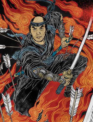
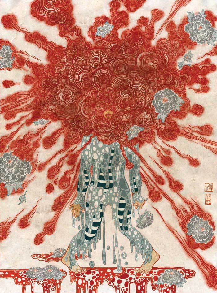
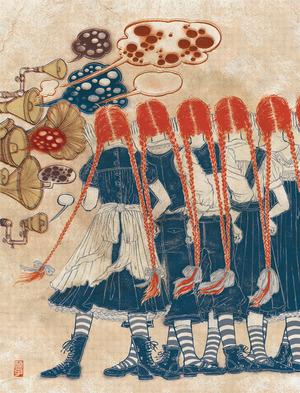
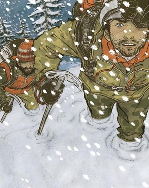
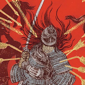 Samurai Process.
February 8
Congratulations again to everyone who’s work is exhibited at the Society of Illustrators Book/Editorial Show,...
Samurai Process.
February 8
Congratulations again to everyone who’s work is exhibited at the Society of Illustrators Book/Editorial Show,...
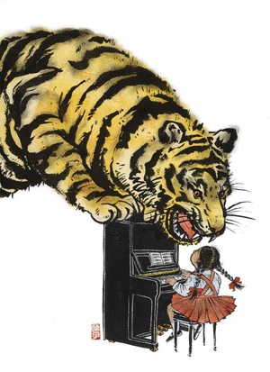
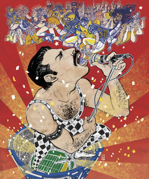 We Will Rock You.
February 3
I don’t like to regret. So I try not to dwell over things that didn’t work out in past. But...
We Will Rock You.
February 3
I don’t like to regret. So I try not to dwell over things that didn’t work out in past. But...
 My 'Killed Job of the Year'
December 9
You realize you are a 'pro' when a killed job does not hurt your feelings anymore.
Of course, nobody...
My 'Killed Job of the Year'
December 9
You realize you are a 'pro' when a killed job does not hurt your feelings anymore.
Of course, nobody...
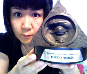 SPECTRUM silver medal!
December 4
I have to be just honest; 2009 was definitely not the best year I had, and work was definitely slower than usual....
SPECTRUM silver medal!
December 4
I have to be just honest; 2009 was definitely not the best year I had, and work was definitely slower than usual....
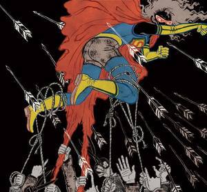 Fall of Superwoman!
October 21
I still dream about my corporate days and wake up completely stressed, although I left there more than 10 years...
Fall of Superwoman!
October 21
I still dream about my corporate days and wake up completely stressed, although I left there more than 10 years...
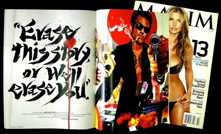 My First Blackmail.
October 14
Yes, I wrote my very first blackmail. No. Of course not for real! I’m not that kind of a girl.
Sean...
My First Blackmail.
October 14
Yes, I wrote my very first blackmail. No. Of course not for real! I’m not that kind of a girl.
Sean...
 Mundane Objects
September 28
‘How do professional illustrators come up with ideas?’ I often get asked by students and aspiring...
Mundane Objects
September 28
‘How do professional illustrators come up with ideas?’ I often get asked by students and aspiring...
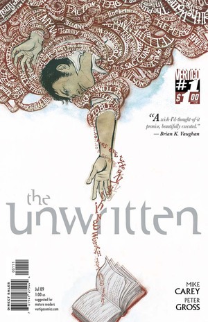
 Drawing for Comic Books No.2
September 17
Working as a cover artist for DC Comics Vertigo has been a whole different experience from my regular life as...
Drawing for Comic Books No.2
September 17
Working as a cover artist for DC Comics Vertigo has been a whole different experience from my regular life as...
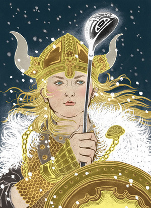 Viking Queen Plays Golf
August 25
The idea of “golf” still have that old-fashioned feel. You know, rich executives, exclusive...
Viking Queen Plays Golf
August 25
The idea of “golf” still have that old-fashioned feel. You know, rich executives, exclusive...
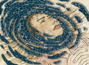 Visualizing Nightmares
August 13
Drawing nightmares is tricky.
It is easy to draw a nightmare you had last night, but when it comes to...
Visualizing Nightmares
August 13
Drawing nightmares is tricky.
It is easy to draw a nightmare you had last night, but when it comes to...
 Reality Check!
August 4
“Reality check: things are not looking so great when you wake up.”
This was the line I received from...
Reality Check!
August 4
“Reality check: things are not looking so great when you wake up.”
This was the line I received from...
 You Look Great in It!
July 1
OK, so I have to be absolutely honest. I do NOT wear t-shirts. They look horrible on me. Over the years, many...
You Look Great in It!
July 1
OK, so I have to be absolutely honest. I do NOT wear t-shirts. They look horrible on me. Over the years, many...
 Drawing for Comic Books
June 4
I dreamed of becoming a comic artist when I was child. Just like any other Japanese kid growing up in economic...
Drawing for Comic Books
June 4
I dreamed of becoming a comic artist when I was child. Just like any other Japanese kid growing up in economic...
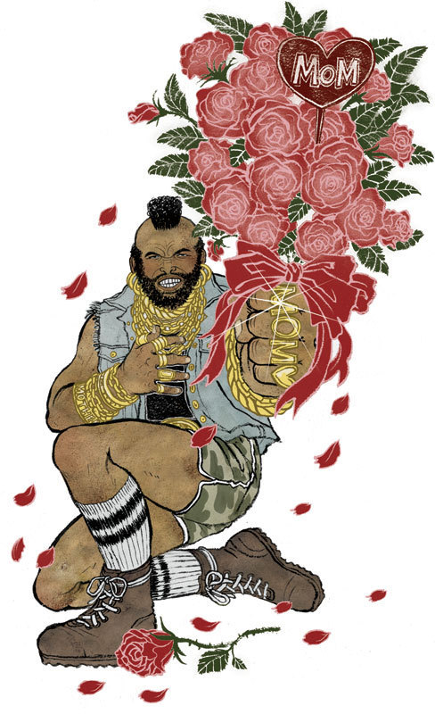 Mr.T Wishes You A Happy Mother’s Day
May 8
According to BLENDER Magazine, the first creator of hip-hop “mama” song was Mr.T. Treat Your Mother...
Mr.T Wishes You A Happy Mother’s Day
May 8
According to BLENDER Magazine, the first creator of hip-hop “mama” song was Mr.T. Treat Your Mother...
 Diapers, no joke.
April 24
“We want you to design diapers.” When the e-mail came in, I thought it was a joke. Or, at least a...
Diapers, no joke.
April 24
“We want you to design diapers.” When the e-mail came in, I thought it was a joke. Or, at least a...
 How Unromantic!
April 15
A lot of the world famous classics won’t work if there were cell phones or characters knew how to text...
How Unromantic!
April 15
A lot of the world famous classics won’t work if there were cell phones or characters knew how to text...
 Mexico bound...
March 12
Day light savings time has started, but it feels like there is no end to New York winter. I am flying out to Mexico...
Mexico bound...
March 12
Day light savings time has started, but it feels like there is no end to New York winter. I am flying out to Mexico...
 yes, SPECTRUM!!!
March 10
I just found out I have received a silver medal from SPECTRUM 16. Yes, that SPECTRUM, where sci-fi and fantasy artists...
yes, SPECTRUM!!!
March 10
I just found out I have received a silver medal from SPECTRUM 16. Yes, that SPECTRUM, where sci-fi and fantasy artists...
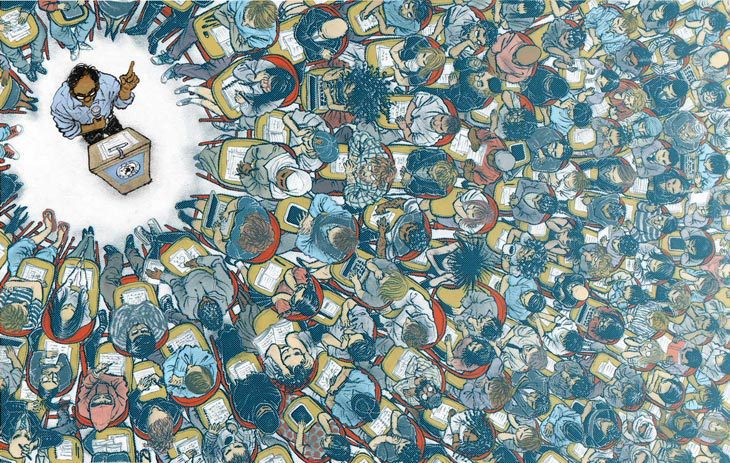
 what do we sacrifice for security?
February 23
"What do we sacrifice for homeland security?"
That was the topic thrown at me from a team of curators for...
what do we sacrifice for security?
February 23
"What do we sacrifice for homeland security?"
That was the topic thrown at me from a team of curators for...
 Abe drawn 8 different ways
February 9
Yesterday's NY TImes Book Review (AD: Nicholas Blechman) cover featuring 6 different portraits of Lincoln drawn by 6...
Abe drawn 8 different ways
February 9
Yesterday's NY TImes Book Review (AD: Nicholas Blechman) cover featuring 6 different portraits of Lincoln drawn by 6...
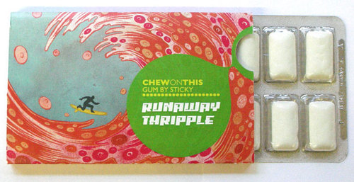 chew on this, and support next generation of creative minds
February 8
I heard on the news recently that people feel most happy and fulfilled not by monetary insentives, but by rewarding...
chew on this, and support next generation of creative minds
February 8
I heard on the news recently that people feel most happy and fulfilled not by monetary insentives, but by rewarding...
© 2024 Yuko Shimizu