Which Species Will Live?
MARCH 30, 2013
Conservation triage. That's the term conservationists use to describe the difficult decisions they must make when deciding which species they will focus on saving and those they have to reluctantly let die off. It was one of those facts that boggle the mind and from an assignment Scientific American's Mike Mrak asked me to illustrate.
I think the initial pitch was animals in spheres with some sort of cracks. I was sent the article and once I read it, I began to smell a musty specimen lab, such as the one I saw at RISD during ICON last summer. I saw jars filled with small animals and large ones, all labeled and put into storage.
I think the initial pitch was animals in spheres with some sort of cracks. I was sent the article and once I read it, I began to smell a musty specimen lab, such as the one I saw at RISD during ICON last summer. I saw jars filled with small animals and large ones, all labeled and put into storage.
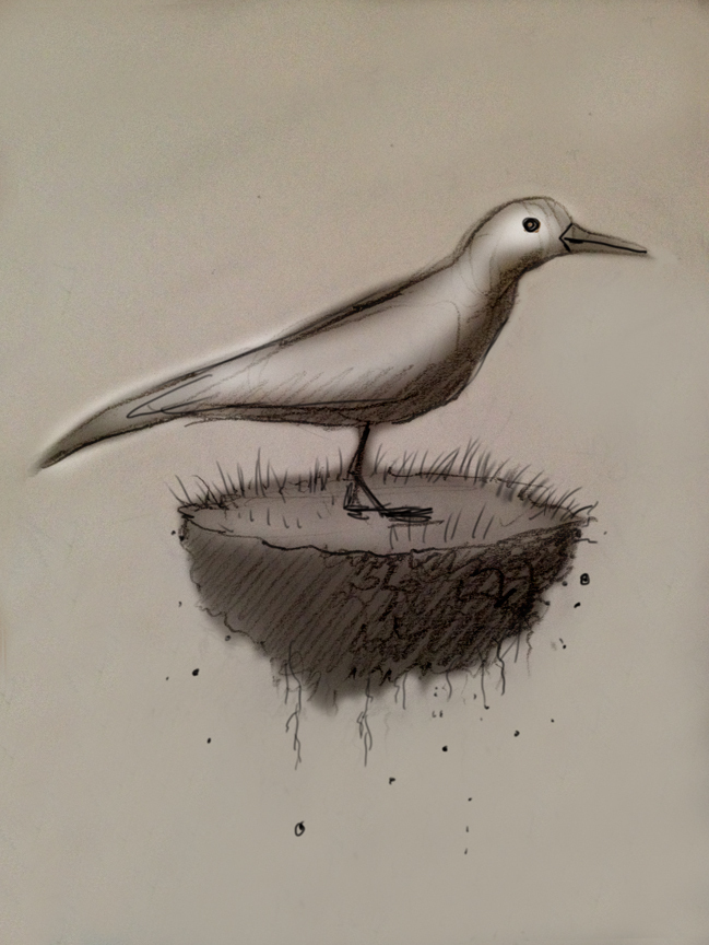
The first thumbnail was a simple, iconic image of a small bird on a piece of land, perilously floating. Of course, it's compelling but the bird could just fly away. Perhaps that's still enough and is just a metaphor for the idea of an animal having no place to live.
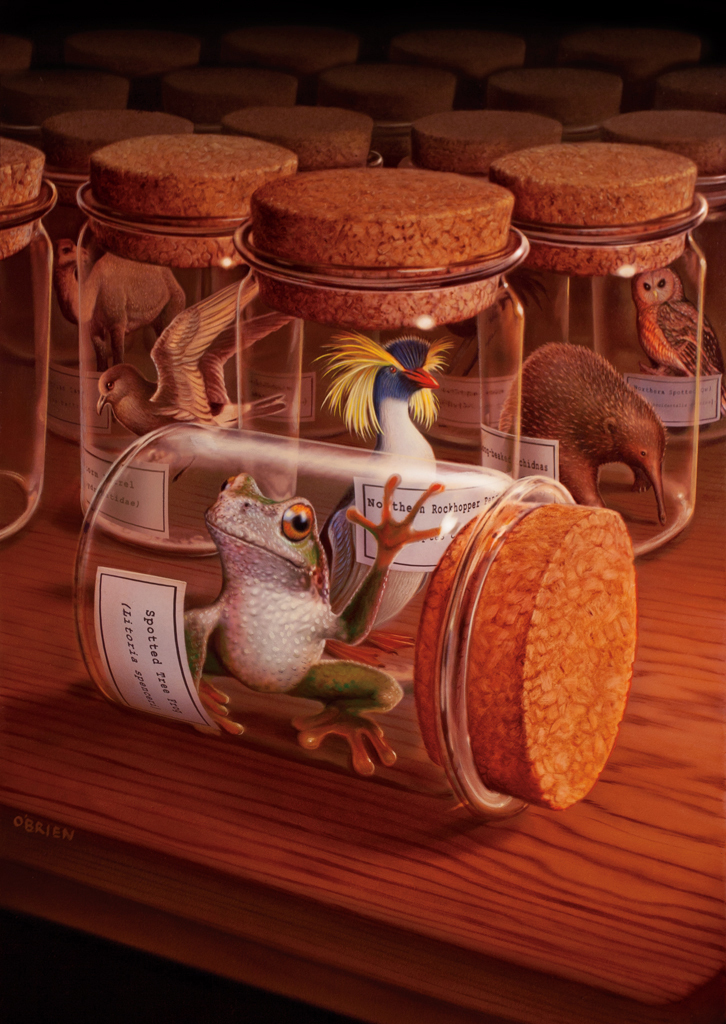
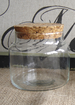
My second thumbnail more closely aligned with the idea of animals in small spheres and used specimen jars instead.
My second thumbnail more closely aligned with the idea of animals in small spheres and used specimen jars instead.
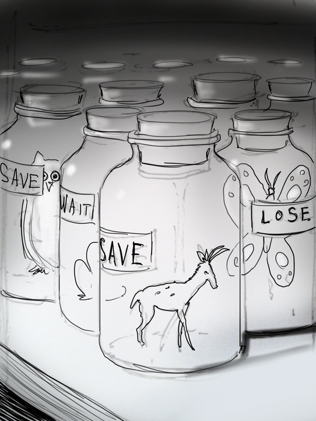
I knew I wanted labels on the jars but I wanted them to state their IN or OUT status. This was not where we finally went.
Once this sketch was approved, I went to a more finished sketch.
Once this sketch was approved, I went to a more finished sketch.
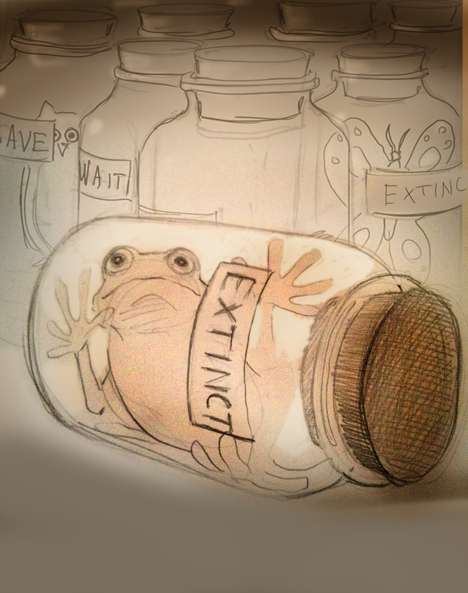
The thing about being a portrait painter as an illustrator is that you learn to connect the reader or viewer to the subject matter through eye contact. A myriad of specimen jars would look impressive but we would just see them and not necessarily feel anything right away. Eye contact was crucial.
The hard part of this assignment was the scientific nature of the article. Each animal I chose had to be part of this conversation. Were they in danger? Were they being saved and is this specific animal the right one?
This process took a while. The front jar was important. I considered all the animals I found and this specific tree frog had the most 'humanoid' possibilities.
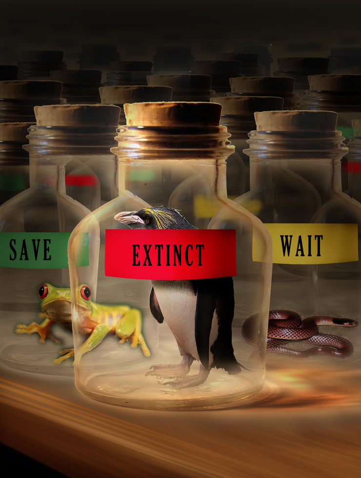
First digital sketch with a Penguin...not quite right.
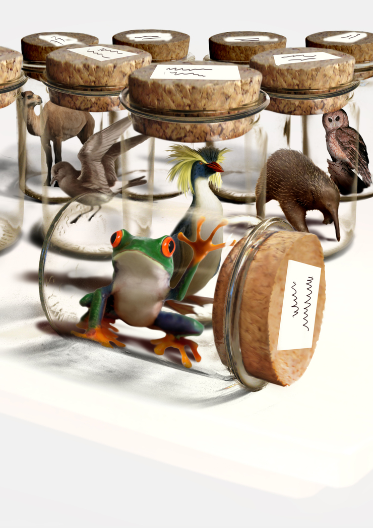
This slowly worked out design took a while. It is almost exactly what I painted in the end. I loved the animals, how they played against each other and even the white. Still, I wanted to have them on a table. It could have worked either way. Highlights pop better on a value other than white. The only thing I had to do was to put the labels ON the jars. That was a bit heartbreaking but it works better.
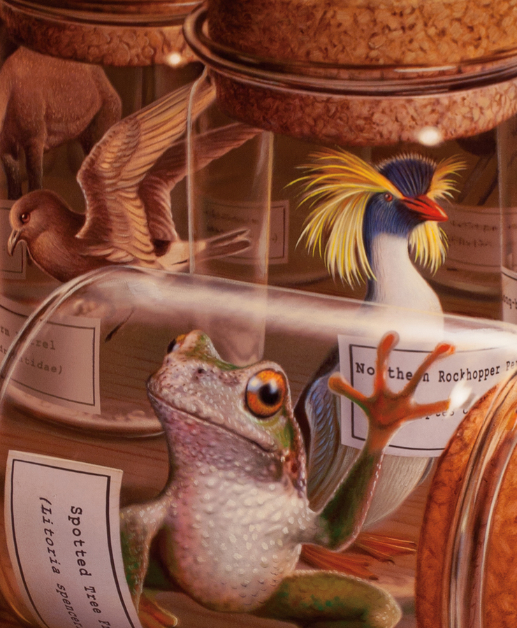
As much as I like a challenge, the type was put in digitally. This crop is the heart of the image.
Thanks again to Mike Mrak, who many of us know through the Society of Illustrators. He's a great guy and smart Art Director.
Finally, let's take care of this planet.
Finally, let's take care of this planet.
© 2024 Tim O'Brien