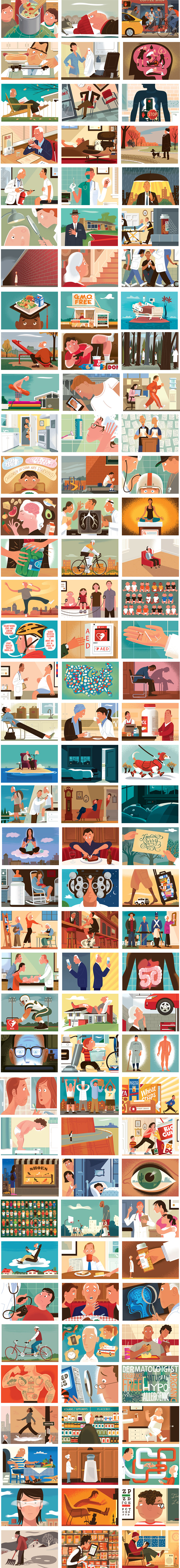
 New York Times Personal Health Column
January 28
I've been doing a weekly column for the Science section of the New York Times for about three years. Every week I...
New York Times Personal Health Column
January 28
I've been doing a weekly column for the Science section of the New York Times for about three years. Every week I...
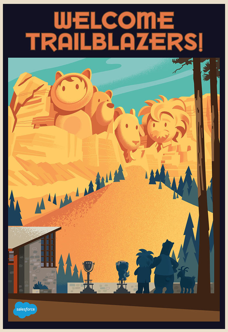 SALESFORCE
November 12
I’ve been working with two friends, Matt Haligman and Kirk Citron on a project for Salesforce for most of the...
SALESFORCE
November 12
I’ve been working with two friends, Matt Haligman and Kirk Citron on a project for Salesforce for most of the...
 Odds and Ends from 2016
January 10
Odds and Ends from 2016
January 10
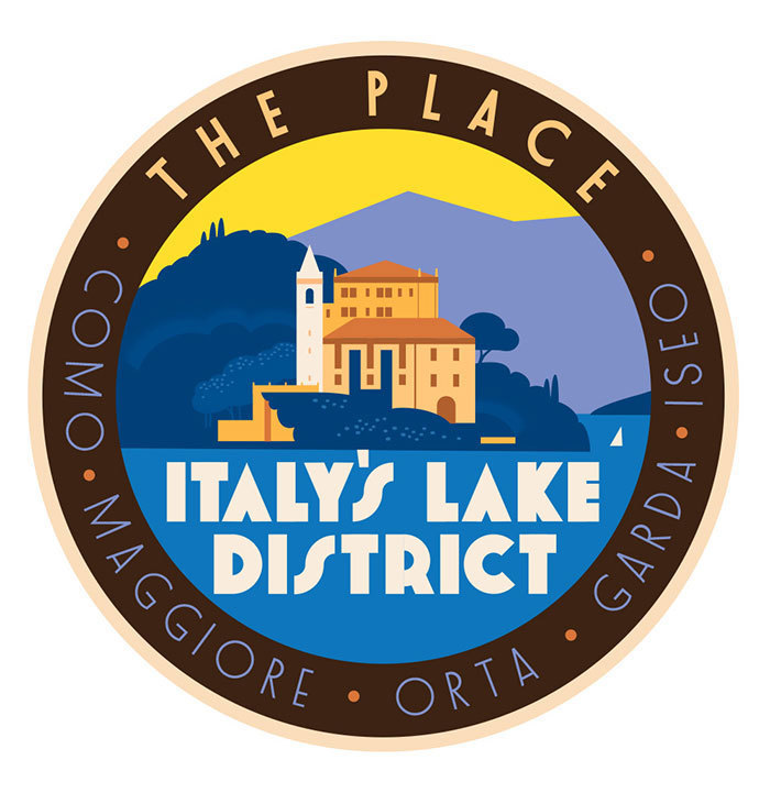 Travel and Leisure Magazine
November 26
Here's some vintage luggage labels and maps I've done recently for Travel + Leisure Magazine, I always enjoy...
Travel and Leisure Magazine
November 26
Here's some vintage luggage labels and maps I've done recently for Travel + Leisure Magazine, I always enjoy...
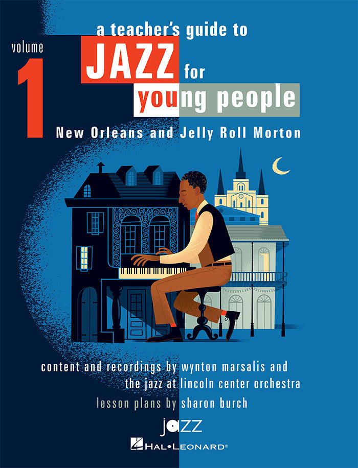 Jazz for Young People
July 14
I’m working with my friends at Jazz at Lincoln Center on a ten volume set of teacher’s guides to Jazz...
Jazz for Young People
July 14
I’m working with my friends at Jazz at Lincoln Center on a ten volume set of teacher’s guides to Jazz...
 Watch on the Rhine Theater Poster
June 3
Arena Stage in Washington D.C. just announced its 2016/17 Season and I designed one of the posters for The Lillian...
Watch on the Rhine Theater Poster
June 3
Arena Stage in Washington D.C. just announced its 2016/17 Season and I designed one of the posters for The Lillian...
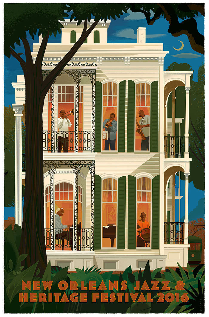 New Orleans Jazz & Heritage Festival
April 14
It’s an honor to have designed the poster for the 2016 New Orleans Jazz & Heritage Festival. I’ve...
New Orleans Jazz & Heritage Festival
April 14
It’s an honor to have designed the poster for the 2016 New Orleans Jazz & Heritage Festival. I’ve...
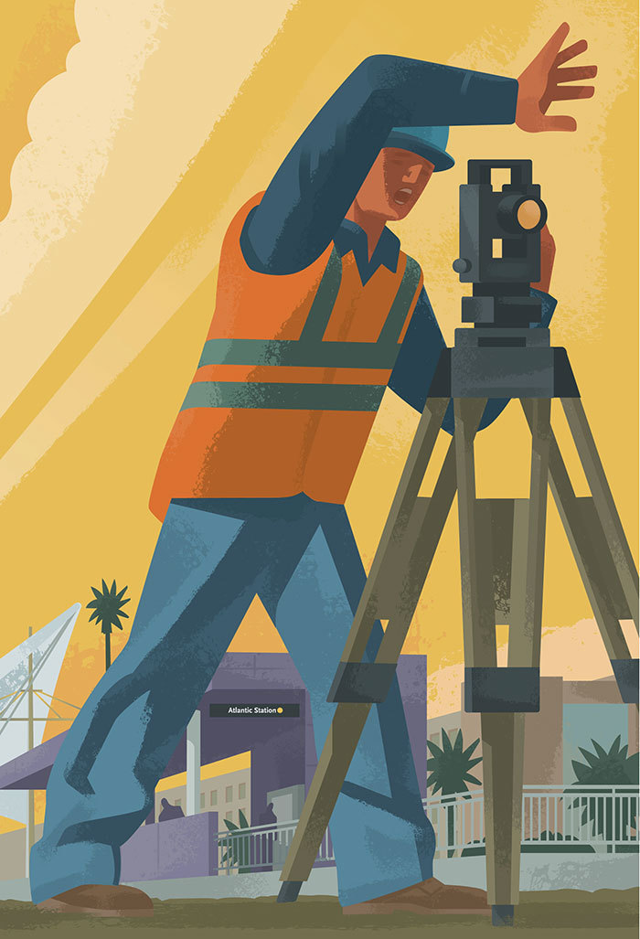 LA Metro
March 15
I’ve been working for a few years with LA Metro making illustrations that can be used in a variety of formats,...
LA Metro
March 15
I’ve been working for a few years with LA Metro making illustrations that can be used in a variety of formats,...
 Squash, the sport, not the vegetable
January 16
Last week Nicholas Blechman called requesting an illustration for an article about squash, the sport, not the...
Squash, the sport, not the vegetable
January 16
Last week Nicholas Blechman called requesting an illustration for an article about squash, the sport, not the...
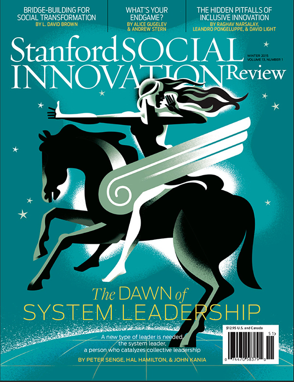 A Few Odds & Ends from 2015
December 22
Cover for Stanford Social Innovation Review, AD David Herbick
A Few Odds & Ends from 2015
December 22
Cover for Stanford Social Innovation Review, AD David Herbick
Animation
Art Center Student Work
Baseball
Book Jackets
EDITORIAL
Forever Young
Jazz ABZ
Jazz at Lincoln Center
L.A. Sketchbook
London Sketchbook
Maps
Musicians
Name That Movie
New Orleans
On The Road: Illustrated Scroll
Paintings
Playboy Jazz Festival
Postage Stamps
Posters
Sketchbooks
The New York Times
© 2024 Paul Rogers