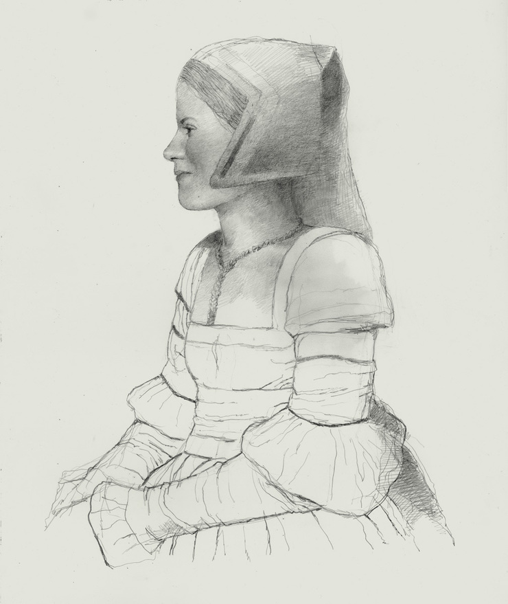
Last spring I did a painting of Martin Luther for a book jacket. In the process I tossed off this pencil drawing. It began as my favorite of three rough sketches I sent the publisher. But since it wasn't the one they picked, I gave them the cover they prefered and finished this one for myself. It wasn't the first time this had happened: I have lots of unpublished drawings laying around the house. But it did lead me to reflect on my long steady affair with the lowly pencil.
Pencil is such a common medium that it's easy to take for granted. Most of us use a pencil nearly every day and rarely think about it. Yet until I was 17 and out of high school, pencil was almost my only means of expression. Then suddenly, working on deadlines in a small Chicago studio, I had to quickly get up to speed rendering finished art. As a result, until recently, my pencil drawings were generally limited to preparatory sketches.
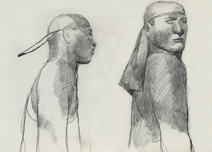
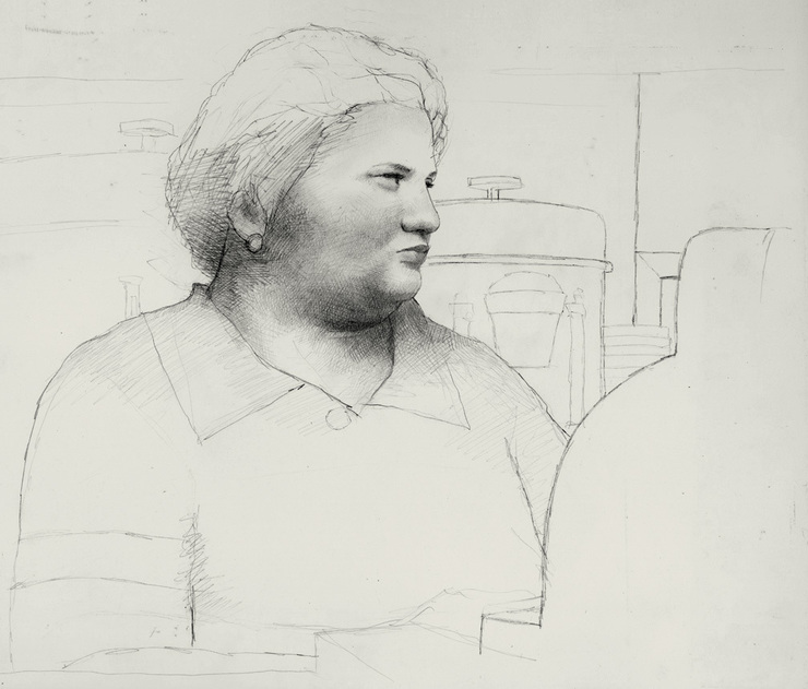
One example is this drawing of Mamie, a Choctaw Indian woman I met years ago in Moffet, a little Oklahoma border town. I used her as a model for a painting that was published in Playboy. In real life Mamie had pitch black hair. But for my purposes, I gave her a short blonde hairdo and made her the owner of an all-night diner set in Shel Siversteinland. The piece was called “Rosalie’s Good Eats Cafe,” and it was the second of several features that Shel and I worked on together.
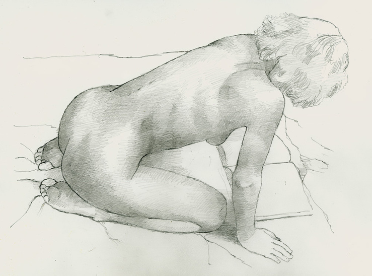
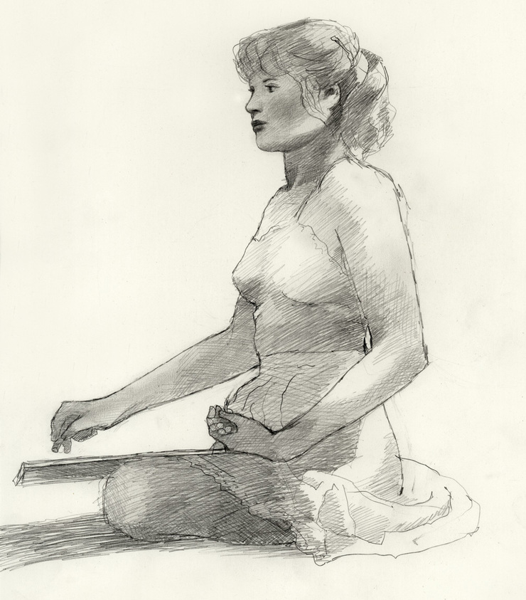
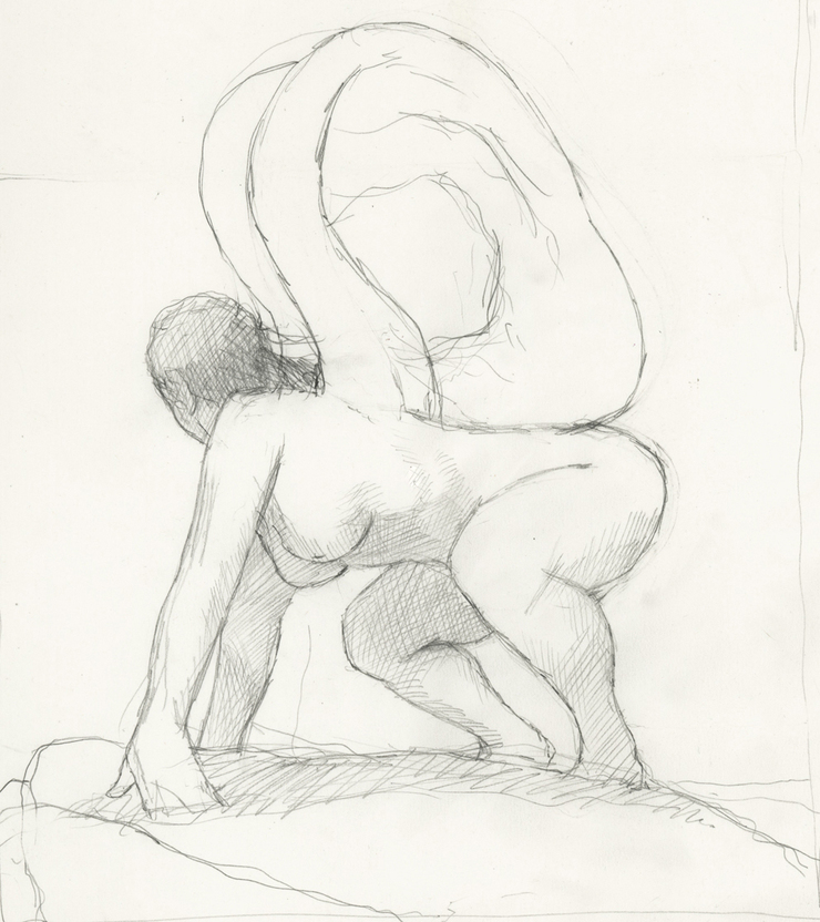
Often, however, I have no models to go by, and so I use pencil drawings to work out both the characters and the compositions of what I intend to paint. In this case – a sketch for another Playboy painting – I posed my own hands and knees and made faces in a mirror until I had all the elements I was looking for.
And since the picture was to be published as a double page spread, I had to work the figures around the gutter and design the composition so that there’d be space on the right for both a title and several paragraphs of text.
In my earliest pictures for Playboy, the Ribald Classics series, pencil drawings played an even more basic role. Here the style I developed was very graphic. The pictures were usually half drawn in ink and half painted. So in addition to working out the designs, the figures and the anatomy, the sketches let me resolve which areas I was going to paint in color, which I would draw in line and if and where I’d spot the accents of black or areas of textured color.
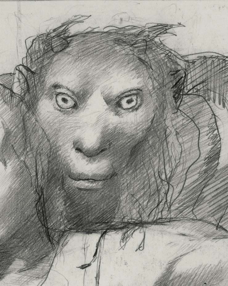
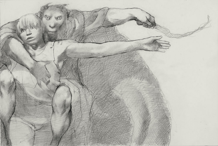
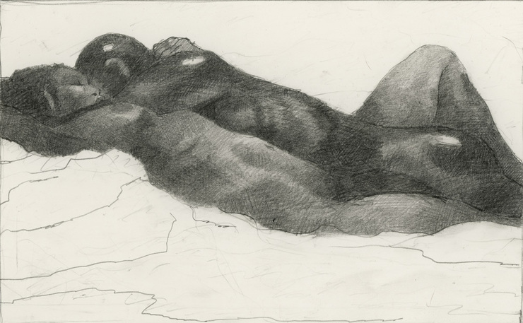
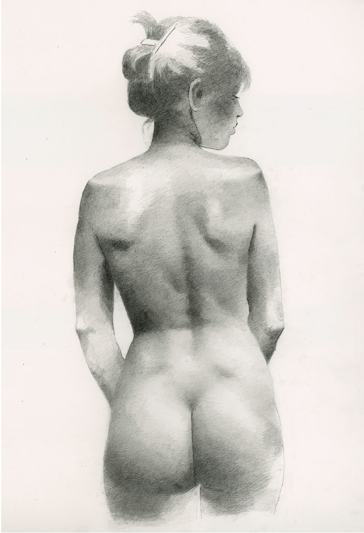
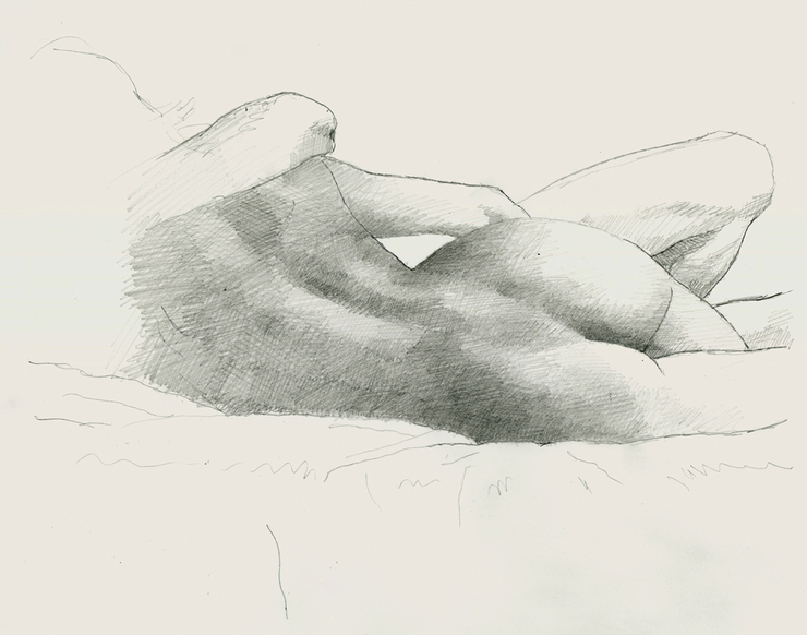
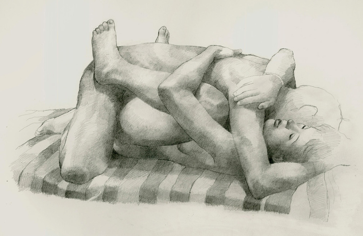
This was especially true of drawings like the one below, where I didn’t use models at all. Here I wanted the two figures to merge into a single shape, with only a few details to indicate separate individuals. By working out the design and anatomy in advance, I saved myself a lot of grief in painting the final art.
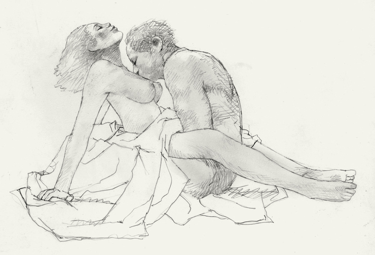
Other times, where anatomy was going to be central to the picture, I often modeled what I needed and made up the rest. But then, without my ever intending it, studies like this one began to lead me beyond my Playboy style. Originally the art for Love Nest was going to be half painted and half drawn. But once I got started, I was seduced by the sensuality of the figures into finishing it as a completely tonal painting.
The studies I do to prepare for paintings are usually no more finished than they need to be. But other times, I do drawings just to record what's going on around me, the same way normal people take photographs. That was the case with this drawing of my ex-wife.
She was drawing crested cranes on the lawn of the Playboy Mansion in Holmby Hills. It was early morning and as she sketched the animals in Hefner’s menagerie, several of the babes-in-residence began to stir and head out to the lawn in their bikinis. Most of them passed Judy by, but one of them stopped, looked over her shoulder, and for a minute watched her draw. Then she said “Gee I wish I had talent,” and moved on to bask in the sun with the others.
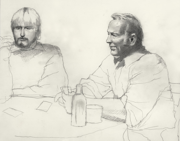
There’s something about pencil drawings that lend themselves to private moments. One Christmas Eve when I was still married, I sat in on a family card game and ended up drawing my wife's father and brother. People with cameras in their cell phones must ask themselves why someone would spend half an hour doing a drawing like this when in five minutes you could take hundreds of photos. For people who think like that, I doubt that there’s any rational explanation. But of course, I don’t think like that.
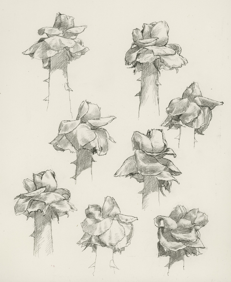
I’ve always thought of drawing as a form of thinking. As a result, a lot of my drawings have traditionally been efforts to study the architecture of something I wanted to draw, in this case roses. I did several sheets of drawings like this. When I was 17, I did the same thing with hands.
From the first, drawing came as naturally to me as speaking and without as much effort as writing. Drawing is the most intimate of media becuse it’s so direct. There's none of the mixing and matching of colors that breaks up your rhythm when you're painting. The pencil touching the paper is literally an extension of your fingertips. That means you don't just see what you're drawing, you can actually feel it.
I sketched these guys in Washington Square Park for use in a painting I was doing for Playboy. I liked the subtle profile of the guy on the left, but the brother on the right, with his "what the fuck are you looking at" stare had the attitude I needed for the picture. It's a good thing I'm fast, though. If it had taken me any longer to get these two birds on paper, my experience with them would probably have ended with a punch in the nose.
I found this street magician doing tricks for a small crowd on Prince Street in Manhattan. That was back in the 1980s, and ever since, I've been looking for an opportunity to use him in a painting. Several times I thought I had him cast as a devil, but each time I concluded that I needed to resolve the character differently. Other that that, nothing else has come up to put him to work, and in the end I’ve come to see the drawing simply as an end in itself.
I’ve written elsewhere about drawing Stevie Ray Vaughn for his first album cover. He came to the studio to pose and I did four or five sketches of him. I wasn’t very happy with the first few but with this one I thought I had finally got the look I was looking for. In the painting I darkened the shadow under his hat. It gave him a more dramatic look for the cover, but for characterization, I think this drawing did a better job.
As a rule, my presentation sketches are pretty rough. But sometimes I’ve used more fully-realized drawings for clients.
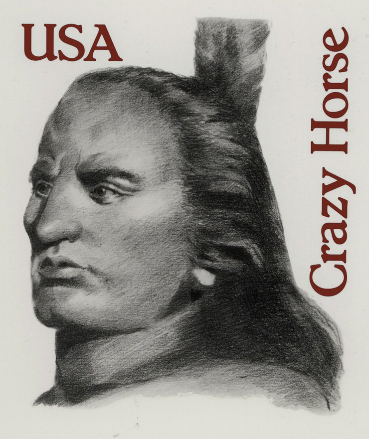
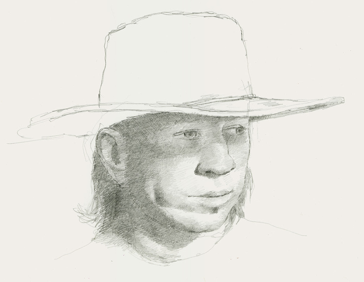
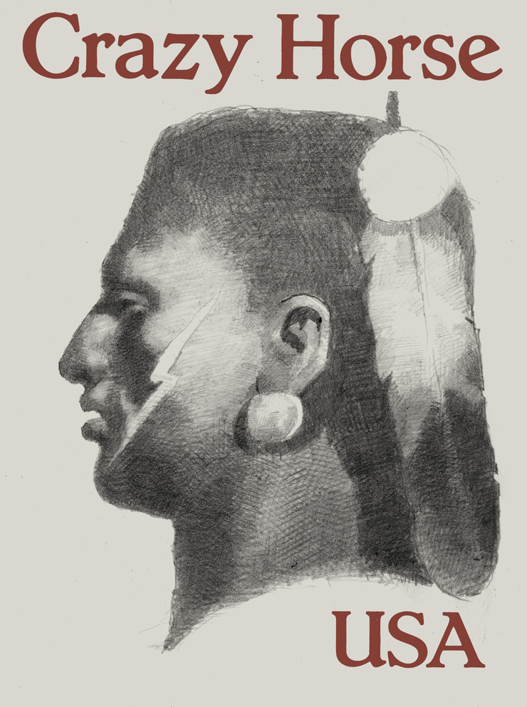
That was the case when the US Postal Service commissioned me to design a thirteen cent stamp of Crazy Horse. There are no known photographs of the Sioux chief. Photos that claim to be of him aren’t. So I began my designs by doing half a dozen imaginary portraits based on eyewitness descriptions of him in the book Crazy Horse:Strange Man of the Oglala, by Mari Sandoz. This was my favorite of the drawings, although it’s not the one we ended up using.
Before I had a chance to present my stamp designs to the Postal Service, Senator Carl Levin of Michigan got into the act and I was suddenly dispatched to the Black Hills of South Dakota to do additional "research."
There I ended up spending a couple of days with Korczak Ziolkowsky, the old Polish sculptor who was blasting and bulldozing a 500 foot high statue of Crazy Horse out of a mountain.
The account of my adventures with Korczak will have to wait for another occasion, but it’s a good story and I’ll try to tell it here one of these days.
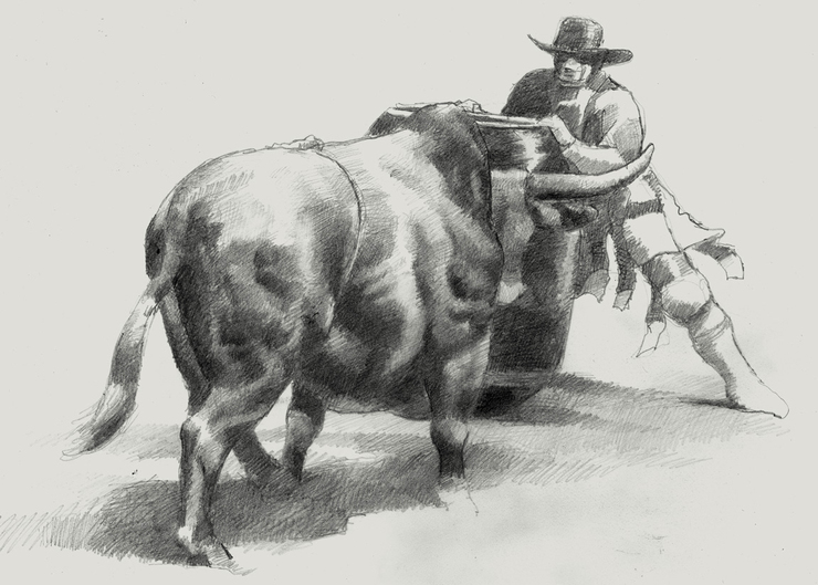
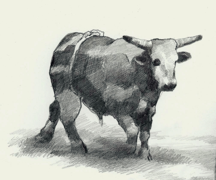
Some years ago I spent a week with rodeo clowns in Arkansas and wrote an article about the experience for Texas Monthly. I did 12 paintings for the piece, which meant there wasn’t room in the magazine for any of the sketches I did for research, in the clowns' make-up room, or in the arena or down in the bull chutes.
My rodeo clown sketches were done in various media: pencil, charcoal and ink. I used whatever was handy or most convenient at the moment. Some of the drawings were never more than quick action sketches that I'd work up in more detail when I got back to my hotel room. Others were more finished drawings that I did later when I was composing figures for the color paintings.
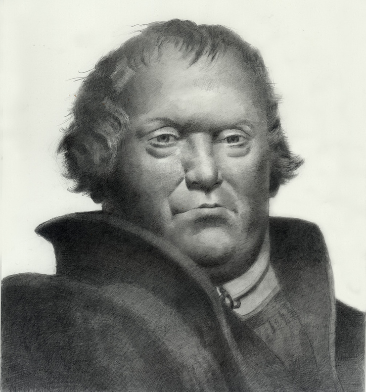
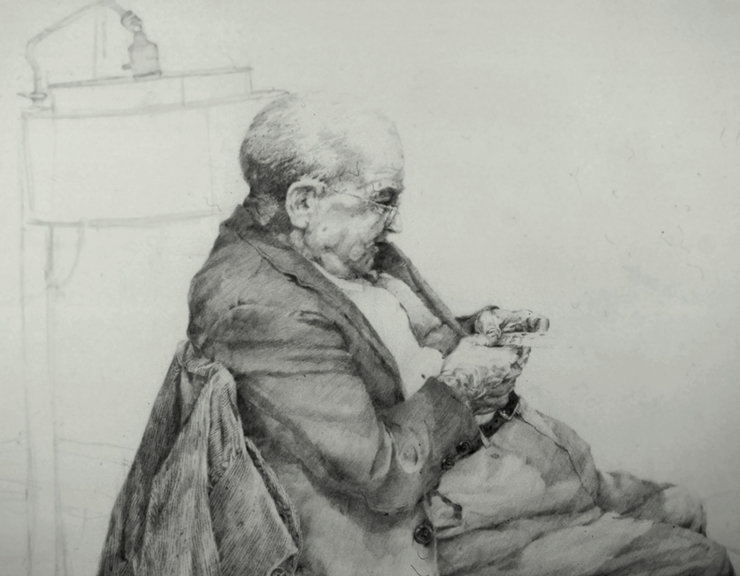
Until I was 17, my lack of art training and limited access to art supplies had forced me (or allowed me: sometimes necessity is a blessing) to concentrate entirely on drawing with paper and pencil; like the drawing below of an old man who lived next door.
As a result, by the time I graduated from high school I could draw pretty well, but my strength was also my weakness: I had no experience with any other medium.
Then suddenly I found myself in Chicago looking for work and trying to develop a professional rendering style overnight. This led me into crash experiments with ink and charcoal, watercolor and the now-forgotten medium of casein. Or for some of the cheesier assignments, ink drawings toned with Zip-a-Tone and Cello-tak.
Some of these experiments were more successful than others, but however they turned out, my trials and errors were always anchored in the fact that whatever I was trying to render, I could at least draw it well.
Then four years later, I broke into the world of New York publishing; and from the first – from the afternoon I got off the train, in fact – I found work quickly.
By then I had compiled a very professional portfolio comprised almost entirely of black and white work. Although most of the samples were very stylized, I included a couple of pencil drawings of Nietzche and Schopenhauer that caught the eyes of publishers and led them to give me assignments designing book jackets.
In those days, we were expected to design the entire cover for a book, including typography. And for technical reasons, we had to supply the publisher with finished mechanicals in the form of 3-color hand-drawn separations.
But since doing full color art by means of separate black and white overlays always involved a great deal of guesswork, I tended to keep my designs simple and foolproof: a pencil drawing for the main image, a neutral PMS color for the background, and a strong PMS color for the type.
I was grateful to get so much work so quickly. But what happened next was a real blessing.
Just four months after arriving in Manhattan, I walked into Playboy with my portfolio and walked out with a handshake offer to do pictures for them every issue. The art director, Arthur Paul, had given me the break of a lifetime.
In the few years since I had left high school I had developed a very graphic pen and ink style inspired by etchings and lithographs. It was an original approach to illustration, both graphically and conceptually, but I needed to develop it further. By handing me an opportunity to do it in the pages of "the most visually exciting magazine of the day," Art Paul had given me an international showcase not just for the style, but for my total approach to graphic art.
I didn't take any of this for granted and often did dozens of concept sketches for each month's issue. But in the rush to meet short deadlines and to fit my compositions to pre-determined layouts, my pencil drawings became little more than line drawings that served as blueprints for the elements that would go into the final art.
It was years before I began to rediscover pencil drawings as an end in themselves.
And when it happened, it wasn't a calculated decision. Instead, it was just an ad hoc case of developing some unfinished sketches that happened to turn up whenever I was digging through a drawer of old work. "That's a nice sketch," I'd think to myself when I saw some of these things. "I wonder what would happen if I just worked on it a little."
As a rule, the drawings I found myself developing were rough sketches originally done for old Playboy pictures. No mystery there, of course: the sensuality of the images made them a natural for the sensuality of a tonal rendering. But there was another reason.
The Ribald Classics series was always about some kind of sexual adventure or misadventure – which meant that I often drew people naked. And since it's harder to improvise naked figures than clothed ones, these were the drawings that I had most carefully defined in the first place.
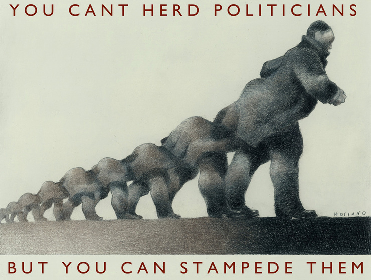
Then around the same time, the French publication Nine Weeks asked me to do some drawings for their issues leading up to the national French elections. There were no articles to work around, no briefs of any kind: the publisher just asked me to send him pictures about politics, whatever that meant to me.
With a brief that open-ended, this was a guy who was speaking my language.
The images I sent the publication included paintings and ink drawings, but a couple of them, like the drawing below, were a throwback to the kind of art I had all but stopped doing two decades before. In fact, this particular drawing was the first time in all that time that I had submitted a pencil drawing to a client as finished art.
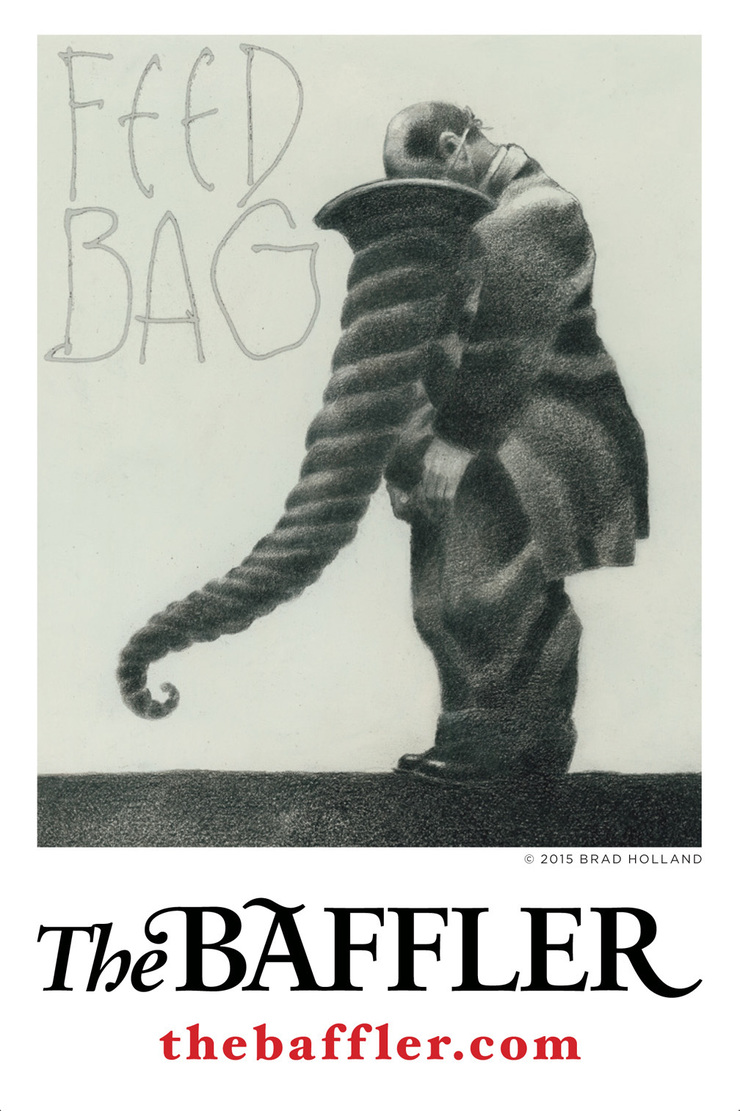
Since then, whenever an art director is interested, I've tried the same approach with other images. When Patrick Flynn showed an interest for The Baffler, for example, I sent him this.
I've also done some imaginary pencil portraits of characters from Shakespeare's plays. I thought as a design concept they'd be good foils for the more conceptual paintings I was doing.
Moreover, given the unfinished state of the drawings, I thought they'd go well with the playwright's soliloquies and, like the soliloquies, inject a certain intimacy to the more theatrical aspect of the plays.
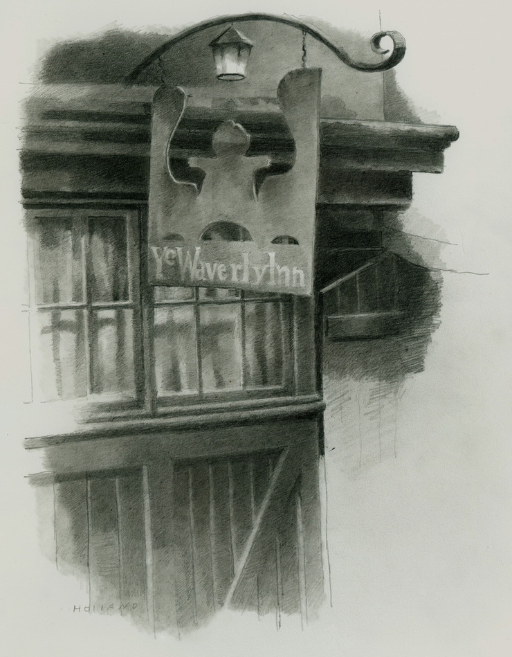
Last fall I drew the Waverly Inn for a book about literary cafes published in Milan. The restaurant was always one of my favorites: back in the seventies I used to live nearby and ate there often.
My original idea was to do a painting of its distinctive red and green facade. So one afternoon in September I set out for the Village to do a detailed sketch. I intended to use it for reference. But once I had what I needed, I wondered why I needed anything more. So I sent the drawing to Milan, they liked it, and this is the way it was published in the book.
In Burnt Norton, TS Eliot wrote "Time present and time past / Are both perhaps present in time future."
I've been using pencil now for a long time, and while as far back as fifth grade, I may have imagined that I had mastered the art of drawing, I now feel more like Hokusai, who at 80 reportedly said he was just beginning to get the hang of it.
We all know that in the world of popular art we work in, there's not much call for the kind of simple drawings I've posted here. It's like the old lady said who used to live next door to my folks in Arkansas, "your son's pictures would be good if he'd just do them in color."
But that's why I've posted these drawings. Because while lots of us see each others' work in publications and exhibitions, there's always a side of ourselves that we reveal in our drawings that may never be seen anywhere else.
Years ago when I was doing an album cover for Billy Joel, he nearly cringed when I showed him some sketchbook drawings. He advised me never to show such unfinished stuff to anybody else. It would be like letting people listen to the outtakes from his recording sessions he said.
But of course I disagree. I think as artists, most of us like to see the work behind the work, not just as a way of evesdropping on the process, but because it gives us a chance to see what else is on the other side.
It's like the look on Stevie Ray Vaughn's face. The finished album cover may be more dramatic, good for the image of the cowboy troubadour, but the drawing behind the painting shows more of the person behind the image.
For me all art begins in the observation of things we can see, even the observation of those things, like ideas, that we can't see.
Drawings and text © 2016 Brad Holland