
Catching Up- Yup, Still Busy
NOVEMBER 23, 2015
The Nation
I’ve had the pleasure of working with Robert Best a number of times since he’s taken the helm of art direction at The Nation. He’s one of those rare art directors who gets it and trusts the people he hires. That in turn inspires people like me to hopefully exceed the expectations and justify that trust.
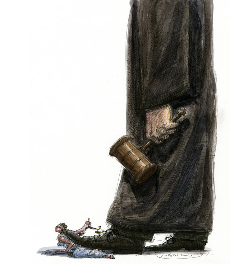
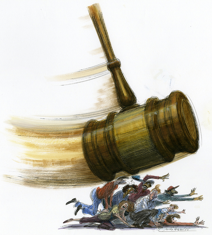
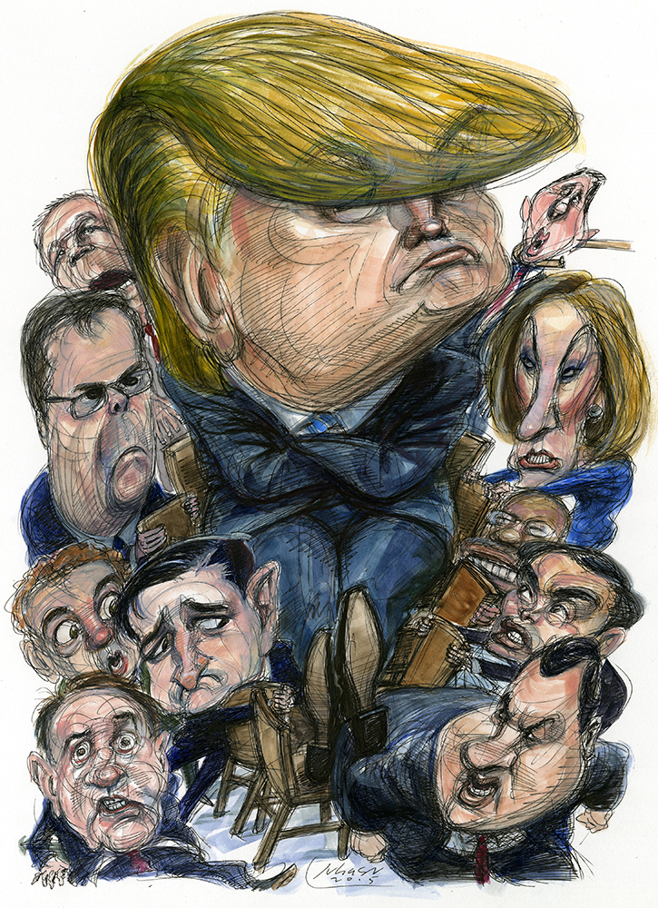
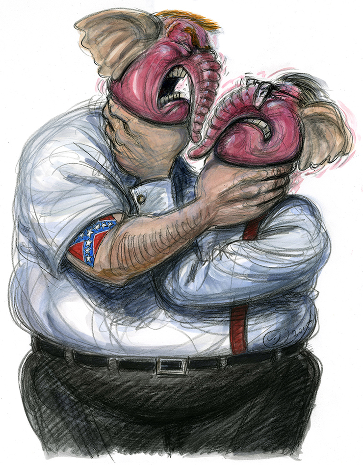
Back in September Robert sent me copy for a feature assessing the Supreme Court under Justice John Roberts. It was quite even handed but didn’t hold back on some of the major decision fails over the past decade. I chose not to go the caricature route and instead make the concept take center stage. The cover idea, with one not insignificant adjustment suggestion from Robert, came pretty quickly and graphically looked strong as a cover image. Covers are different from inside art as covers must grab attention. They don’t need to cover all the details of the story; they need to make a point. In this situation, the close-up of a judge stepping on the back of Justice (originally Uncle Sam) got the message across quite strikingly, especially as it appeared in the layout. The inside follow-up illustration, a bit less serious, visualized a judge’s gavel as a pendulum with a mean swing. While we were on a roll it seemed a perfect opportunity to take a whack at Trump hogging all the chairs in a GOP musical chairs contest. Still seems to hold true as his popularity holds strong. I doubt even being caught on tape committing murder would diminish his numbers among the hard core.
My cover image for the GOP Cracking Up owes much to my affection for the visual sight gag. It’s a tip of the hat to early MAD magazine but also inspirations like Rick Meyerowitz. It’s been a liberating experience since dropping pen and ink many years ago as the nearly sole form of working. My comfortableness with the medium has decreased over the years and I find I can often get better effects with good old pencils and wash. Also keeps the drawings feeling fresher. Many toss in the can starts and then you nail the drawing you want.
The Baffler
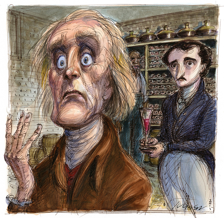
Patrick J.B. Flynn has been handing me interesting pieces to illustrate, pieces I normally would associate myself with. The current Baffler has a excerpt from the play “Monticello” about an imaginary encounter (I’m assuming it’s imaginary.) between a close to death Thomas Jefferson and a young Edgar A. Poe. Jefferson has one of those great faces that I can never get tired of drawing. I’ve never really done Poe to my memory, and wouldn’t consider volunteering an image as he’s been done so magnificently by other illustrators (see Joe Ciardiello). Google searches proved somewhat helpful finding dress styles of the time and as there are such few images of E.A.P. to choose from, the opportunity to imagine, emphasis on imagine, him young.
The American Prospect
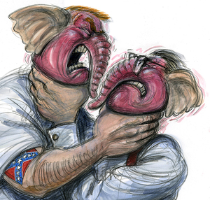
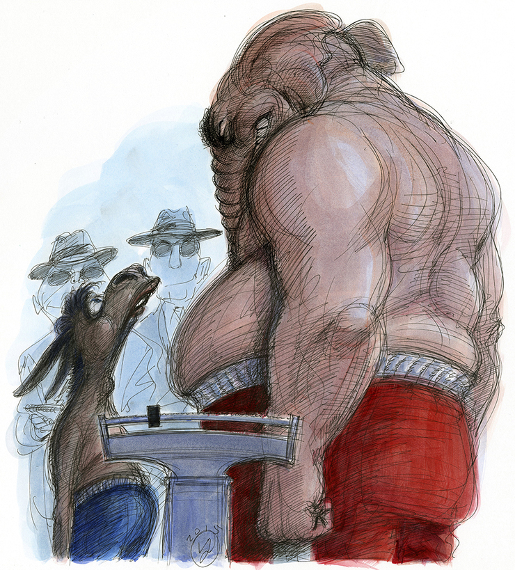
The Prospect has undergone some major changes, especially in terms of publication frequency (it’s a quarterly now) so it’s always great to hear from Mary Parsons, for whom I’ve done some of my best work. Not a major spread piece but an essay on how every election looks like a guaranteed GOP beatup of the Dems that doesn’t always pan out. I focused on a boxing weigh in- usually an opportunity to indulge in some pre-fight intimidation and played to a terribly uneven confrontation. Then I took it a couple steps more and went all prison on the elephant covering him in tattoos expression a more hard right bend. The editor thought it was over the top and unfair (liberals, what can I tell ya) and strongly suggested I tone it down. Though lacking the acid flavor I was shooting for, the result is still a good comic image in large part because of the body language of the contestants and that the jackass is the closest I’ve come to doing a Don Knotts in my career.
Rolling Stone
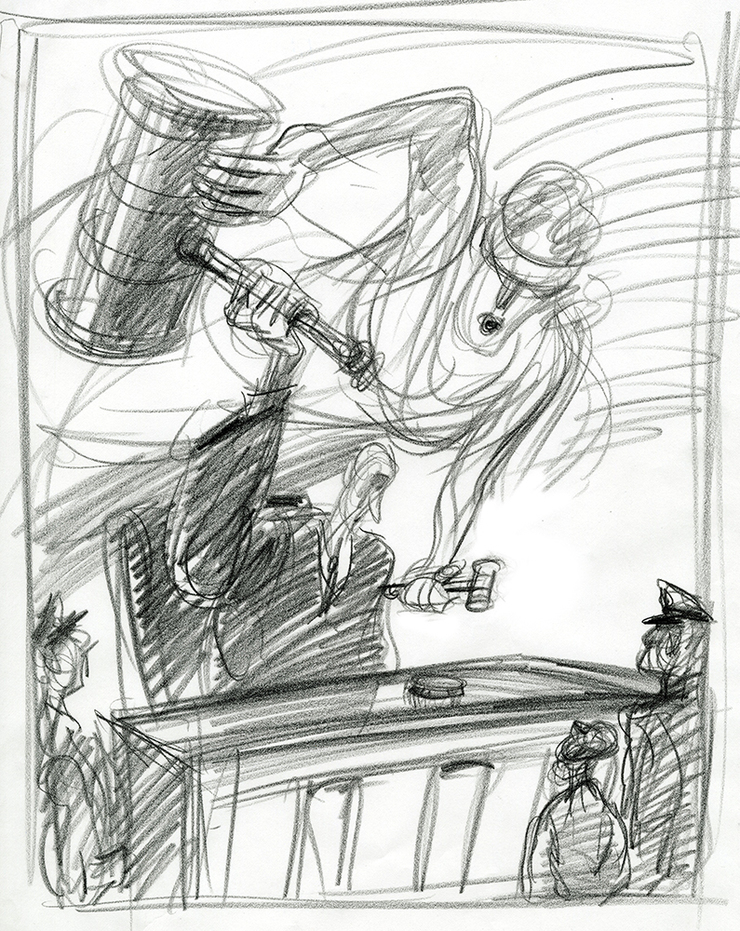
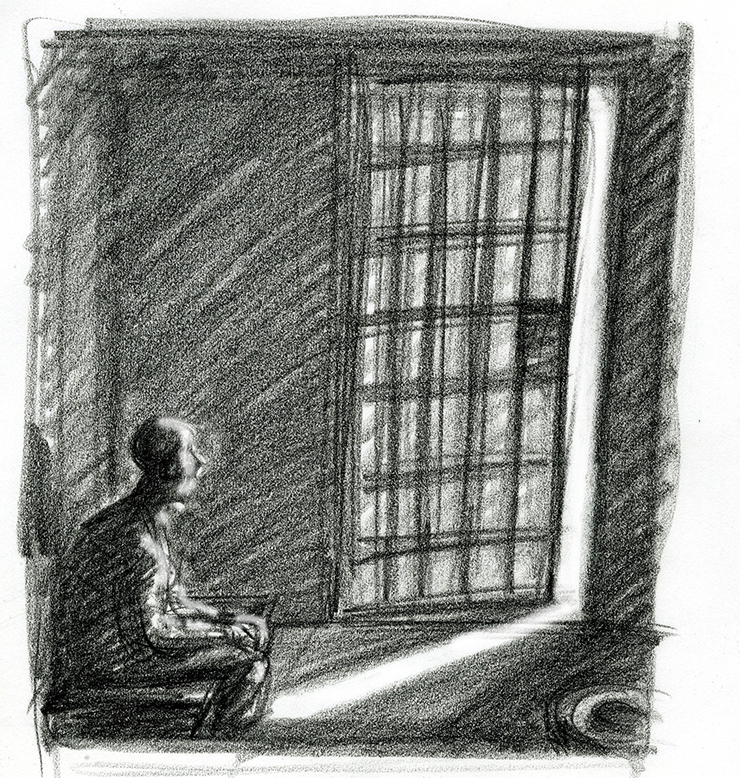
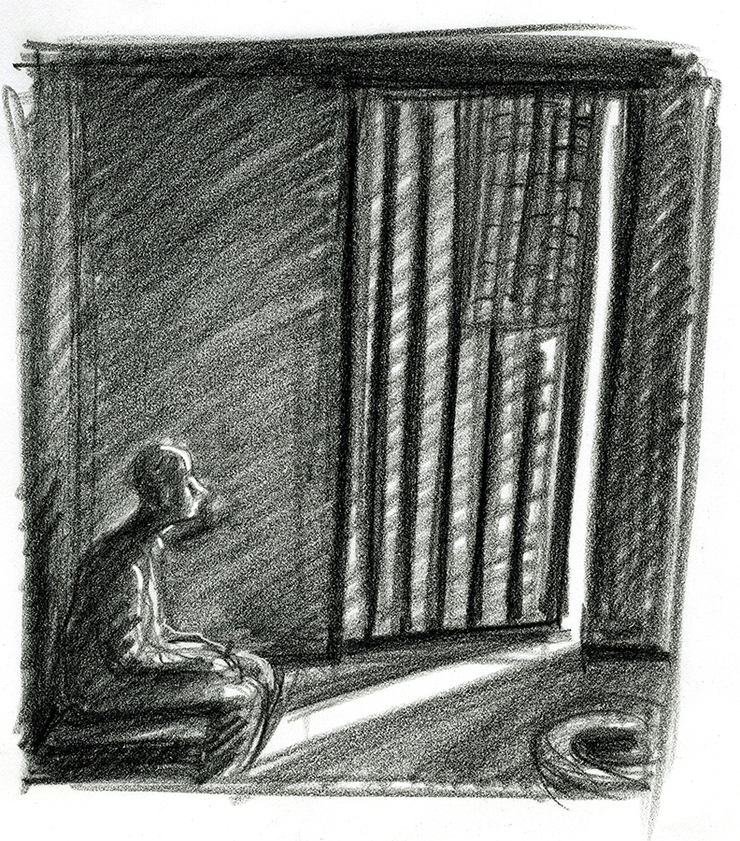
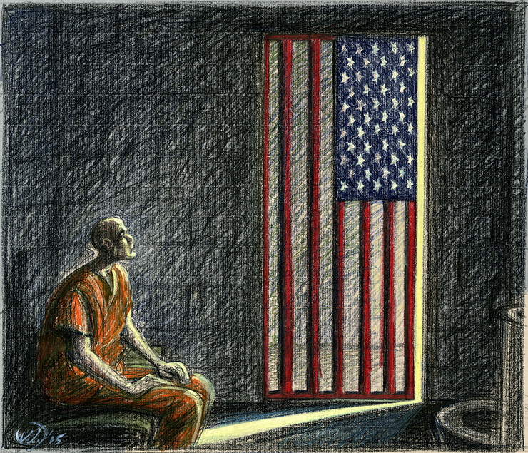
A piece for National Affairs on prison sentencing reform by Nick Pinto, and the small but significant steps being taken to start reducing the prison population of non-violent offenders, more often than not people busted for drugs. The US can boast of a prison population that from a percentage stand point exceeds all other nations on earth, even countries that one might reasonably assume to be police states. I tried two approaches, one where justice is attempting to replace the huge gavel in the hands of a judge with a smaller, less formidable one. The other idea was to show a dark prison cell with just the slimmest bit of light coming in through a barred door that has cracked open slightly. Some hope. I modified it further by morphing the cell door bars into a US flag. My sketches had a murky nighttime feel that I loved and suspected would not carry over completely into the finish. Why? Because we (well, at least I) just naturally tighten up when the decision is made to go ahead. Rethinking the drawing and getting more ‘correct’ almost immediately kicks in. What had such appeal in a rough drawing suddenly gets a disapproving squint from the inner critical adult. 41 years in the business and it remains a challenge to hold onto as much of the rawness of the original sketch as possible. This one managed to find a nice balance.
It's comforting to note that no matter how desperate and depressing the current state of American politics is, Matt Taibbi will manage to find the very dark and very funny humor in the craziness. His follow up report from the campaign trail in the current RS is a pure pleasure to read. My biggest challenge when illustrating a piece by Matt is trying to match the quality of his writing. There was no finished copy to read but Matt did send some notes how he was going to pursue the theme. The idea of a magician continuously pulling skunks from a hat was worth pursuing. In this case the latest skunk happens to be Marco Rubio.
Art Director, Mark Maltais.
The New York Observer
The Top 40 Power Players- State of Confusion. That state being New York, which is watching the unfolding of significant corruption trials (Shocking!) of powerful leaders of both parties. There are any number of other Albany pols probably sweating plenty as Preet Bharara, the U.S. Attorney for the Southern District of New York, lays out his indictments and brings to trial the seriously ethically challenged representatives of the people. This was pretty straight forward- compose an image of some of the nervous key players with a very calm Preet central to the image. A woman needed to be added to the image so poor Eva Moskowitz, not under any corruption scrutiny got the dubious honor of appearing on the cover. Art Director- Lauren Draper.
Trusteeship Magazine
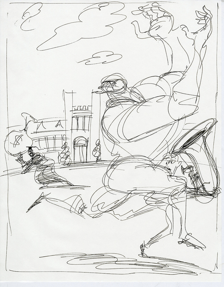
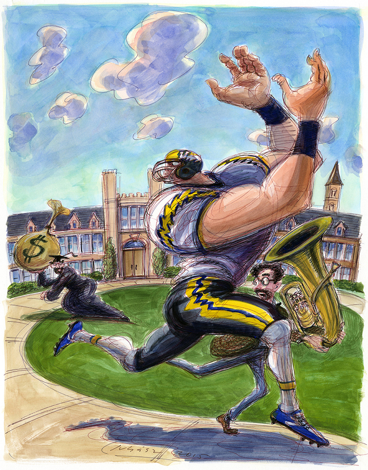
“Trustees and the Rise of Football in the 21st Century”. It’s great when an art director you haven’t heard from in a while and whom you enjoy working with touches base. I’ve known Jeff Kibler from the days we were both still living in New Jersey and he was working for the design firm, Johnson and Simpson, in Newark. Trusteeship is just one of the publications he art directs for McMurry/TMG. He contacted me regarding a piece examining the responsibilities of college and university trustees allocating money to a bedrock college sport that has come under severe scrutiny the result of all the medical findings of brain damage suffered by the athletes. Where should future money be allocated? What benefits the university more in the long term? I tried several approaches playing to the idea of the elephant in the room that needs to be addressed but threw in an image of a gigantic football player competing with a less than gigantic music student for college dollars. That was approved and we went to finish. I enjoyed all the physical gestures in the illustration.
THE NATION.
THE BAFFLER.
It seems you can find anything on Google, including reference of Jefferson's wine cellar. Added to the fun of illustrating this piece.
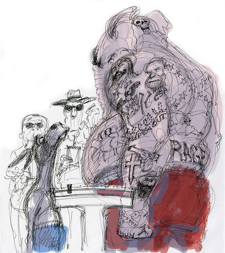
THE AMERICAN PROSPECT.
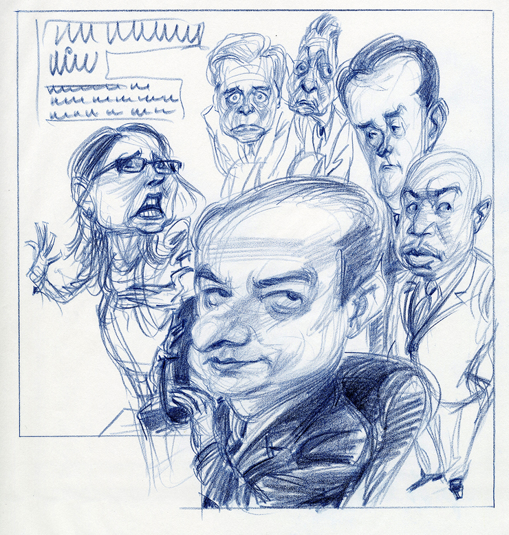
THE NEW YORK OBSERVER. L to R in the background: Eva Moskawitz,head of Success Academy Charter Schools, Dean (Oh Dean!) Skelos, Sheldon Silver, John J. Flanagan, Carl Heastie. In front-Preet Bharara.
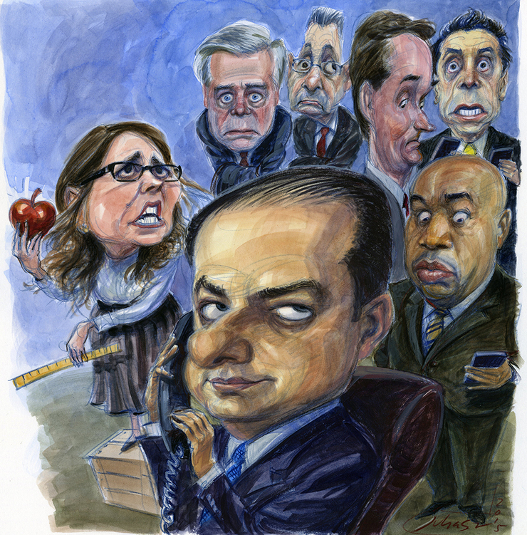
I love drawing Andrew Cuomo. He looks like he's in a perpetual fit, even when he's happy. And that voice. Like a hectoring mother.
ROLLING STONE.
ROLLING STONE.
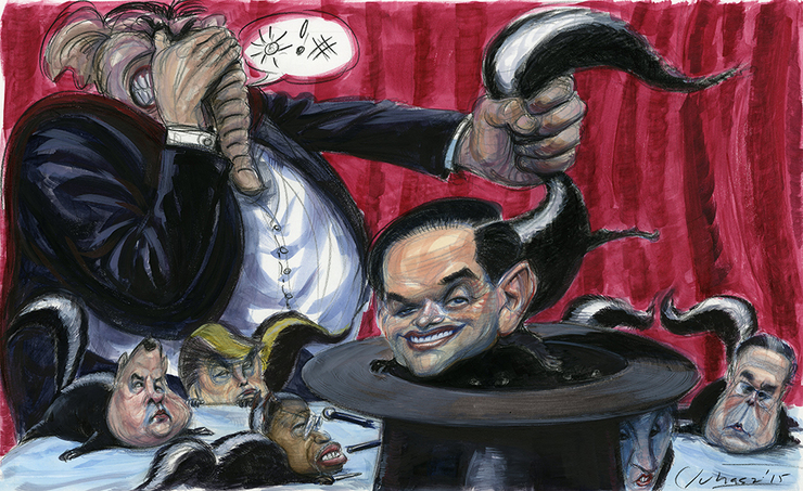
Taibbi: "A bitter Bush recently pegged Rubio as a Republican version of Obama, a comparison neither Rubio nor many Democrats will like, but it has a lot of truth to it. The main difference, apart from the policy inverses, is in tone. 2008 Obama sold tolerance and genial intellectualism, perfect for roping in armchair liberals. Rubio sells a kind of strident, bright-eyed dickishness that in any other year would seem tailor-made for roping in conservatives.
But this isn't any year. It isn't just our energy, education and anti-poverty systems that are outdated. So is our tradition of campaign journalism, which, going back to the days of Nixon, trains reporters to imagine that the winner is probably the slickest Washington-crafted liar, not some loon with a reality show."
Read more: http://www.rollingstone.com/politics/news/the-gop-clown-car-rolls-on-20151117#ixzz3sNFyggy3
Follow us: @rollingstone on Twitter | RollingStone on Facebook
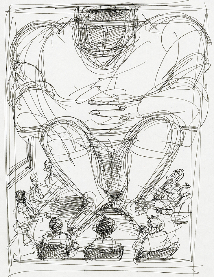
TRUSTEESHIP.
© 2024 Victor Juhasz