THE BOY WHO WOULD BE KING by Ryan Holiday
FEBRUARY 21, 2021
It started with an email in late June, 2020, Year of the Plague. Best selling author (Conspiracy, The Daily Stoic) Ryan Holiday was touching base on the recommendation of a friend, the distinguished editor/publisher (Black Irish Press) Shawn Coyne, whom I have had the pleasure of working with on several books. Shawn felt it would be a good matchup. Ryan wanted to know if I would be interested in illustrating a fable, in the style of a kid’s book but with adults in mind, with a lot of simple, sketchy, drawings. Any illustrator worth his/her salt knows that there are no such things as “simple” drawings. Simple drawings are probably the most difficult thing to pull off successfully. But I was intrigued. The fable was to center on the last of the “good” Roman emperors and notable Stoic, Marcus Aurelius, author of the short but influential notes to himself that became known as his “Meditations”. The fable was to follow his story as a young boy being groomed to eventually take the reins of running the Roman Empire, his fears and resistances to that monumental challenge and how he overcomes them through the assistance of his mentor/teacher, Junius Rusticus.
Ryan wanted to email the manuscript for me to read and respond to. After downloading, printing and reading through it the first time I felt that I needed to do more than just respond yeah or nay. The book was compelling and a great sucker punch of sorts as the message was profound even as the writing was kept simple. There was also something incredibly appealing about the idea of just having fun doing “drawings” that would be treated as finishes. My gut instinct compelled me to do something professionally counter-intuitive. As Ryan hadn’t requested it I asked myself to create, on spec essentially, a slew of sketches, in a style I thought would work best given the project. Shock and awe. I sat down and rifled off a cluster of sketches for the first 15-20 pages. Initial visual ideas on how to handle Marcus and Rusticus as well as addressing the level of sketchiness versus finished look. I allowed first impressions to guide me and how the drawings would unfold, then scanned and sent them out. It was a gamble but as far as I was concerned a good one. I also wanted to plant the flag on the beach before any thought might be given to reaching out to others. The potentiality of a long term fun project like this doesn’t happen often. I gave it a good shot and then waited to see what happened. Long story short, the sketches exceeded what Ryan had been imagining and, more importantly, he felt that I connected with his intentions, that we were on the same wavelength. And yes, other illustrators had also been suggested but Ryan felt no need to pursue after seeing the first drawings.
From the start Ryan visualized drawings for each and every page that often had but one or two sentences. The most important challenge to me was to not just complement the words on each page but keep the visual narrative flowing. These were not chapter heading sketches. It wasn’t exactly following a graphic novel format but visually it had to be narratively compelling. Storyboarding it in my mind’s eye. There was talk of dropping some colors here and there for emphasis but the priority was going to be on the drawings themselves. In so many ways I couldn’t have asked for a challenge more enjoyable. Drawing is what I like to do best. And sketches are more often than not the best part of drawing. Where the critical intellect plays second fiddle to the intuition behind the linework. Finessing can always come later. Regardless the number of drawings and re-drawings, and there were going to be plenty, this was a dream assignment.
Ryan was looking to wrap things up before Christmas time, so we had somewhere in the neighborhood of a half year to make this come together. Having established some foundation with the sketches my next step was to dive deep into reference as well as reading up on the subject matter. These can be some of the most rewarding aspects of doing projects of this type. The informational rabbit holes are fascinating and add to the knowledge I can bring to an image, whether a piece is whimsical or serious. It’s up to me how to digest and interpret what I’ve learned and make it part of the drawing. I had been aware of Stoicism since high school but until this project that knowledge was superficial and largely incorrect as I soon learned.
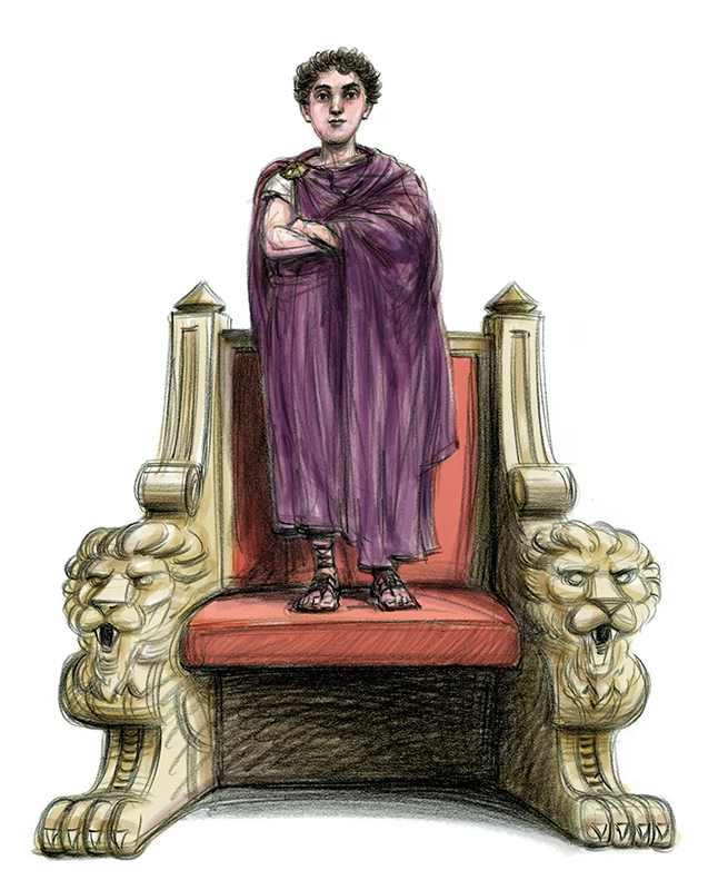
Ryan was kind of hoping to use his older son as a model for the young Marcus, but to our dismay and frustration the age difference between Marcus in the story and Ryan’s son made incorporating the features unworkable. It was time to go with the facts. The Google searching resulted in a number of images of Marcus as emperor, in portrait bust and full figure in horseback statue pose, as well as one or two portrait busts claiming to be of him as a boy. I wanted to find a workable balance between whimsical and serious (he did indeed seem to have such old soul eyes in the youthful bust) and the early rounds of sketches began finding their way to a solution. Rusticus was one of several mentor/instructors in Marcus’ life. To simplify the fable Ryan’s choice was to make Rusticus a combination of all the mentors. Here the reference sources were sketchy. We went with a few, somewhat dubious, representations to create his character. Based on one of the portraits Rusticus reminded me somewhat of Roger Waters from Pink Floyd. So I used Roger Waters reference as a basis from which to work. Marcus’ half-brother, Lucius Verus, eventually shared the emperor position with him. There are representations of him as emperor but they were of limited use thinking of him as the boy in the story. Of Marcus’ mother I could find nothing and relied on portraits of the time to imagine her.
What followed over the course of the next 6 months. Hundreds and hundreds of drawings, in both sketch and finish stages, lying in batches around the studio. Most of them fails. Not necessarily because they were bad- in fact many were quite good- but because they didn’t quite hit that mark, didn’t quite contain the right balance between looseness and structure that was in my mind’s eye. So many times I would send out sketches that would receive enthusiastic approval from Ryan and his editor, Nils Parker, only to find myself thinking of further tweaks. But the energy was positive, we were seeing this thing come to life and it seemed I was exceeding the original expectations. That said, it was important never to feel too satisfied or even merely satisfied. We hadn’t even gotten to the culling and proceeding to finish stage.
And it came. With a kind of vengeance. The stakes were raised considerably once all the approved sketches were laid out from beginning to end on the pages and I got the green light to go to finishes. Worth noting that a certain point Ryan and Nils informed me that if something terrible were to happen to me (Memento Mori) they had enough solid sketches to construct the book with them alone.
Forty seven years doing this work and it never fails that once a sketch is approved to proceed to “finish” it turns into a wrestling match between spontaneity and correctness. Paper company stocks rise whenever I sit down and start rifling through pads of paper overflowing garbage containers and eventually creating a snowstorm of crumpled sheets on the studio floor. If there were hundreds of sketches to get to the approved 90 or so, there were going to be uncountable volumes of sheets of fails during the finish stage. And yet, I was completely embracing the fun part of it all enmeshed in the joy of drawing. If there were days that produced just one finished drawing hitting the spirit of a sketch there were others that saw a seemingly effortless flow of several before closing up for the night. I have yet to successfully explain why some days breeze by and others have you questioning whether you can even draw.
But there was color to add. As the project progressed it was clear that dashes of color were not going to cut it. It was going to get more involved. But I did not want to mess with the original pencil artwork. Years ago I had done a large volume of portraits of speakers for a TED event. It was my first real experience, as a Luddite, of making drawings and not coloring the original artwork. I used Photoshop colors and brush apps created by Kyle Webster to add some atmosphere. But it was hardly rendering. It was more special effects. With Ryan’s book I was going to treat color as complementary to the narrative flow. Photoshop and Kyle’s brush apps liberated me to focus on the drawings as drawings and not fret the color and application choices. If something didn’t work I could just trash the layer. It also allowed me the option, if necessary, of creating several versions for Ryan and Nils to choose from. And the original artwork remained undamaged.
One thing I hadn’t factored at the beginning was how my drawings might adjust, even if in subtle ways, to the manuscript as it unfolded. Yet, here I was, somewhere three quarters of the way in (it was pretty much an A to Z progression) taking note that without conscious intent the drawings were getting more serious. Well, the story was getting more serious. The lessons were taking on weight and I had been responding in kind. There were no jarring breaks in style, just subtle levels of greater completion with each new image. I may also have simply found myself wanting to bring something a little extra the more I returned to the chief players in the story, finding further nuances in their portrayals. Repetition, even of something that works, is stasis.
By the time we arrived at a closeup of the older Marcus I wanted the face to speak as well as the words. The intent was to make that connection with the reader.
There continued to be revises once everything was handed in and felt ready to go to print. In those cases I would opt to just completely re-draw, or recolor, the images rather than getting all caught up in erasing what was on the original artwork. It didn’t matter to me as the mission was to create the best possible book for a reader. I had been fortunate enough to be part of this project and some last minute revises we not an issue in the big scheme of things.
The book is going out as of March 9th. The Stoics might observe that what happens next is not in our control. Only the sincere, hard work we did was in our control and what ultimately matters. It’s a marvelous book for kids, and kids of all ages. It’s not often we find ourselves in projects that we look forward to working on each and every day. I hope you enjoy it.
Ryan wanted to email the manuscript for me to read and respond to. After downloading, printing and reading through it the first time I felt that I needed to do more than just respond yeah or nay. The book was compelling and a great sucker punch of sorts as the message was profound even as the writing was kept simple. There was also something incredibly appealing about the idea of just having fun doing “drawings” that would be treated as finishes. My gut instinct compelled me to do something professionally counter-intuitive. As Ryan hadn’t requested it I asked myself to create, on spec essentially, a slew of sketches, in a style I thought would work best given the project. Shock and awe. I sat down and rifled off a cluster of sketches for the first 15-20 pages. Initial visual ideas on how to handle Marcus and Rusticus as well as addressing the level of sketchiness versus finished look. I allowed first impressions to guide me and how the drawings would unfold, then scanned and sent them out. It was a gamble but as far as I was concerned a good one. I also wanted to plant the flag on the beach before any thought might be given to reaching out to others. The potentiality of a long term fun project like this doesn’t happen often. I gave it a good shot and then waited to see what happened. Long story short, the sketches exceeded what Ryan had been imagining and, more importantly, he felt that I connected with his intentions, that we were on the same wavelength. And yes, other illustrators had also been suggested but Ryan felt no need to pursue after seeing the first drawings.
From the start Ryan visualized drawings for each and every page that often had but one or two sentences. The most important challenge to me was to not just complement the words on each page but keep the visual narrative flowing. These were not chapter heading sketches. It wasn’t exactly following a graphic novel format but visually it had to be narratively compelling. Storyboarding it in my mind’s eye. There was talk of dropping some colors here and there for emphasis but the priority was going to be on the drawings themselves. In so many ways I couldn’t have asked for a challenge more enjoyable. Drawing is what I like to do best. And sketches are more often than not the best part of drawing. Where the critical intellect plays second fiddle to the intuition behind the linework. Finessing can always come later. Regardless the number of drawings and re-drawings, and there were going to be plenty, this was a dream assignment.
Ryan was looking to wrap things up before Christmas time, so we had somewhere in the neighborhood of a half year to make this come together. Having established some foundation with the sketches my next step was to dive deep into reference as well as reading up on the subject matter. These can be some of the most rewarding aspects of doing projects of this type. The informational rabbit holes are fascinating and add to the knowledge I can bring to an image, whether a piece is whimsical or serious. It’s up to me how to digest and interpret what I’ve learned and make it part of the drawing. I had been aware of Stoicism since high school but until this project that knowledge was superficial and largely incorrect as I soon learned.
Ryan was kind of hoping to use his older son as a model for the young Marcus, but to our dismay and frustration the age difference between Marcus in the story and Ryan’s son made incorporating the features unworkable. It was time to go with the facts. The Google searching resulted in a number of images of Marcus as emperor, in portrait bust and full figure in horseback statue pose, as well as one or two portrait busts claiming to be of him as a boy. I wanted to find a workable balance between whimsical and serious (he did indeed seem to have such old soul eyes in the youthful bust) and the early rounds of sketches began finding their way to a solution. Rusticus was one of several mentor/instructors in Marcus’ life. To simplify the fable Ryan’s choice was to make Rusticus a combination of all the mentors. Here the reference sources were sketchy. We went with a few, somewhat dubious, representations to create his character. Based on one of the portraits Rusticus reminded me somewhat of Roger Waters from Pink Floyd. So I used Roger Waters reference as a basis from which to work. Marcus’ half-brother, Lucius Verus, eventually shared the emperor position with him. There are representations of him as emperor but they were of limited use thinking of him as the boy in the story. Of Marcus’ mother I could find nothing and relied on portraits of the time to imagine her.
What followed over the course of the next 6 months. Hundreds and hundreds of drawings, in both sketch and finish stages, lying in batches around the studio. Most of them fails. Not necessarily because they were bad- in fact many were quite good- but because they didn’t quite hit that mark, didn’t quite contain the right balance between looseness and structure that was in my mind’s eye. So many times I would send out sketches that would receive enthusiastic approval from Ryan and his editor, Nils Parker, only to find myself thinking of further tweaks. But the energy was positive, we were seeing this thing come to life and it seemed I was exceeding the original expectations. That said, it was important never to feel too satisfied or even merely satisfied. We hadn’t even gotten to the culling and proceeding to finish stage.
And it came. With a kind of vengeance. The stakes were raised considerably once all the approved sketches were laid out from beginning to end on the pages and I got the green light to go to finishes. Worth noting that a certain point Ryan and Nils informed me that if something terrible were to happen to me (Memento Mori) they had enough solid sketches to construct the book with them alone.
Forty seven years doing this work and it never fails that once a sketch is approved to proceed to “finish” it turns into a wrestling match between spontaneity and correctness. Paper company stocks rise whenever I sit down and start rifling through pads of paper overflowing garbage containers and eventually creating a snowstorm of crumpled sheets on the studio floor. If there were hundreds of sketches to get to the approved 90 or so, there were going to be uncountable volumes of sheets of fails during the finish stage. And yet, I was completely embracing the fun part of it all enmeshed in the joy of drawing. If there were days that produced just one finished drawing hitting the spirit of a sketch there were others that saw a seemingly effortless flow of several before closing up for the night. I have yet to successfully explain why some days breeze by and others have you questioning whether you can even draw.
But there was color to add. As the project progressed it was clear that dashes of color were not going to cut it. It was going to get more involved. But I did not want to mess with the original pencil artwork. Years ago I had done a large volume of portraits of speakers for a TED event. It was my first real experience, as a Luddite, of making drawings and not coloring the original artwork. I used Photoshop colors and brush apps created by Kyle Webster to add some atmosphere. But it was hardly rendering. It was more special effects. With Ryan’s book I was going to treat color as complementary to the narrative flow. Photoshop and Kyle’s brush apps liberated me to focus on the drawings as drawings and not fret the color and application choices. If something didn’t work I could just trash the layer. It also allowed me the option, if necessary, of creating several versions for Ryan and Nils to choose from. And the original artwork remained undamaged.
One thing I hadn’t factored at the beginning was how my drawings might adjust, even if in subtle ways, to the manuscript as it unfolded. Yet, here I was, somewhere three quarters of the way in (it was pretty much an A to Z progression) taking note that without conscious intent the drawings were getting more serious. Well, the story was getting more serious. The lessons were taking on weight and I had been responding in kind. There were no jarring breaks in style, just subtle levels of greater completion with each new image. I may also have simply found myself wanting to bring something a little extra the more I returned to the chief players in the story, finding further nuances in their portrayals. Repetition, even of something that works, is stasis.
By the time we arrived at a closeup of the older Marcus I wanted the face to speak as well as the words. The intent was to make that connection with the reader.
There continued to be revises once everything was handed in and felt ready to go to print. In those cases I would opt to just completely re-draw, or recolor, the images rather than getting all caught up in erasing what was on the original artwork. It didn’t matter to me as the mission was to create the best possible book for a reader. I had been fortunate enough to be part of this project and some last minute revises we not an issue in the big scheme of things.
The book is going out as of March 9th. The Stoics might observe that what happens next is not in our control. Only the sincere, hard work we did was in our control and what ultimately matters. It’s a marvelous book for kids, and kids of all ages. It’s not often we find ourselves in projects that we look forward to working on each and every day. I hope you enjoy it.

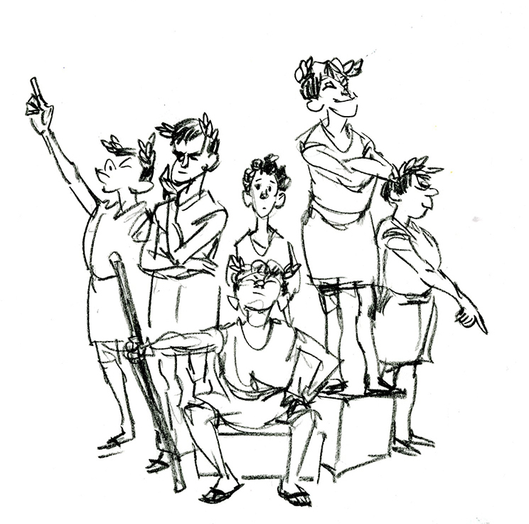
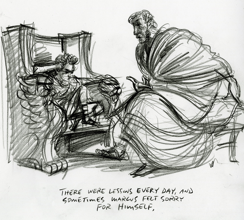
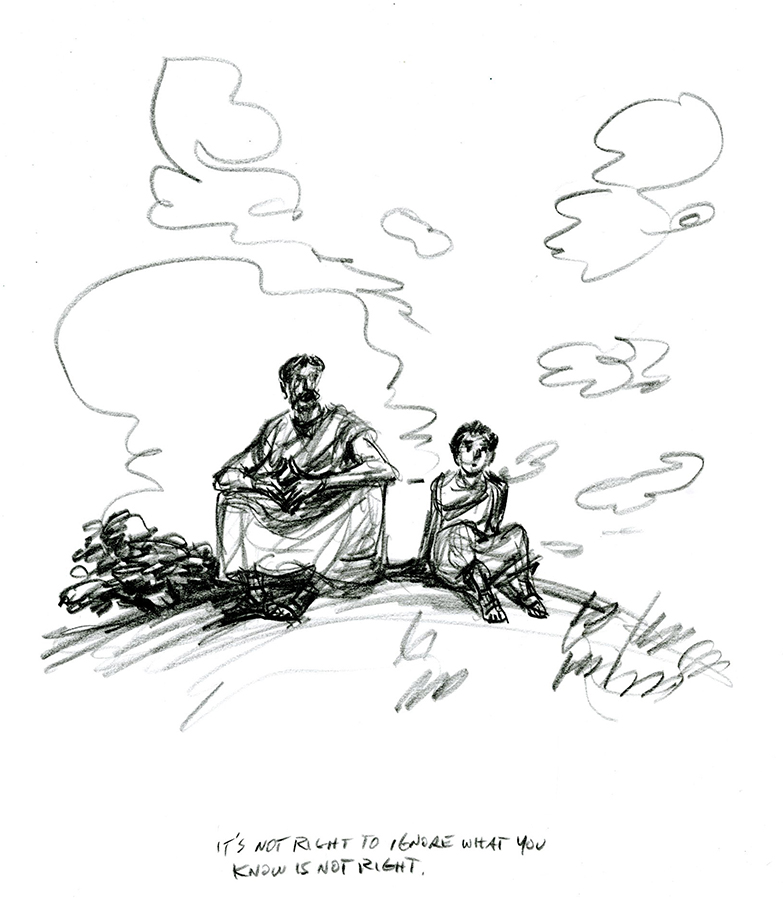
Early sketches as well as Marcus were lighter and more humorous in tone.
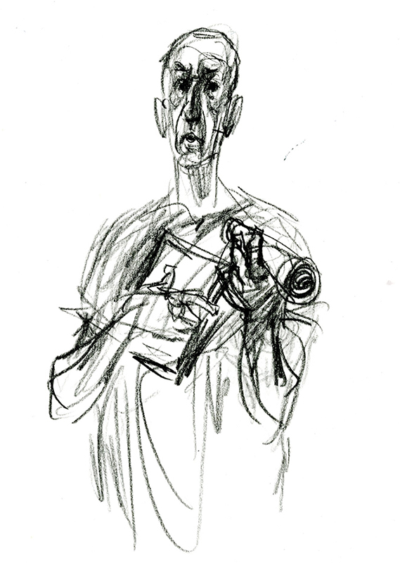
Rusticus as originally imagined, before my research indicated that this was not the period of short haircuts for Roman men.
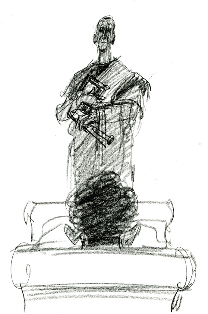
Rusticus as reimagined.
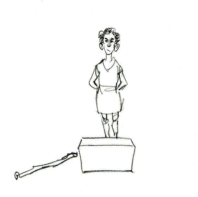
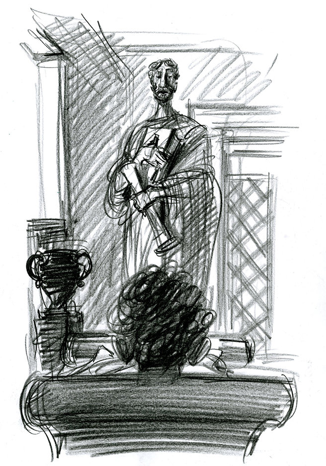
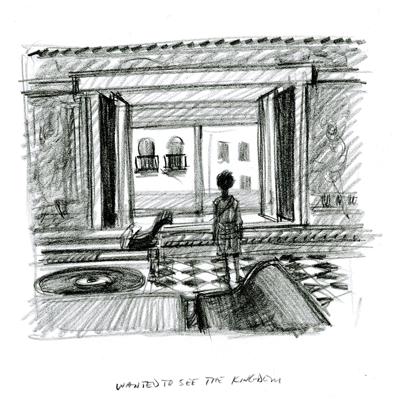
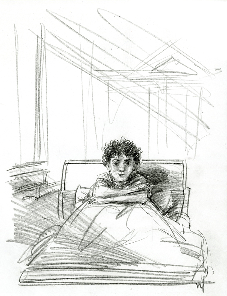
One of the many sketches that didn't make it to finish.
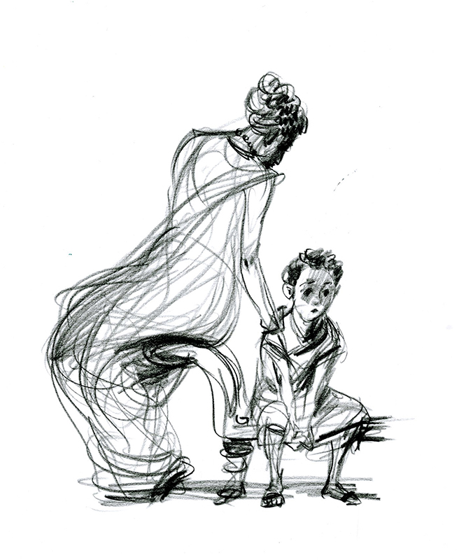
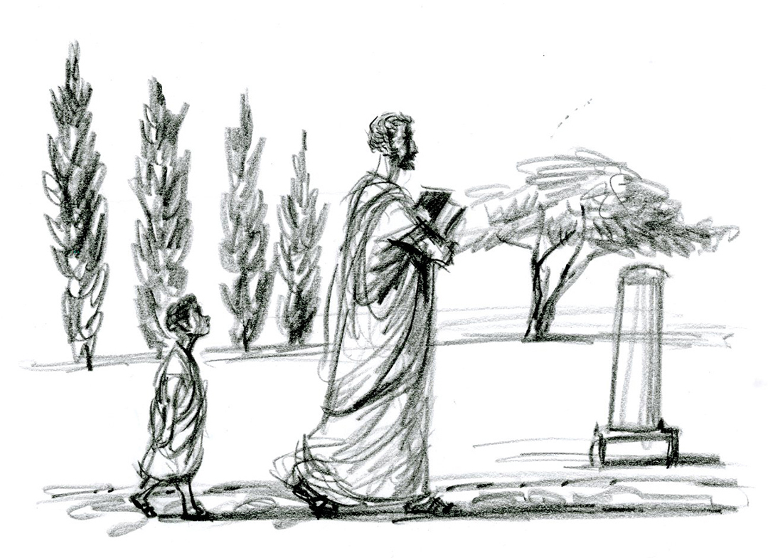
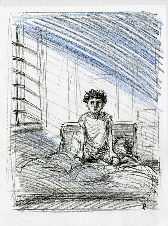
Like so many, this sketch, based on how we wanted to do the illustrations for the book, felt perfect. It was just one of the numerous challenges to replicate the mood and in color.
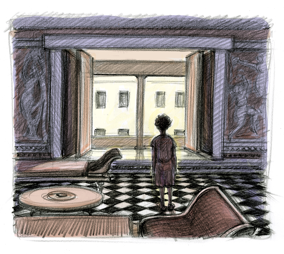
The finish.
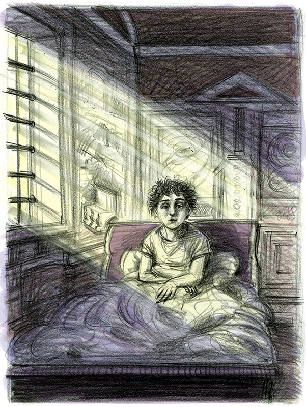
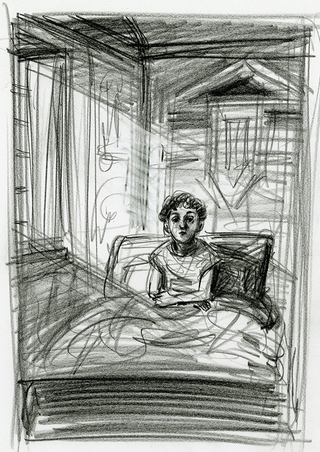
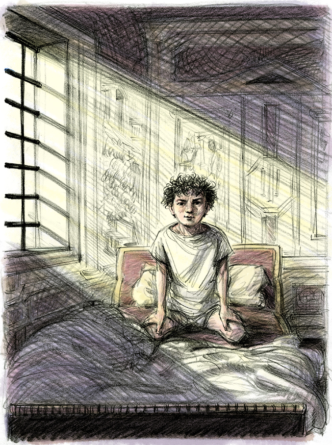
There's a crucial point in the story where Marcus has a dream that forces him to realize that he must take command of his life and destiny. The atmosphere was right here with that early morning light, but his expression seemed more dazed than determined. This image went through many changes. The hardest part was capturing the right expression.
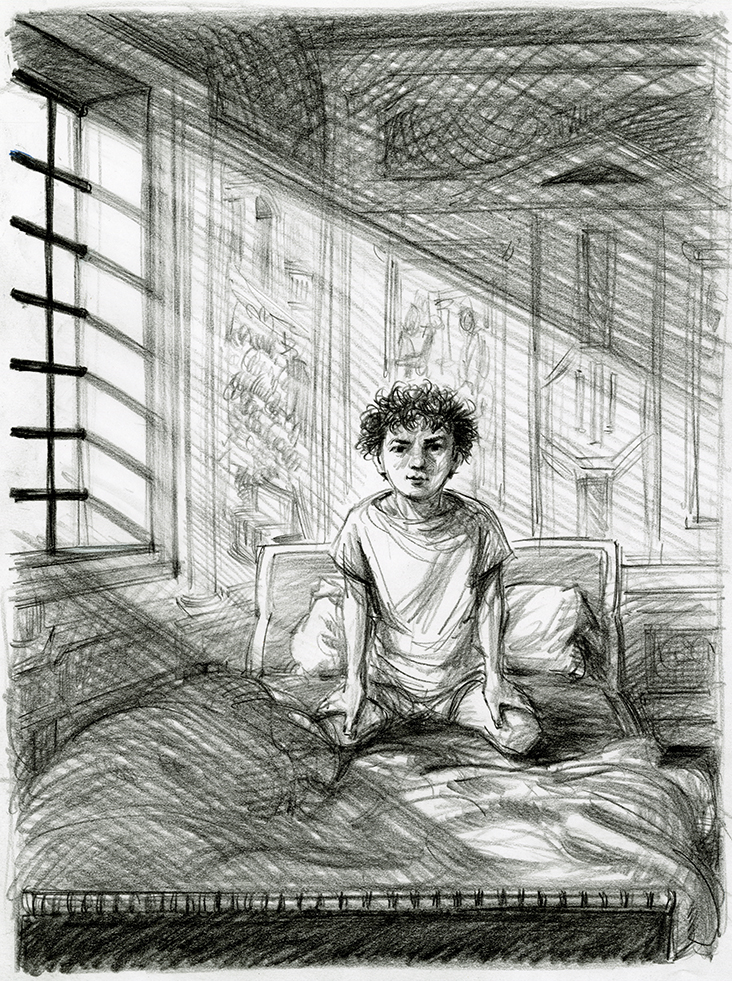
It eventually occurred to me that body language as well as facial expression was necessary to convey that change in attitude. He needed to be sitting up in bed.
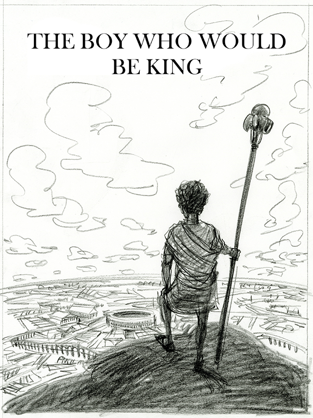
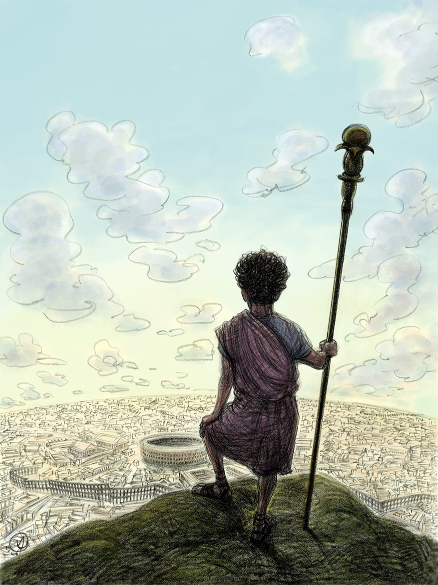
One of a number of possible solutions that we kicked around for the cover.
© 2024 Victor Juhasz