Edel Rodriguez
Cuban Music Film
July 15
While in Cuba this year on a photo shoot for Billboard magazine, I shot my first short film, a look at the country...
 Newsweek Cover
January 31
This is my new cover for Newsweek, it's been in the news and received commentary, both positive and negative,...
Newsweek Cover
January 31
This is my new cover for Newsweek, it's been in the news and received commentary, both positive and negative,...
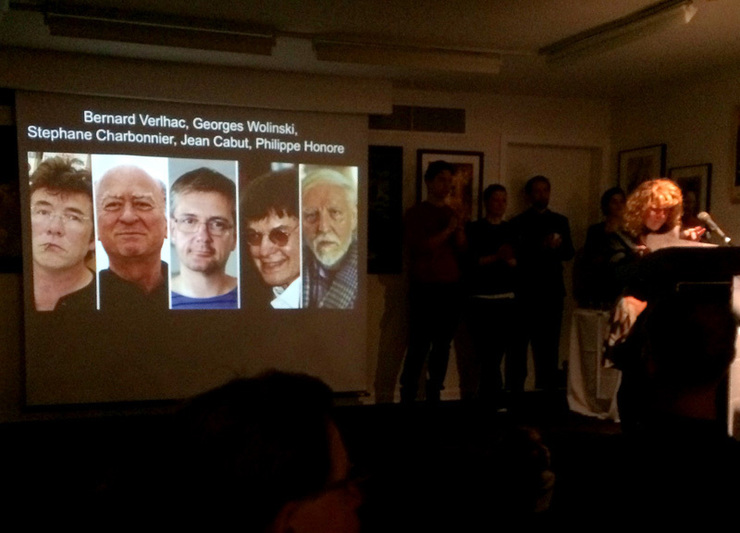 Charlie at the Society
January 10
Charlie at the Society
January 10
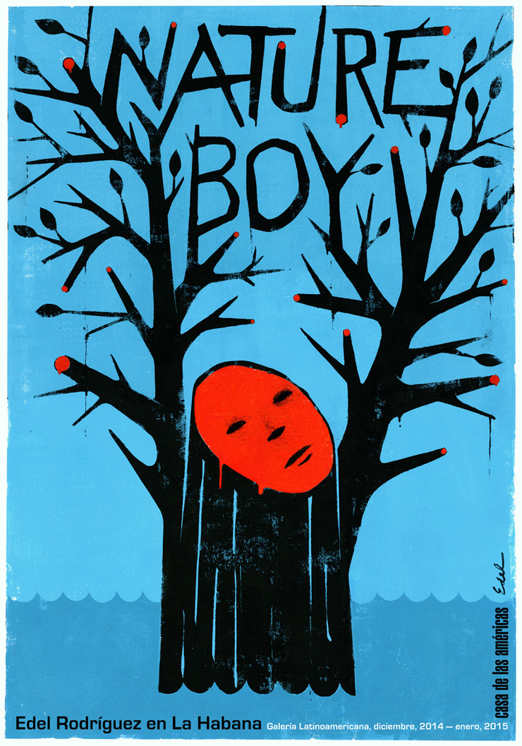 Show in Havana
November 27
I'm having my first show in Cuba, opening December 5th, at Casa de las Américas. I'm traveling...
Show in Havana
November 27
I'm having my first show in Cuba, opening December 5th, at Casa de las Américas. I'm traveling...
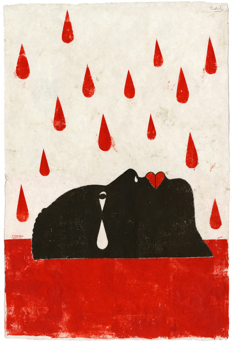 Bob Newman Auction
May 29
This is my contribution to The Friends of Bob Newman auction. An original painting, acrylic and ink on bark paper,...
Bob Newman Auction
May 29
This is my contribution to The Friends of Bob Newman auction. An original painting, acrylic and ink on bark paper,...
 Art and Cooking in France
March 23
A couple of years ago I was in France to attend a cooking class with my wife for a week at Le Calabash Petit...
Art and Cooking in France
March 23
A couple of years ago I was in France to attend a cooking class with my wife for a week at Le Calabash Petit...
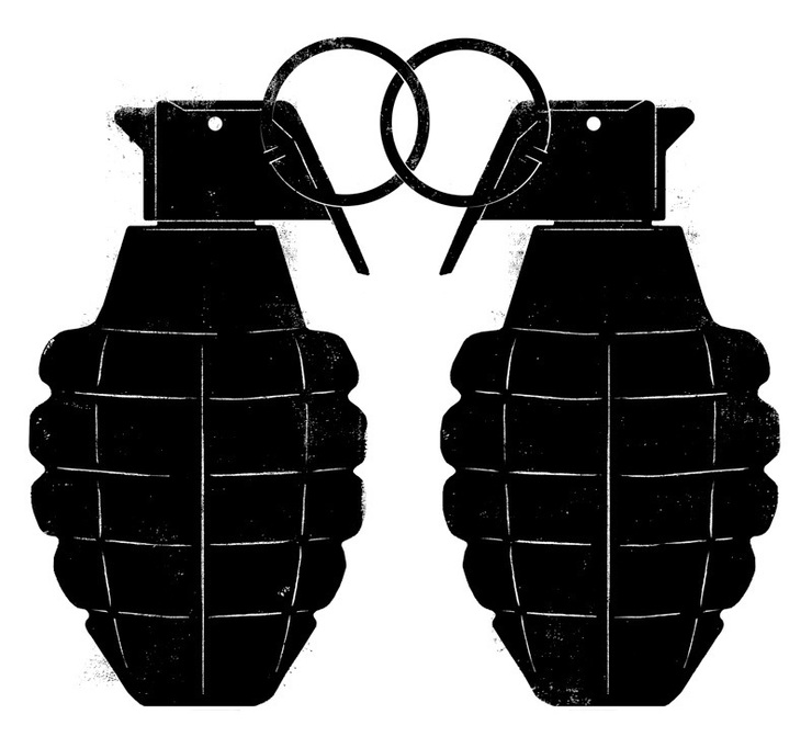
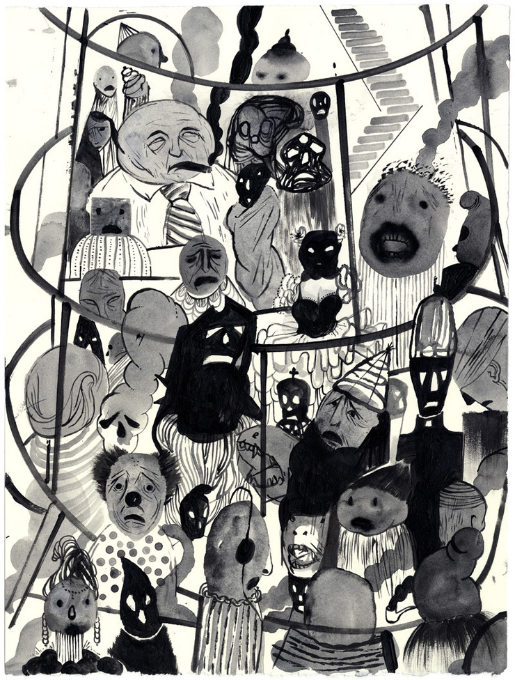 Inferno for WW3 Illustrated
March 12
This is a page in the current edition of World War 3 Illustrated, which Peter Kuper has been co-editing for many...
Inferno for WW3 Illustrated
March 12
This is a page in the current edition of World War 3 Illustrated, which Peter Kuper has been co-editing for many...
 For The New York Times
March 5
This is a selection of recent work for The New York Times. The first one above is for an Op-Ed on the current...
For The New York Times
March 5
This is a selection of recent work for The New York Times. The first one above is for an Op-Ed on the current...
 for Playboy Magazine
February 26
I was asked to illustrate a lengthy article in Playboy magazine about women and orgasms, more specifically the...
for Playboy Magazine
February 26
I was asked to illustrate a lengthy article in Playboy magazine about women and orgasms, more specifically the...
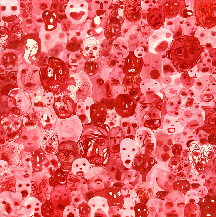 work selected for SI and CA
February 6
These are my images from the past year that were selected for the Society of Illustrators and Communication Arts...
work selected for SI and CA
February 6
These are my images from the past year that were selected for the Society of Illustrators and Communication Arts...
Newsweek Cover
January 31
This is my new cover for Newsweek, it's been in the news and received commentary, both positive and negative,...
Charlie at the Society
January 10
Show in Havana
November 27
I'm having my first show in Cuba, opening December 5th, at Casa de las Américas. I'm traveling...
Bob Newman Auction
May 29
This is my contribution to The Friends of Bob Newman auction. An original painting, acrylic and ink on bark paper,...
Art and Cooking in France
March 23
A couple of years ago I was in France to attend a cooking class with my wife for a week at Le Calabash Petit...
Inferno for WW3 Illustrated
March 12
This is a page in the current edition of World War 3 Illustrated, which Peter Kuper has been co-editing for many...
For The New York Times
March 5
This is a selection of recent work for The New York Times. The first one above is for an Op-Ed on the current...
for Playboy Magazine
February 26
I was asked to illustrate a lengthy article in Playboy magazine about women and orgasms, more specifically the...
work selected for SI and CA
February 6
These are my images from the past year that were selected for the Society of Illustrators and Communication Arts...
© 2024 Edel Rodriguez