How Unromantic!
APRIL 15, 2009
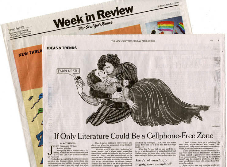
A lot of the world famous classics won’t work if there were cell phones or characters knew how to text message. Casablanca or Romeo and Juliet would have had happy endings. If Joseph had a cell phone there was no Judaism. It sounds like a joke, but these technologies forever changed how the writers would create stories.
This was the article I illustrated for the last Sunday’s The New York Times Week In Review. It was a little goofy illustration. Not an epic kind of work. But I had a lot of fun.
All my illustrator peers know about this, but in case the readers here are aspiring illustrators or art students, I will explain a bit how it works with a job like this.
For a newspaper illustration, we usually have less than a day from start to finish. Yap. In this particular case AD Aviva Michaelov called me the evening before it was due on Thursday for Friday end of the day deadline, but I was working on another deadline for Friday so I asked if it is OK to send the sketches on Friday AM.
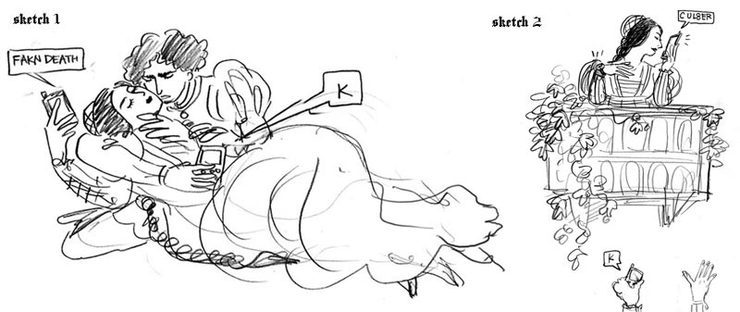
I try to give at least two ideas to pick from. I actually liked the right one, because you can do so much more with layout.
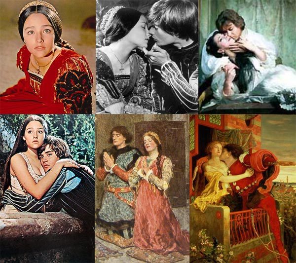
References I downloaded from internet. I used the top right for reference of the pose, and faces and costumes from that famous film (remember Olivia Hussey??), Romeo's hair style from bottom two paintings, etc. Mix and match!
After my other deadline wad done on Friday morning, I spent about 1 hour coming up with ideas. Sketches are rough, but everyone knows it has a tight deadline, so it is OK. I got an approval by early PM, worked on drawing and coloring for the rest of the afternoon. There was a minor revision, but everything was done by 7PM. There are two versions of finals: b/w to be printed in the actual paper, and color to be used on the web.
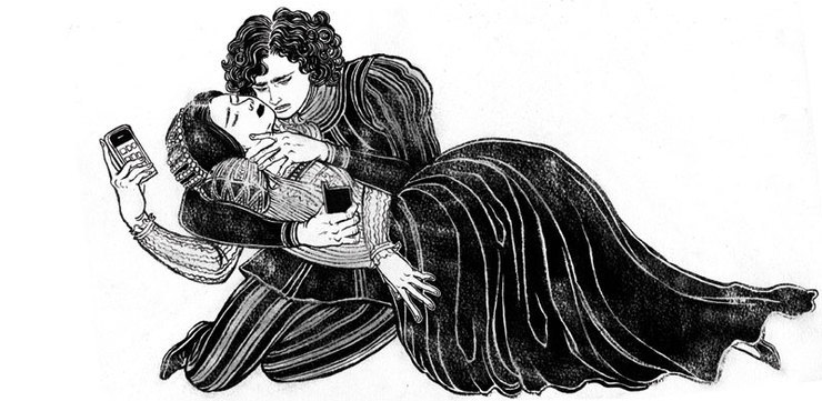
This is the original b/w drawing with ink on watercolor paper, without any computer coloring or editing.
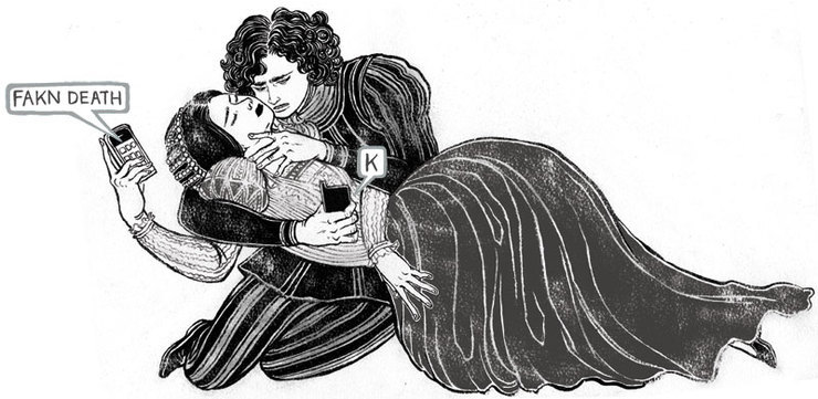
And this is the final b/w image for print. Bubbles were drawn separately and added. Also some harsh blacks were toned down so Romeo and Juliet are separated more into two figures.
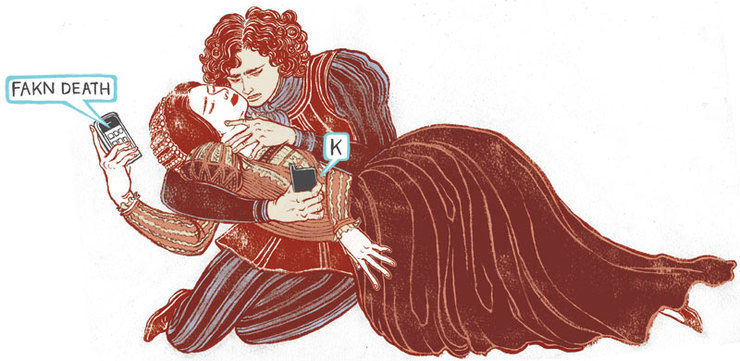
Finally the color version used only for website. We found out that the print was in b/w before I started coloring, so I made two versions. It was not too much more work, and I don't love the way color image prints as b/w. So, it worked out for both parties.
By the way, if anyone is interested, you can actually visit (what is supposed to be) Juliet’s house in Verona, Italy. Balcony was later added to make it look more authentic, but still fun to see where Juliet lived. Besides, Verona is a stunningly beautiful walled city with lots of fabulous wine bars and real Roman coliseum!
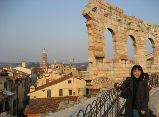
This is a view of Verona from the top of the coliseum. It is not the most common tourist destinations, but it definitely worth a trip. (No, I did not go there for a research of this job.I wish.)
Topical: illustration process
© 2024 Yuko Shimizu