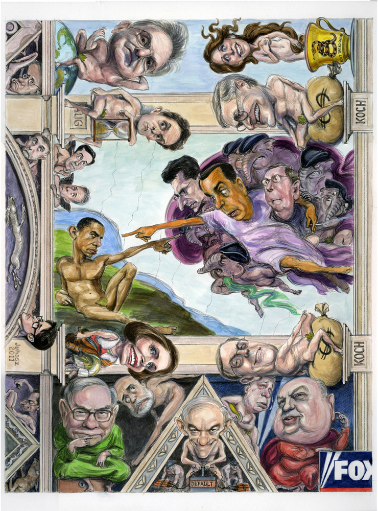
The Grand Opus
When Chelsea Cardinal from GQ Magazine called me in early October to explain the concept of the project for the upcoming issue, I tried my best not to have a seizure in the middle of her description. I’ve done any number of wrap-around book covers, usually anthologies, with multiple casts of characters. The turnaround time on them would often be three weeks to a month. The vision, as passed down from the editors, that Chelsea was describing- a spoof of the Sistine Chapel, saturated with noteworthy politicos, cultural figures and cast of hundreds scenes- all due in about a week-was causing me to have that old caught-on-an-amusement-park-ride-getting-ready-to-barf physical reaction. I felt a brain freeze coming on and my natural reflexive response of, “I CAN’T DO IT!” taking hold. Funny, 58 years old, almost 38 years doing illustration and I’m still capable of relapsing to the terrified 8 year old of my childhood.
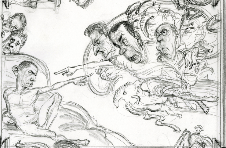
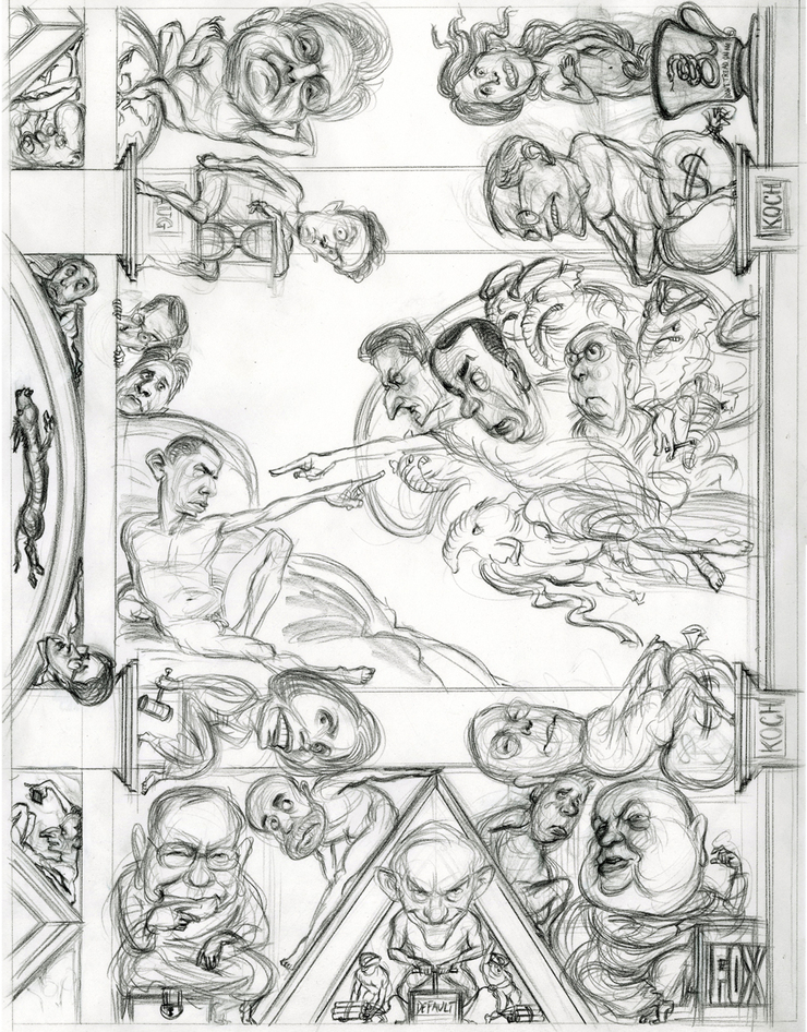
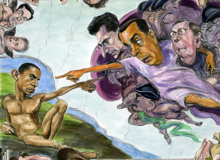
But I also like working for GQ, and didn’t want to walk away from what appeared in so many ways to be a blast of an assignment. After asking Cjelsea to email me the basic information and whatever copy was available I slept on it (actually I didn’t sleep at all that night fretting) regrouped and came back to her with some observations. One, that doing the entire Sistine Chapel with a cast of thousands was going to be problematic within the time/deadline constraints. Two; that even if it was possible with two/three weeks to get everything onto the image, it would reduce to irrelevance on a two-page spread, let alone the one page that was being allotted for space. There was no disagreement from Ms. Cardinal. I proposed treating the image more like a detail from the masterwork, dropping a lot of the extraneous characters and focusing on enough of the main personalities that we could actually see their characterizations. Obviously we would use the Creation of Adam portion of the painting as the central point from which the illustration would expand. There was concurrence on the points and I proceeded with a more relaxed and focused sense of confidence. Amazing what a little sense of being in control of a problem can do for follow through.
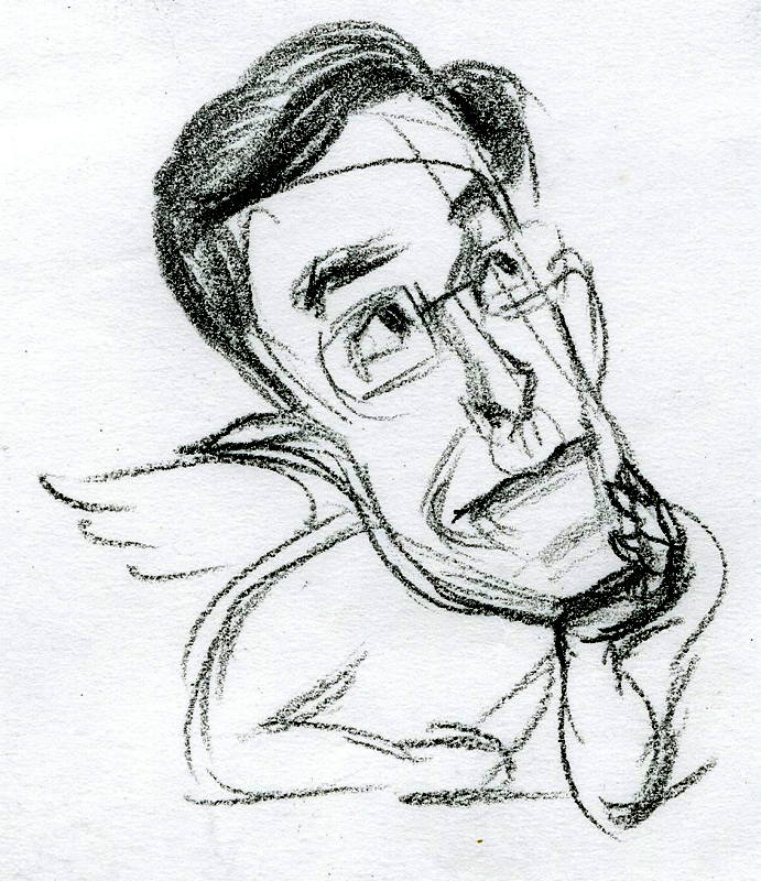
Even with the edited number of characters and scenes it was important, given the time constraints, to work within a manageable size. An 18 by 24” sheet seemed right. For the sake of efficiency, and with the understanding of where certain elements would be placed in the picture, I decided to work up a sketch good enough to move right into finish if approved, rather than redoing the whole damn thing and trying to replicate what was already working. Good bond paper was the perfect choice, sturdy enough to handle many mediums and transparent enough to develop a drawing over previous sketches and selecting the parts that worked.
The great thing about spoofing the work of great masters is that you already have fantastic drawing and composition built into the original. If you’re smart you’ll enjoy building on the already established foundation. Working from the Michelangelo was an opportunity to reacquaint myself with his figure studies and have incredibly focused fun drawing and adding the caricatured heads. By coincidence, I already had in the studio a book devoted solely to the refurbished Sistine Chapel paintings and it was quite an eye opener, yet again, to examine not just the original drawings but the original colors, stripped of the classic grime from the old art books we were familiar with growing up. With all that darkness removed they certainly lost some of that gravitas but gained a more contemporary sense of liveliness a result of the freshness of the colors. Often my thoughts turned to what a great illustrator Michelangelo was, as were so many of the old masters. The gestures, the expressions, the application and choice of color all told stories, complemented narratives for the public to understand.
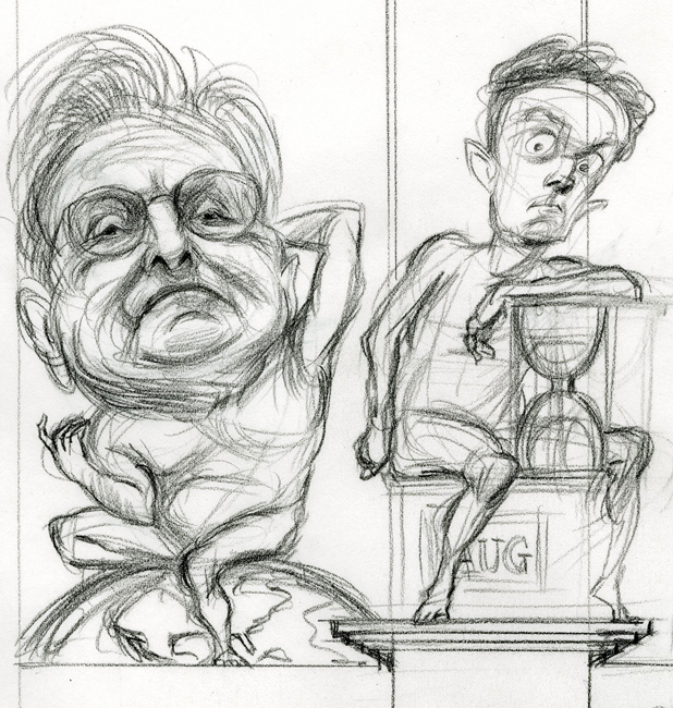
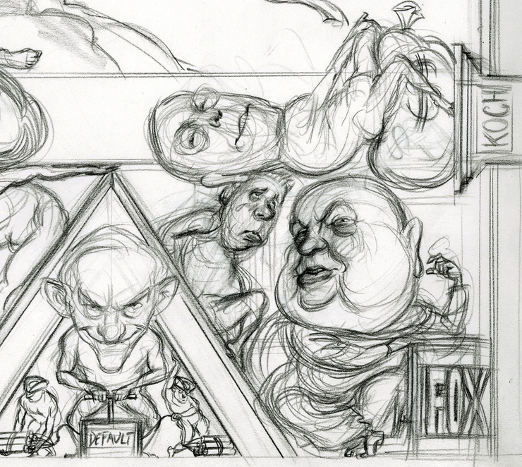
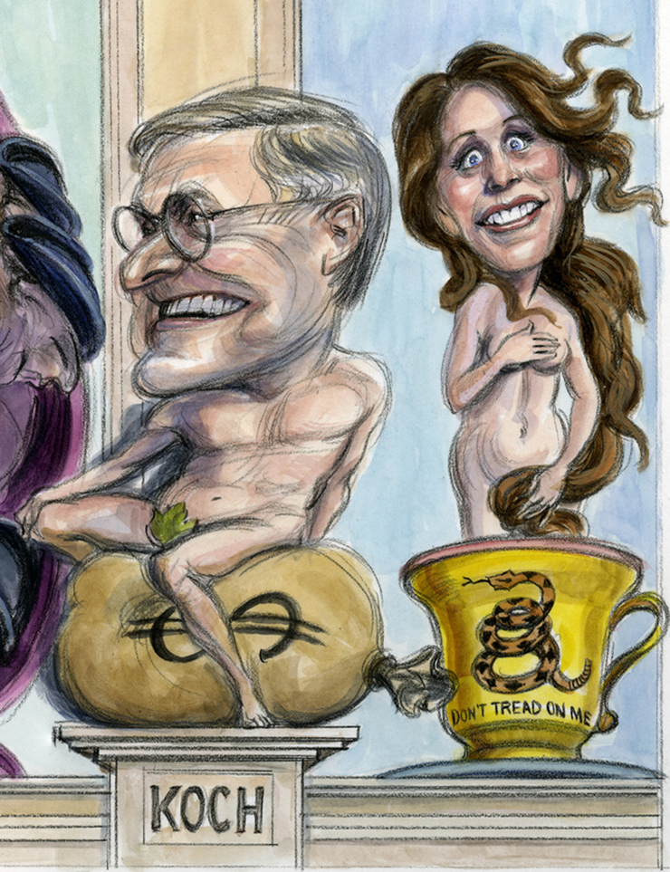
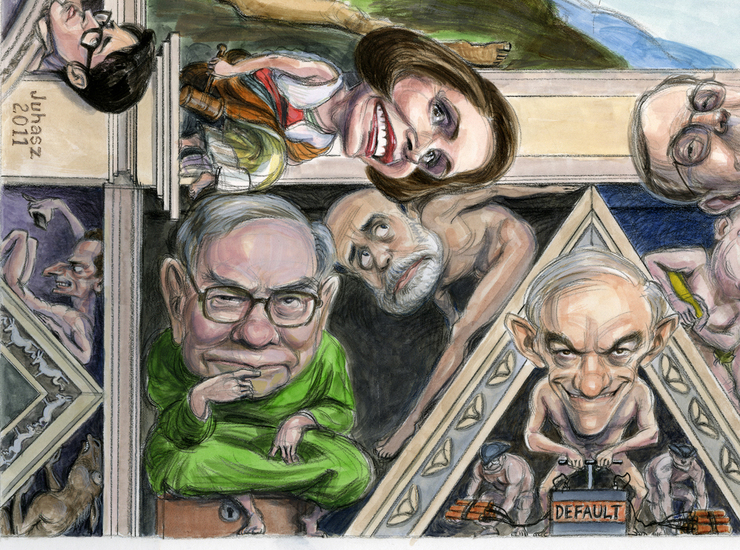
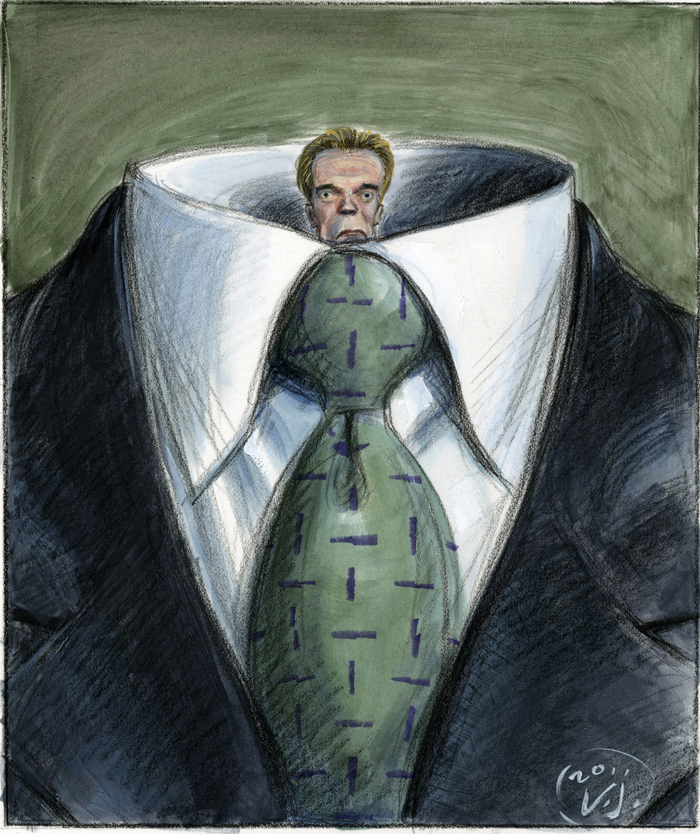
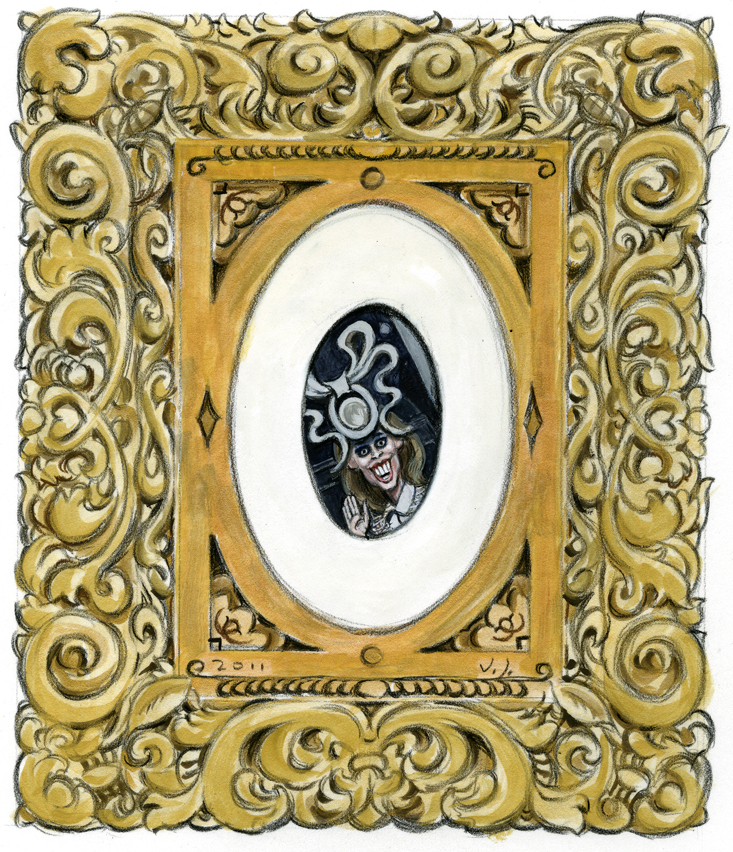
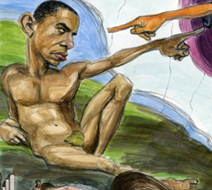
Obviously, an accurate representation of the ceiling painting was impossible as persons and events portrayed are spread apart. I played a game of attempting the illusion of the ceiling painting by picking and choosing elements and sort of jamming them together. Eliminated a fair amount of the faux architecture and kept what I felt was just enough to identify the work for what it was. A few nods were given to Will Elder and Harvey Kurtzman and the old MAD Magazine philosophy of filling scenes with side gags and inside references. So, Michelle Bachmann’s portrayal is a spoof of Botticelli’s Venus and Colbert and Stewart are details of Raphael’s angels. Had there been more time this picture would have been a perfect opportunity to include non-sequiturs galore.
The editors were pleased beyond their expectations with the sketch and relieved that it was going to work. Contrary to my original intention I redrew the picture- again, the benefits of layout bond paper- making necessary tweaks to the faces gestures, etc., and then dry mounted the finished drawing to 4 ply Strathmore paper and proceeded with the watercolors. I don’t find bond paper a perfect receptor of watercolors, but with the proper playing around and patience a richness of color can be built up. I factored about 4 sleepless days to meet the deadline and was pleasantly surprised with how everything was falling into place. A couple days into the color and Chelsea called to know if I could do a couple extra spots. I didn’t flinch much at the request as the watercoloring was progressing at a better pace than my estimations.
The finish was scanned in sections on my Epson tabloid scanner- a replacement for another tabloid scanner that had died earlier this year and one of my best purchases in a long time. The sections were then photo merged in Photoshop and the file sent to Chelsea. Were I a better multi-tasker and tech skilled I would have videoed portions of the work process as there was a surprising amount of logic behind the procedure in this assignment.
I didn’t get a chance to see the issue while away in Kuwait and didn’t realize it had already printed when I returned. Fellow Drawgerite and Renaissance man himself, Marc Burckhardt, cued me to a posting by Nobel winner Paul Krugman, one of the notables portrayed in the piece, on his blogsite at the NYTimes. I found myself reading the comments section on the posting and was surprised with the seriousness of the critiques and analyses. One that appeared in several commentaries, and a spot on good one, was the question about why Grover Norquist hadn’t been included in the image. I regret that omission and am not even sure if he was mentioned in the original notes. Had I been less focused on meeting a deadline I definitely would have included him as well as others who’ve made the headlines. Indeed it is Norquist, the originator of the No Tax Pledge, who has so many members of Congress, mostly Republicans, by the balls and sticking to their no-compromise stance. He certainly deserves inclusion even though he’d be zero fun to caricature. He’s what we would call white bread- bland, featureless, boring looking. But a creepy blandness of a guy who would seek mail-order brides.
Even with the time pressure this was one of those assignments that reminds me why I like doing what I do and why this is such a great career to have. Working with Chelsea Cardinal (for a first time assignment this is a good omen) and Fred Woodward at GQ is a total pleasure because they belong to a select group of art directors that get it. And a tip of the hat to the editors who were also totally on board and made this far easier than I could have expected.