
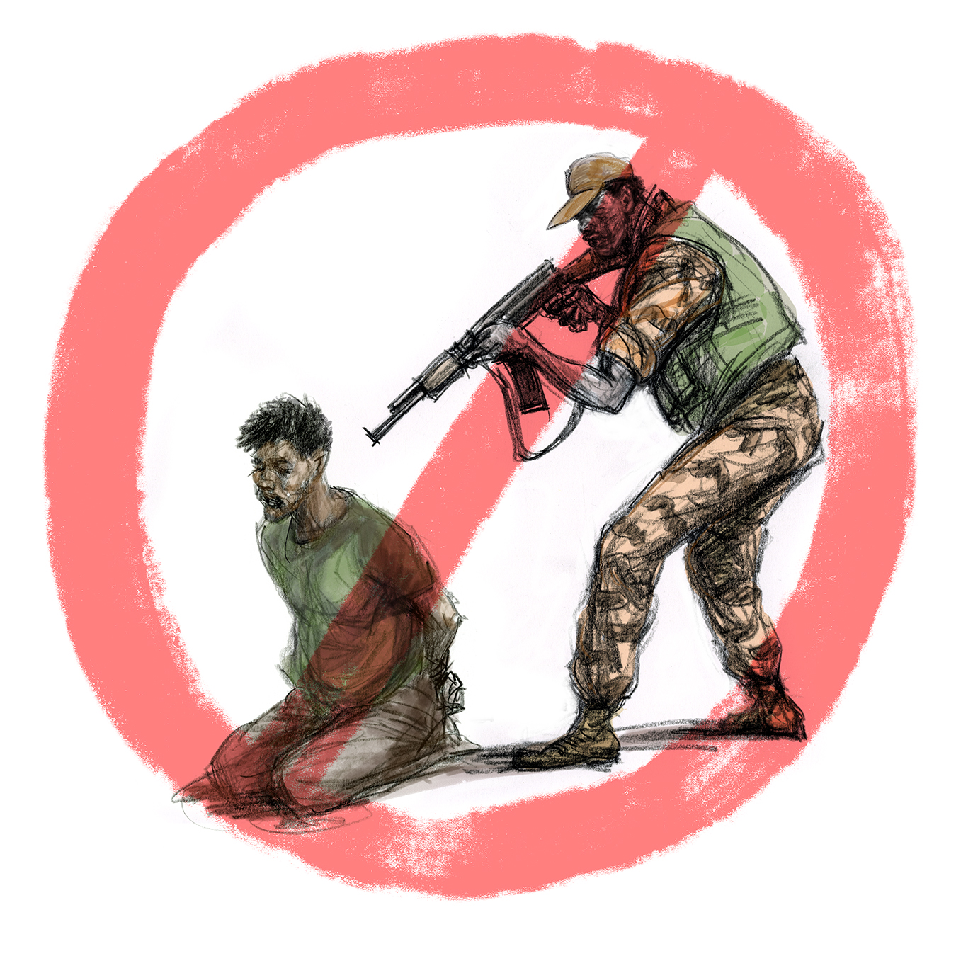
 The Treatment of Detainees for the International Red Cross
May 7
Two years ago I worked on a project for the International Red Cross in Geneva where I created panoramic images to...
The Treatment of Detainees for the International Red Cross
May 7
Two years ago I worked on a project for the International Red Cross in Geneva where I created panoramic images to...
 The Society of Illustrators 65th Annual Exhibition
November 30
Was very pleasantly surprised to receive an email from that Society of Illustrators that 4 of my submissions (already...
The Society of Illustrators 65th Annual Exhibition
November 30
Was very pleasantly surprised to receive an email from that Society of Illustrators that 4 of my submissions (already...
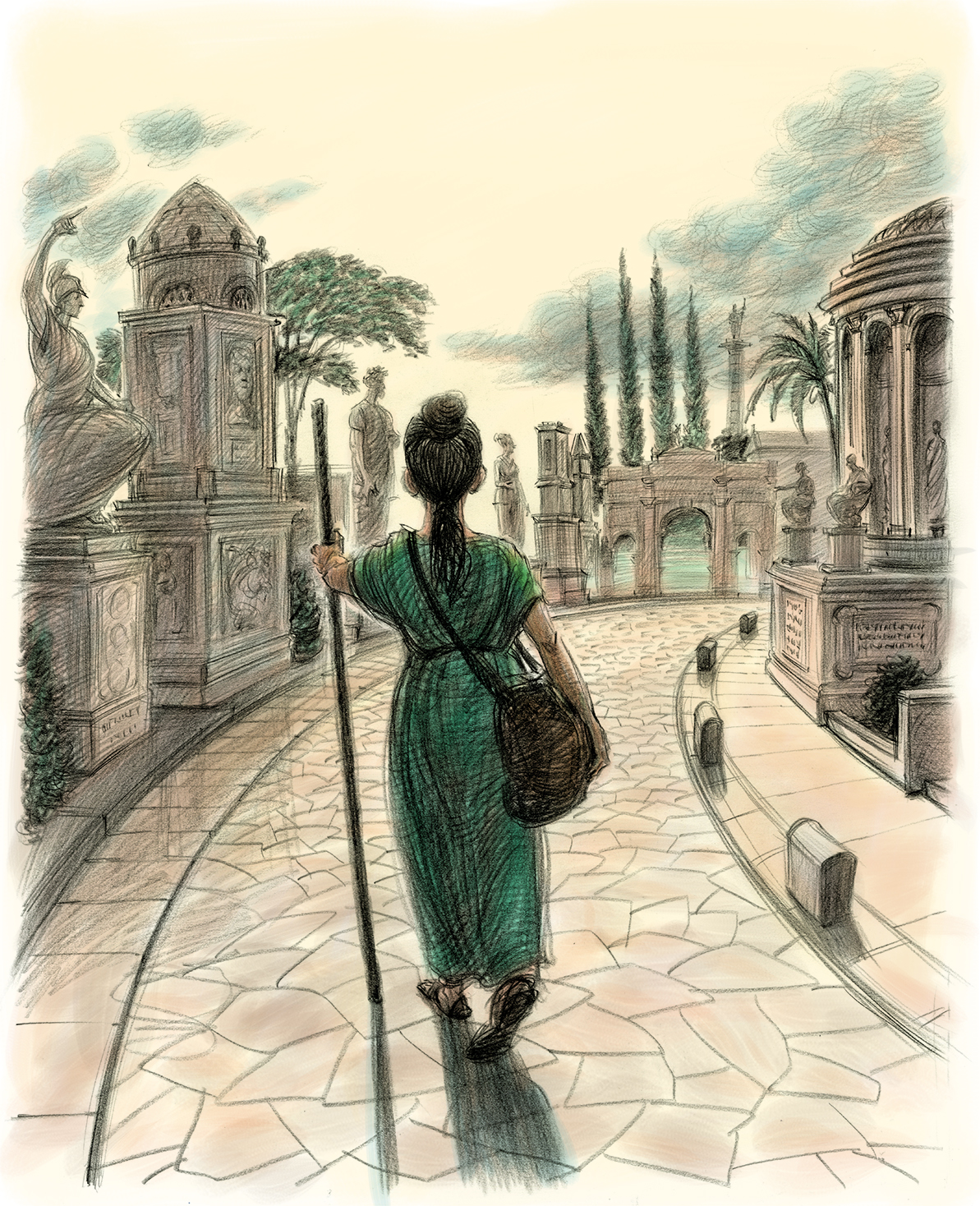 The Girl Who Would Be Free by Ryan Holiday
July 2
In the summer of 2020, Ryan Holiday, author of "The Daily Stoic" and the gripping "Conspiracy", via...
The Girl Who Would Be Free by Ryan Holiday
July 2
In the summer of 2020, Ryan Holiday, author of "The Daily Stoic" and the gripping "Conspiracy", via...
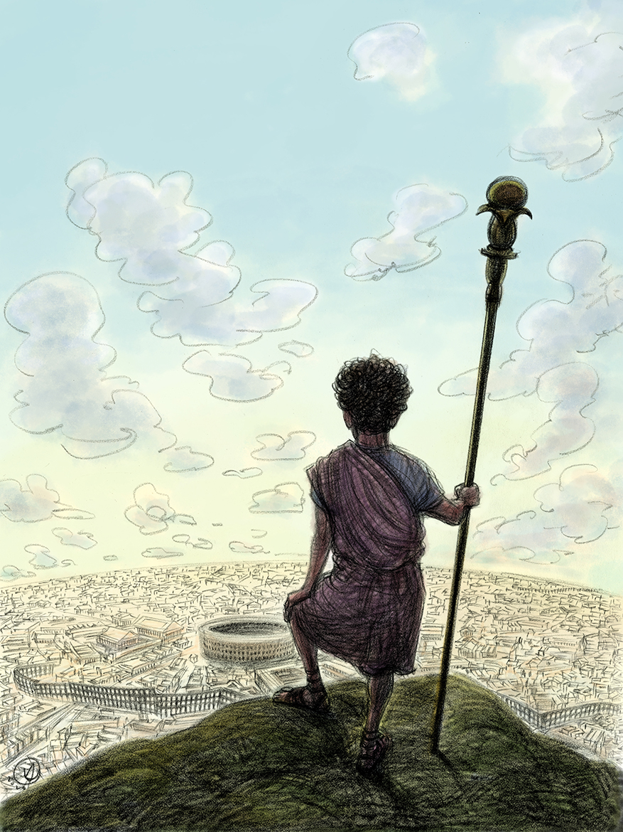 THE BOY WHO WOULD BE KING by Ryan Holiday
February 21
It started with an email in late June, 2020, Year of the Plague. Best selling author (Conspiracy, The Daily Stoic) Ryan...
THE BOY WHO WOULD BE KING by Ryan Holiday
February 21
It started with an email in late June, 2020, Year of the Plague. Best selling author (Conspiracy, The Daily Stoic) Ryan...
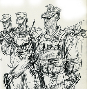
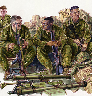
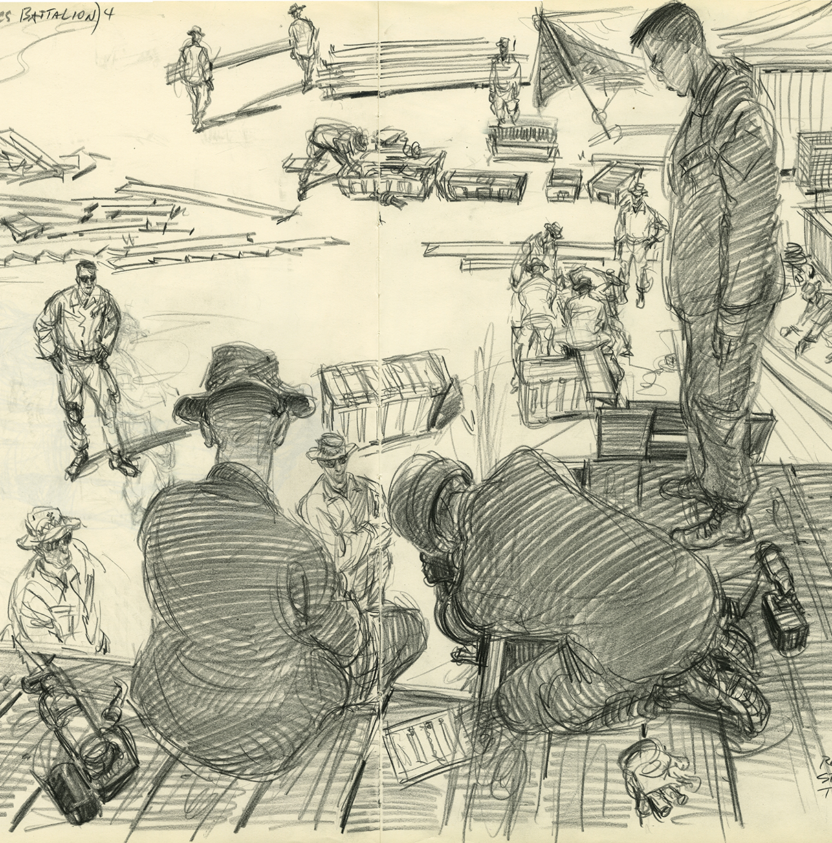 In the Company of Marines continues
November 9
A couple days ago my daily Facebook memories notice posted a blog I had written two years ago, that included...
In the Company of Marines continues
November 9
A couple days ago my daily Facebook memories notice posted a blog I had written two years ago, that included...
 Invested in Portraits
July 1
I was particularly pleased to hear from Art Director extraordinaire, SooJin Buzelli, a couple months ago, when she...
Invested in Portraits
July 1
I was particularly pleased to hear from Art Director extraordinaire, SooJin Buzelli, a couple months ago, when she...
 Three for John Bolton
March 24
Some individuals were made to caricature. In this current administrations with its mad merry go round of hirings and...
Three for John Bolton
March 24
Some individuals were made to caricature. In this current administrations with its mad merry go round of hirings and...
 The Bigly Rolling Stone Cover
March 24
The last time I did a cover for Rolling Stone (which also happened to be the first time) was towards the...
The Bigly Rolling Stone Cover
March 24
The last time I did a cover for Rolling Stone (which also happened to be the first time) was towards the...
 The Prodigal Son Returns- In the Company of Marines- Part 1
February 22
Preamble-
When I first became a member of Drawger it seemed every illustration assignment created...
The Prodigal Son Returns- In the Company of Marines- Part 1
February 22
Preamble-
When I first became a member of Drawger it seemed every illustration assignment created...
 The Prodigal Son Returns- Part 2- On the Bataan with the 24MEU
February 22
Fast forward a couple years. Colonel Streeter has maintained contact with us even as his assignments and...
The Prodigal Son Returns- Part 2- On the Bataan with the 24MEU
February 22
Fast forward a couple years. Colonel Streeter has maintained contact with us even as his assignments and...
© 2024 Victor Juhasz