John S Cuneo
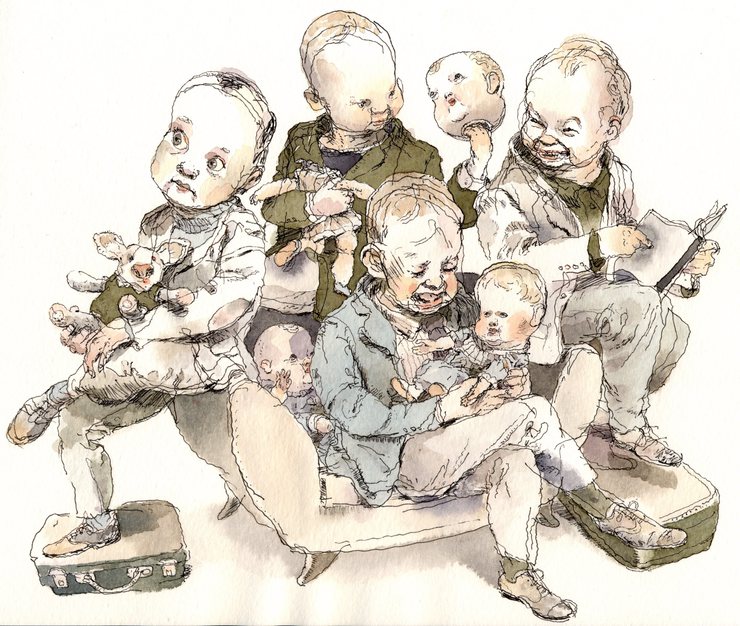
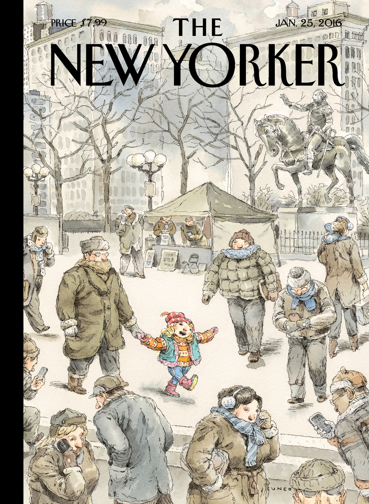 Winter blues ( and pinks and reds, etc)
January 22
Winter blues ( and pinks and reds, etc)
January 22
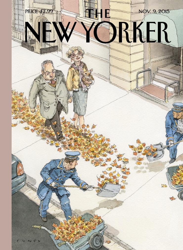 Rolling out the the gold carpet
November 2
Rolling out the the gold carpet
November 2
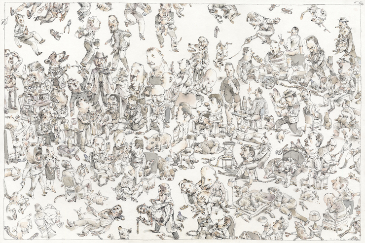 mens club
April 4
mens club
April 4
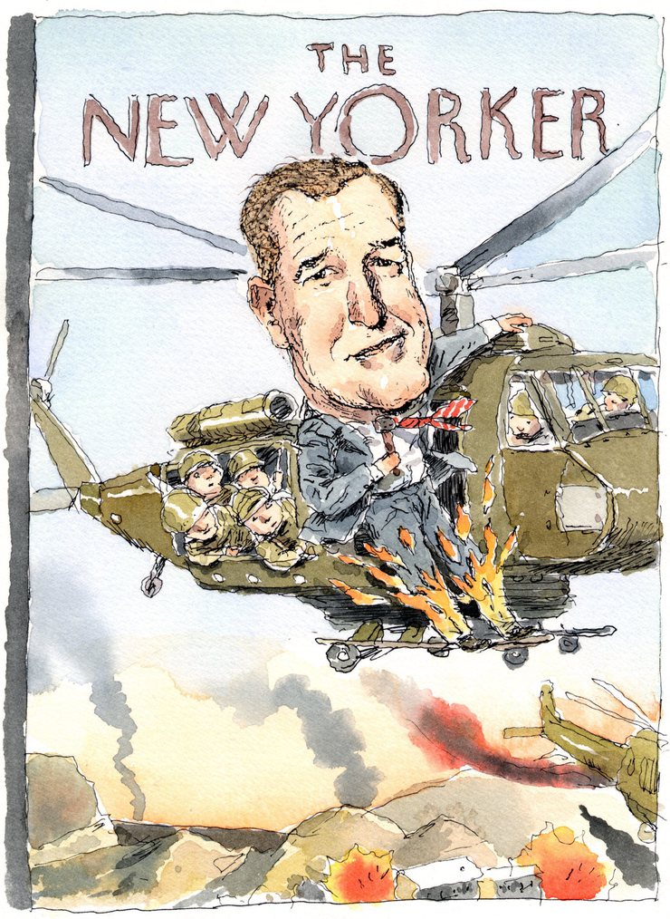 Liar liar, pants on fire.
February 12
Liar liar, pants on fire.
February 12
 sad little drawings
January 22
sad little drawings
January 22
 Richard Thompson draws funny.
December 3
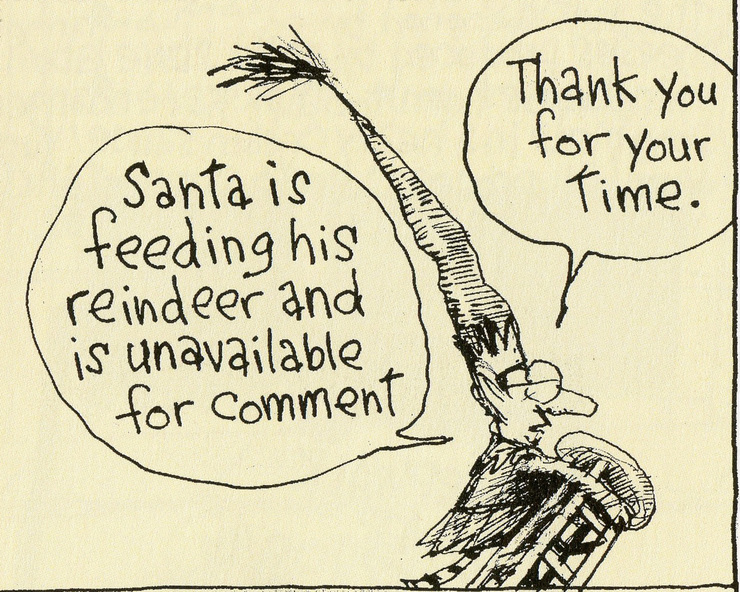
Look at this little Christmas elf. I didn't draw it. I wish I had, I love it so. I love the briskly officious...
Richard Thompson draws funny.
December 3
Look at this little Christmas elf. I didn't draw it. I wish I had, I love it so. I love the briskly officious...
 america's favorite bartender
November 24
Global Warming
November 15
america's favorite bartender
November 24
Global Warming
November 15
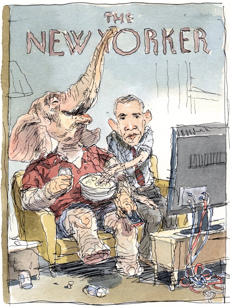 The Elephant in the Room
November 10
The Elephant in the Room
November 10
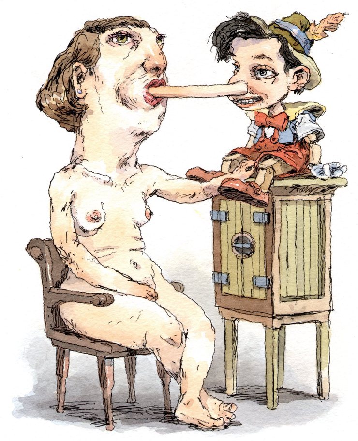 Fetishes
October 20
Fetishes
October 20
© 2024 John S Cuneo