Drawing On Bygone Obsessions
SEPTEMBER 13, 2011
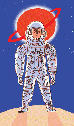
'Overdrive'- AD'd by SooJin Buzelli (natch) for Plansponsor
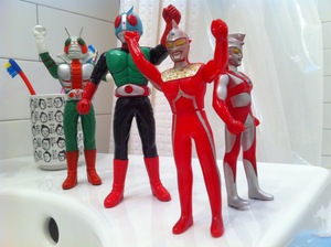
Somewhere in the early 1990's my appreciation of city-trampling behemoths and platter-eyed pixies took root and blossomed into an all-consuming aesthetic overthrow. I was compelled to watch almost naught but bootlegged Japanese movies, most of relatively poor quality and in a language I hadn't even the faintest understanding of. Monthly I would board a shuttle bus to Fort Lee, NJ with a gaggle of Japanese grandmothers and golfers to explore the tiny paradise that was Pony-Toy-Go-Round. PTGR was a 300 square foot shop nestled in between a stationary store and a golf boutique. Attached to an enormous supermarket and food court, this was Yaohan Plaza- a strip mall catering (almost) exclusively to the greater NYC area's homesick Japanese population. Reflecting now on the obscene amount of money I spent on imported vinyl toys makes my teeth clench but the folly of youth is well-documented and foolish expenditures are rite of passage. Or so I console myself as I envision the $350 flocked plastic Mothra toy that now molders unseen and unloved in the attic.
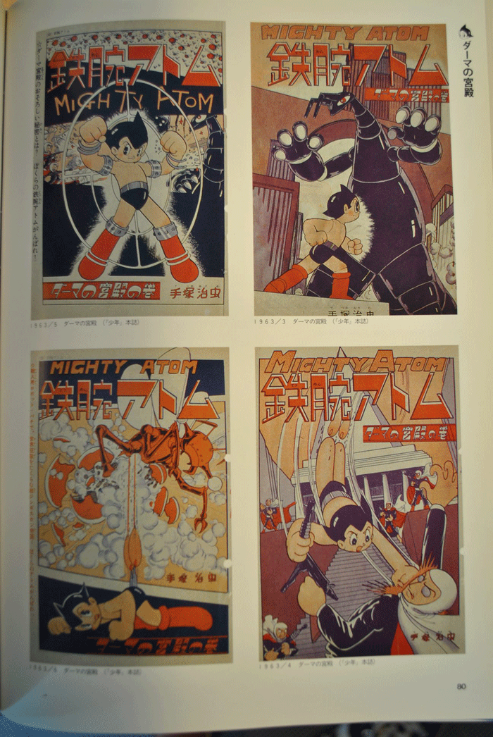
Behold! The Mighty Atom in all his two-color glory!
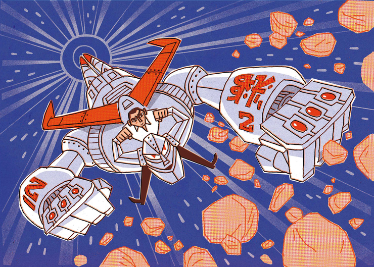
Some of the survivors of the phase, however, were art books. One in particular set my imagination ablaze- the Art of Mighty Atom by Osamu Tezuka, Japan's own 'God Of Manga'. This book compiles much of the artwork form the 1950's manga series. Tezuka was a masterful page designer and a peerless comic illustrator and remains one of my favorites to this day. But what stood out most was the unusual printing technique spotlighted in this edition as a solution for cheap pulp printing - the sole use of blue and orange inks.
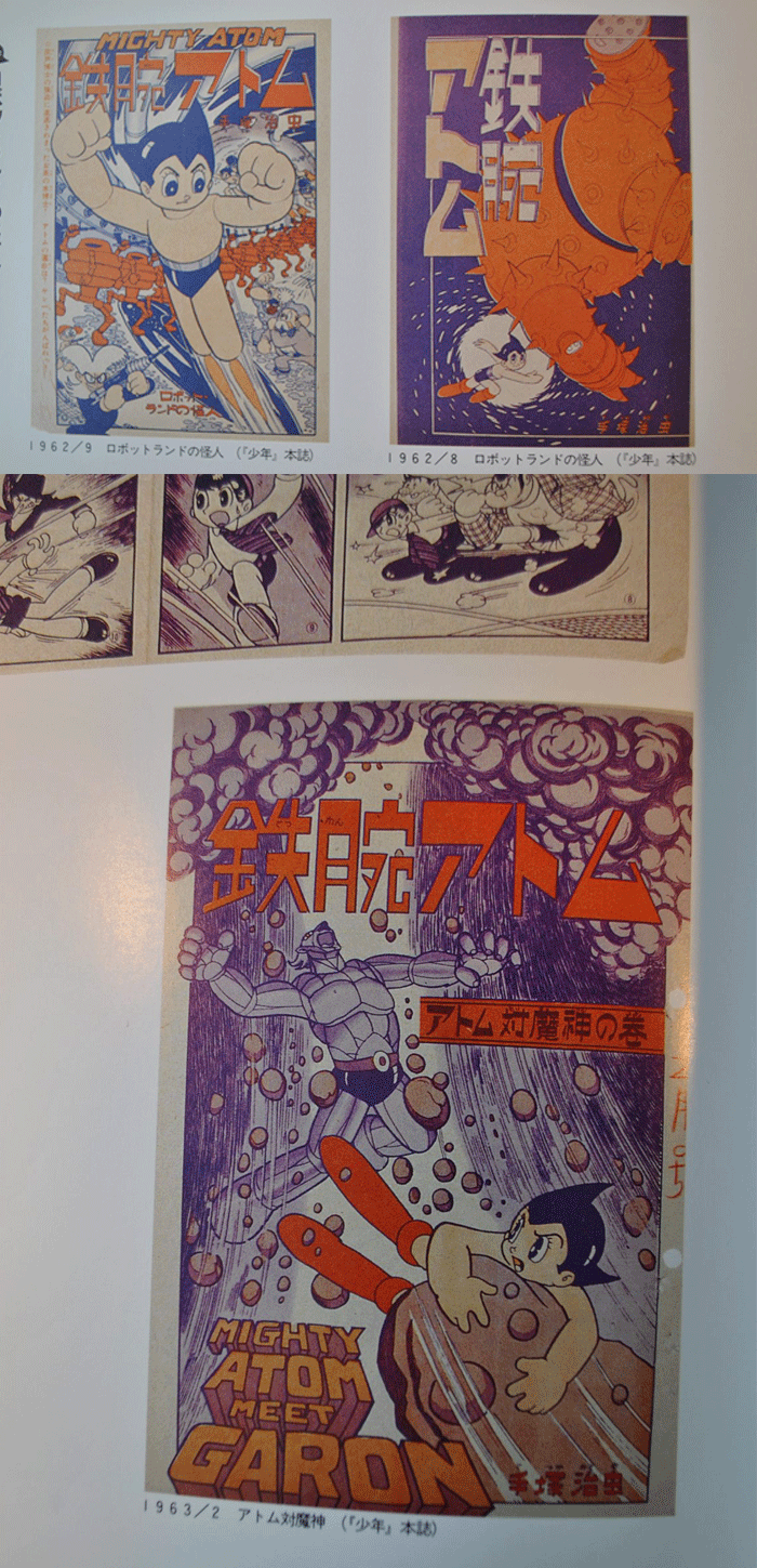
Neither the NY Mets or the NY Knicks EVER looked this cool in blue and orange!
© 2024 Steve Wacksman