
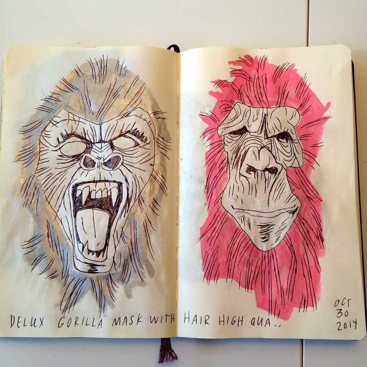
 G'rilla Masks, All Hallow's Eve Edition
October 30
G'rilla Masks, All Hallow's Eve Edition
October 30
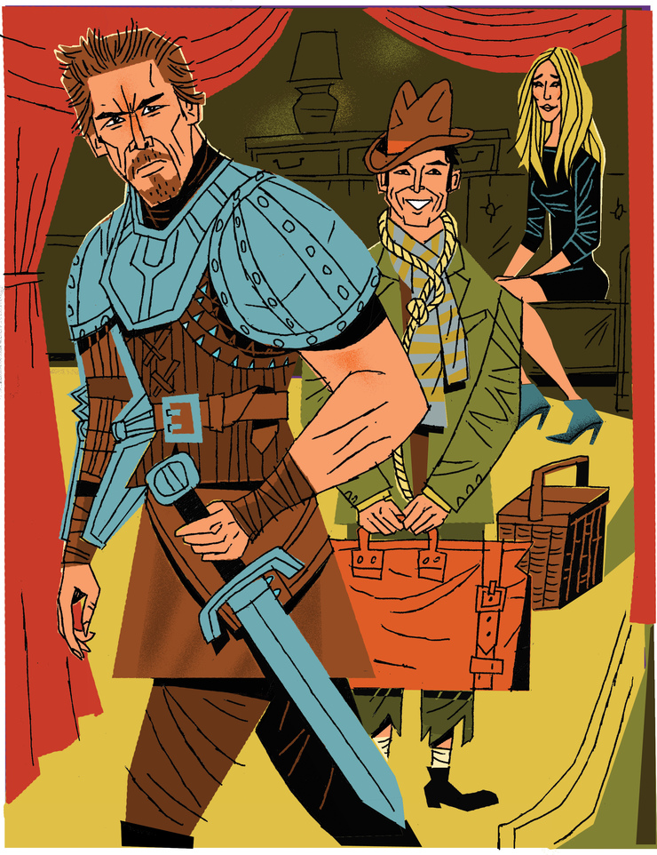 GenX Actors On Broadway
December 16
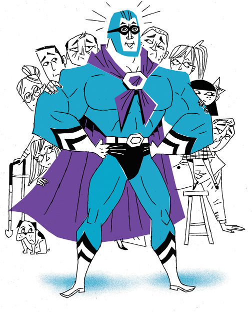
It is a young man's right - nay, his responsibility - to dream. I've had several 'dream' clients on...
GenX Actors On Broadway
December 16
It is a young man's right - nay, his responsibility - to dream. I've had several 'dream' clients on...
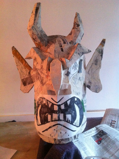 All Hallow's Eve!
October 31
All Hallow's Eve!
October 31
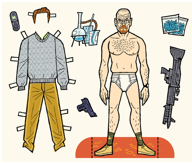 That's (amoral violent nerve-fraying) Entertainment!
September 9
Man, did you see Breaking Bad last night? Hard to believe it's coming to an end after keeping our collective...
That's (amoral violent nerve-fraying) Entertainment!
September 9
Man, did you see Breaking Bad last night? Hard to believe it's coming to an end after keeping our collective...
 A Quick Roundup.
April 15
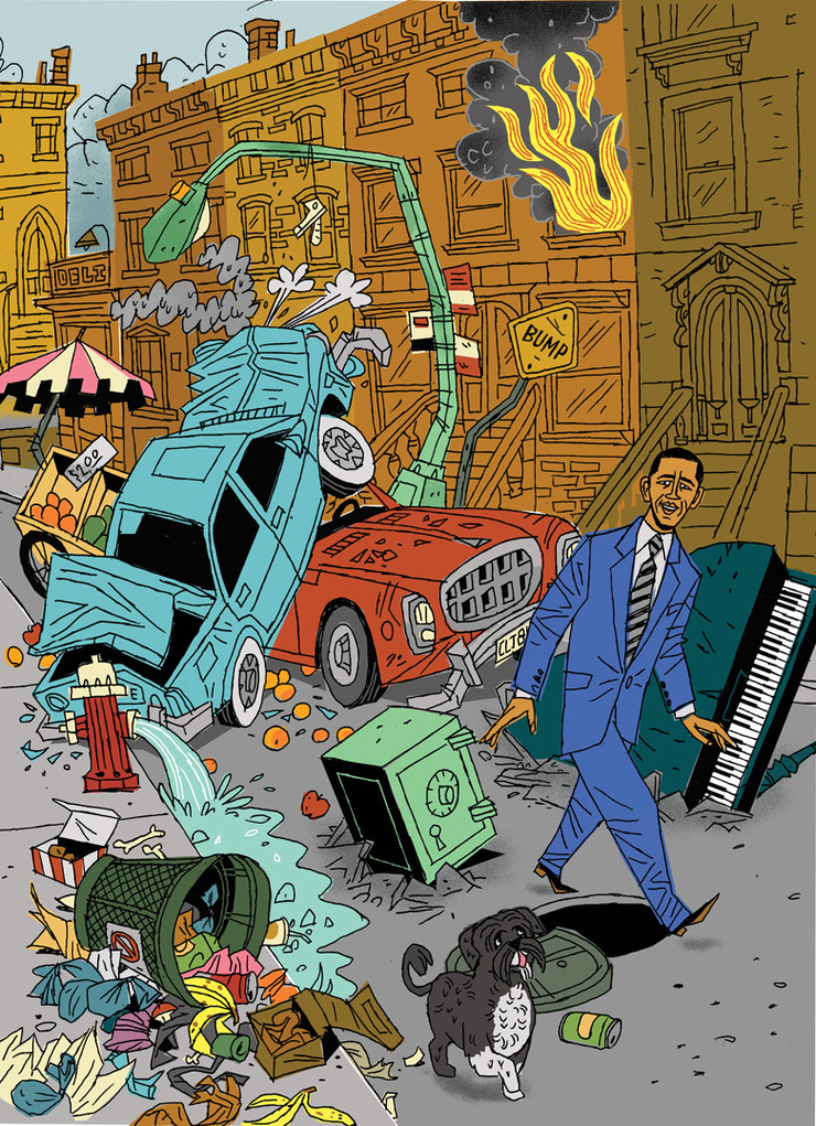
It's been some time since I last dropped in and for that I apologize. These are interesting times here at Chez...
A Quick Roundup.
April 15
It's been some time since I last dropped in and for that I apologize. These are interesting times here at Chez...
 Killing The President*
January 18
*deliberatly provocative title designed to pique your interest. No actual presidents were harmed in the production...
Killing The President*
January 18
*deliberatly provocative title designed to pique your interest. No actual presidents were harmed in the production...
 Recent Portraits Of People You've Never Even Heard Of.
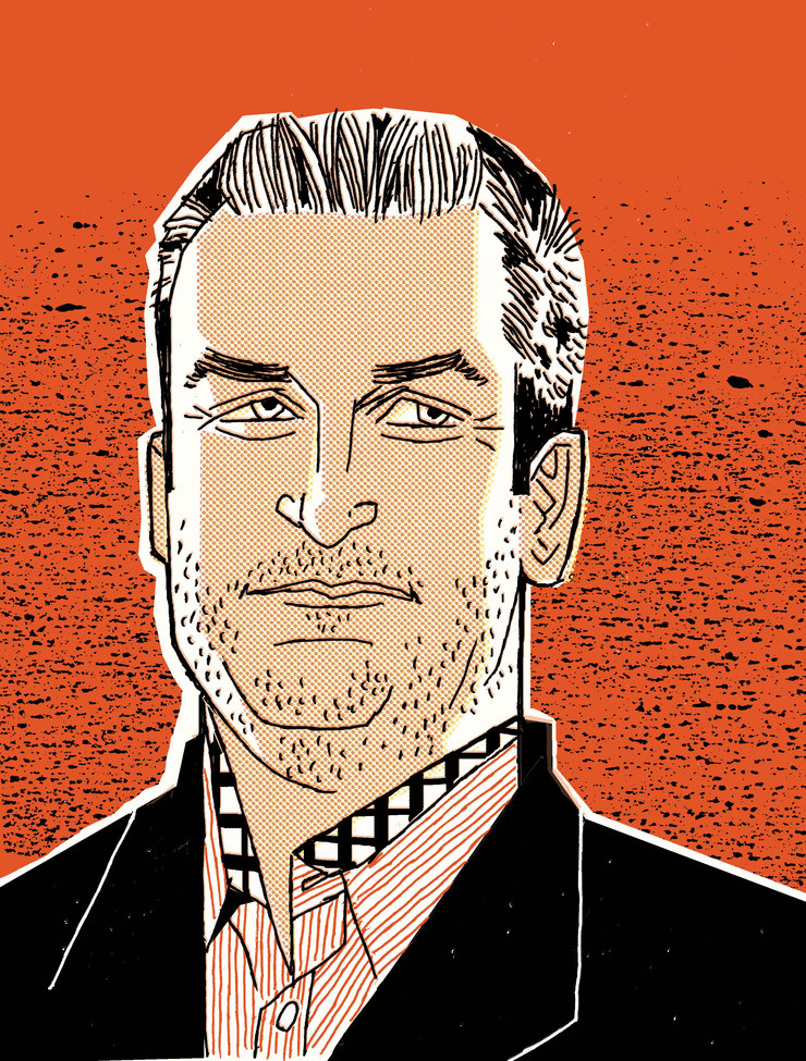
November 26
Hello, reader. I assume your presence here means you've already completed your 'Cyber-Monday' shopping....
Recent Portraits Of People You've Never Even Heard Of.
November 26
Hello, reader. I assume your presence here means you've already completed your 'Cyber-Monday' shopping....
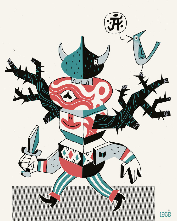
 Hybrid: When Too Much Freedom Leads One To Steer Directly Into A Wall
April 16
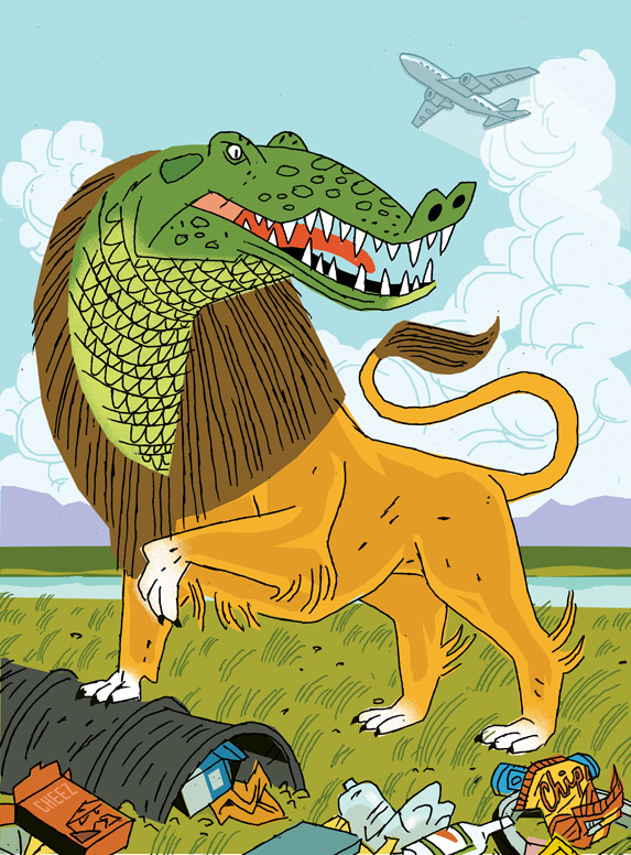
Soojin Buzelli is, as anyone who reads Drawger even occasionally knows, the absolute bee's pajamas and an...
Hybrid: When Too Much Freedom Leads One To Steer Directly Into A Wall
April 16
Soojin Buzelli is, as anyone who reads Drawger even occasionally knows, the absolute bee's pajamas and an...
 Read Write (Hand)
January 20
I was first made aware of Nick Cave's band The Birthday Party after they'd disbanded - I suppose one might...
Read Write (Hand)
January 20
I was first made aware of Nick Cave's band The Birthday Party after they'd disbanded - I suppose one might...
 No Way Out....
January 4
No Way Out....
January 4
© 2024 Steve Wacksman