What I know about opera could fit on the head of a pin and still leave ample space for what I know about blush wines and Inuit folklore. So when I picked up the phone ( side note: almost nobody calls with job requests anymore. These days email holds sway) to discuss the possibility of creating a poster image for the Fort Worth Opera I felt compelled to admit as much. I was assured by the designer , the charming and affable
Lily Smith+Kirkley of Matchbox Studio, that this would not be a hinderance. We discussed the project in brief and she sent me a plot synopsis. I would be illustrating an opera by Verdi called "Il Trovatore" that included among other atrocities: poisoning, burning at the stake, infanticide and a beheading. Who'd say no to a gig like that? Not me, brother!
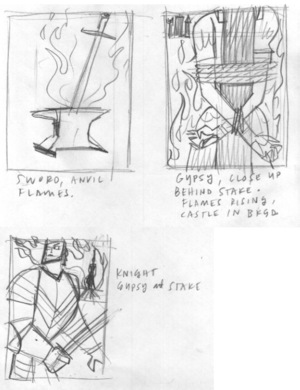
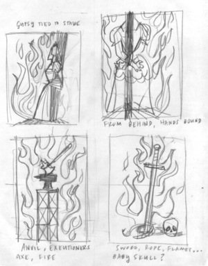
One of the most well-known pieces of music from Il Trovataore is entitled "the Anvil Song". Armed with that knowledge I set out to make the anvil a central theme in my design. Several characters in the story meet their end as a result of being set ablaze; this was a fairly obvious visual opportunity as well.I decided to get as many ideas as I could down on paper as fast as I could. No research, no refining, no erasing. Go!
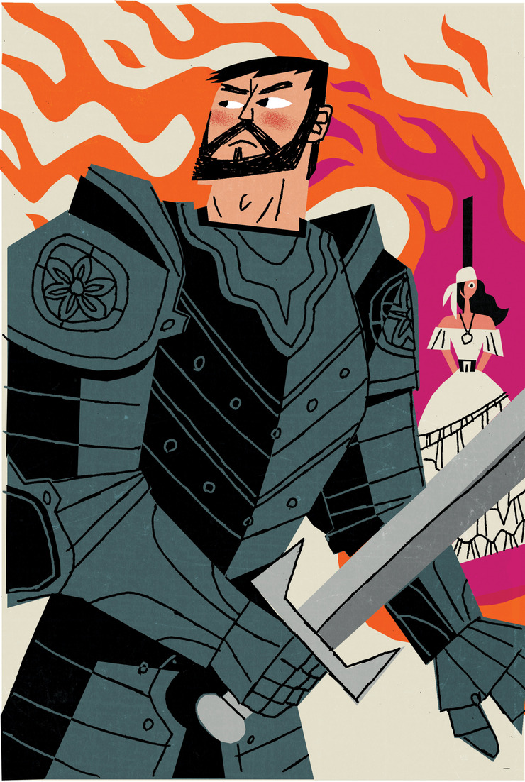
I usually prefer having a being in my compositions, be it a human or animal but in this case I liked the anvil doubling as the executioner's block. Still, I thought any of them could be refined to be effective. I shot these scrawlings over to Lily to give her an idea of where my thought process was leading me. In no time at all she replied that they liked the one with the knight in the foreground.
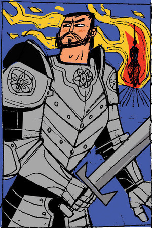
I'll be honest here- I never do color sketches. Never ever ever. I like poking around and refining my color up until the last minute, and too often clients become sold on a color scheme in a sketch and that part of the process is taken out of my hands. In this case, however, I wanted to show a refinement of the thumbnail and I found that the color gave it more character. I was thinking about a very graphic approach using rich blacks and an exceedingly basic palette. This approach was dismissed (perhaps wisely) as unsophisticated and a second approach was presented. This was given the high sign and I charged out of the gate. The job from start to finish was completed in 2 days. Lily sent me a note saying that this poster was her final act at Matchbox- she was moving on. Best of luck to you, Lily- it was a pleasure.