Art imitates art.
JUNE 4, 2013
The magazine cover is for a very real and wonderful client, Mary Zisk, and I will spare no effort to give her my best. The FIT job is what we used to call a "KMA" back in the ancient time of the Detroit art business. On such jobs, I award myself complete artistic freedom which makes it impossible to excuse a lesser solution.
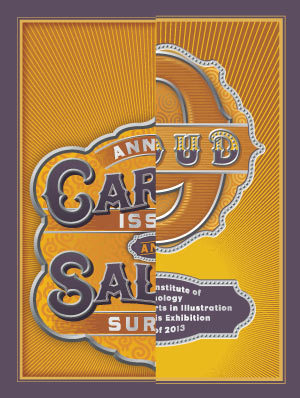
Oddly enough there appears to be a certain similarity between this years' entries. Kismet? Possibly. Coincidence? I don't think so.
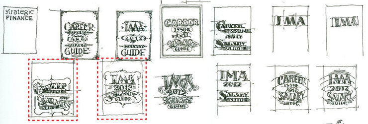
You would think I could go back and look at thirteen years of roughs and have plenty of choices that were never used but, no, I must move forward and try to reinvent the wheel once again.
The only problem with doing tight sketches in greyscale is that I always like them more than the final color art.
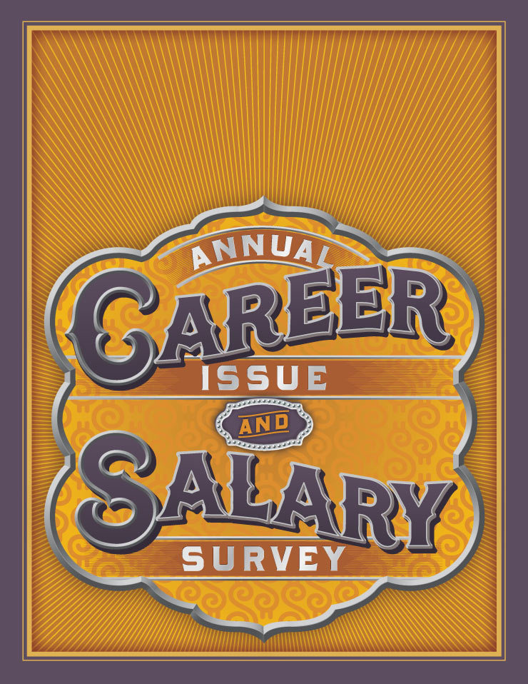
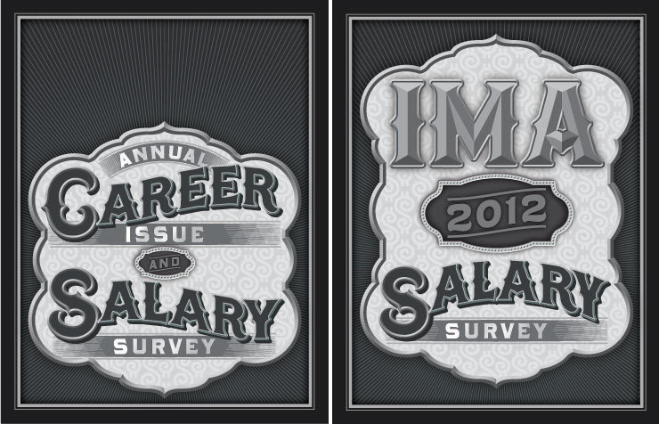
The cover.
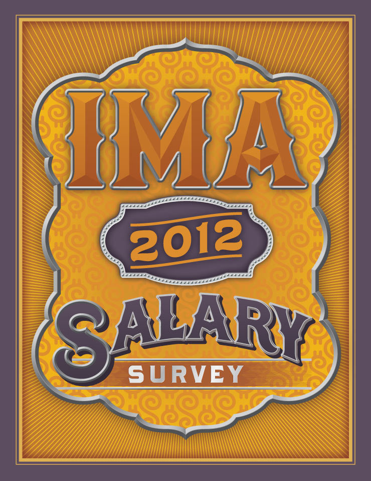
The complementary inside opening page.
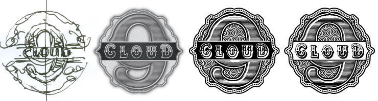
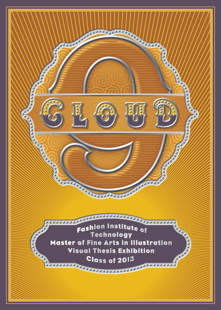
Rough and tight sketches for the FIT exhibition. The catalog and postcard are full color but the display graphic for the museum wall must be a one-color decal.
Entering a new era of ripping myself off and feeling very flattered by it.
© 2024 Daniel Pelavin