The making of Mimosa
JUNE 25, 2012
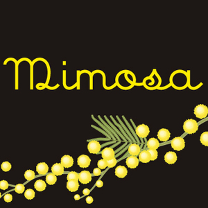
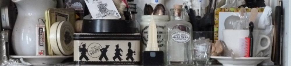
Periodically when I have created some letterforms that I really like for a job, I will finish off the remainder of characters and make a font. The font Mimosa came about as the result of a packaging project based upon the revival of vintage cosmetic labels. Given four of the uppercase letters and a handful more of the lowercase, I took the challenge of conceiving and executing the remainder of the glyphs (individual instances of each character are called glyphs) that would make up a complete font.
So I don't disappoint the brunch lovers among you: the eponymous libation is prepared by filling half a champagne flute with chilled sparkiling wine, topping off with orange juice and garnishing with a slice of strawberry.
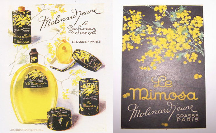
Blurry ads from a bygone era told me all they could about a delightful upright script.
Rough sketching helps me imagine what the missing characters would have looked like.
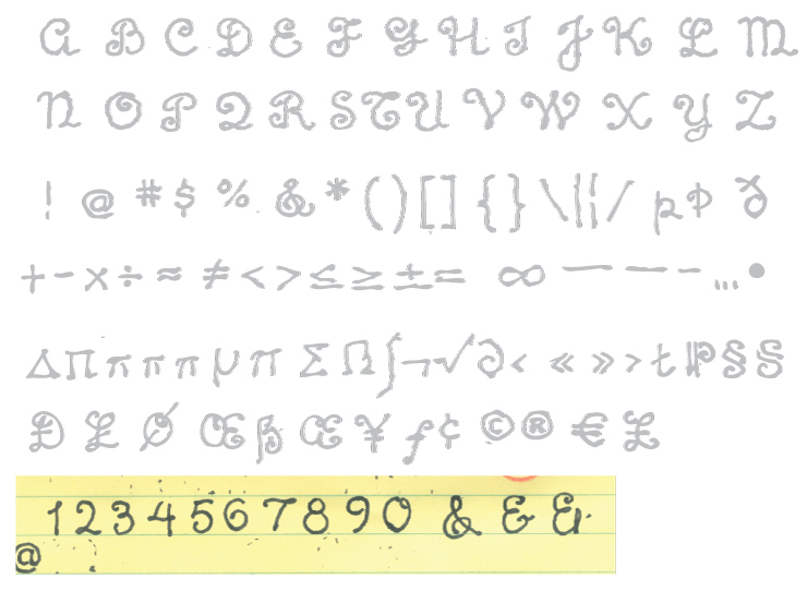
More rough sketching to extend the "look" to the myriad of glyphs which must occur in a font to assure that it is useful in a variety of situations and languages.
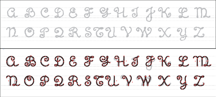
Final selection of the uppercase assembled as a template and drawn as paths in Adobe Illustrator.
Using a single line for the "skeleton" allows the application of a stroke attribute that provides a uniform weight to all characters.
The entire font including alternates, puntuation, numerals, diacriticals and greek & non-latin characters waiting to be put into the font creation program.
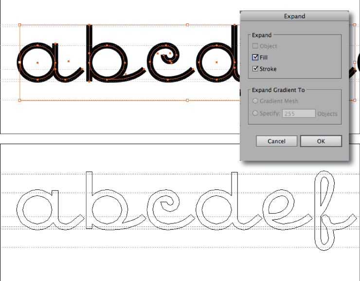
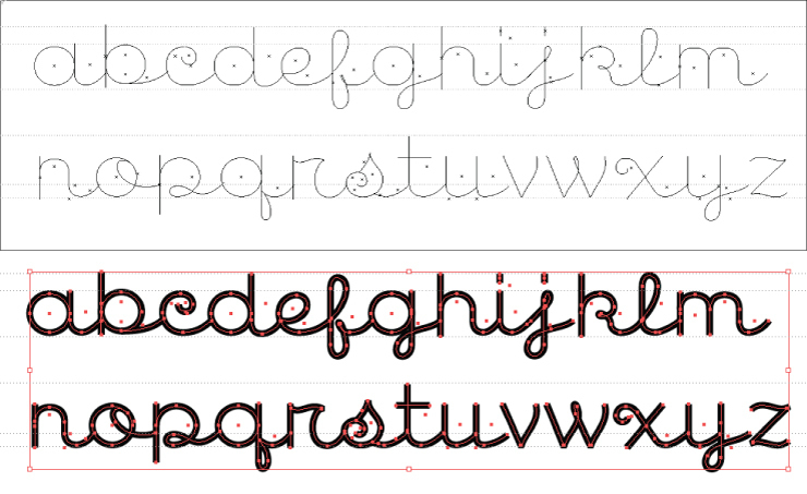
In the final step before pasting glyphs into Fontlab Studio, from which the actual font will be generated, the strokes are expanded into outlines.
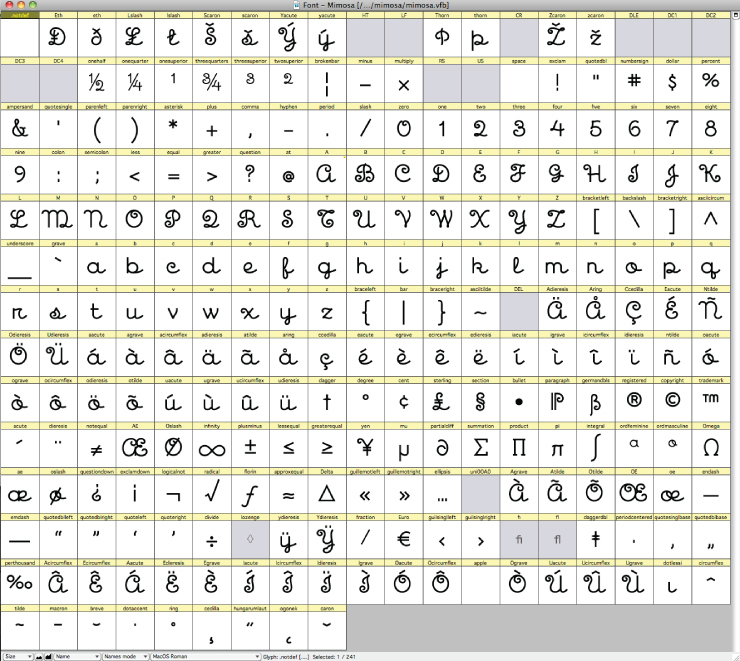
Every glyph has its own slot in Fontlab.
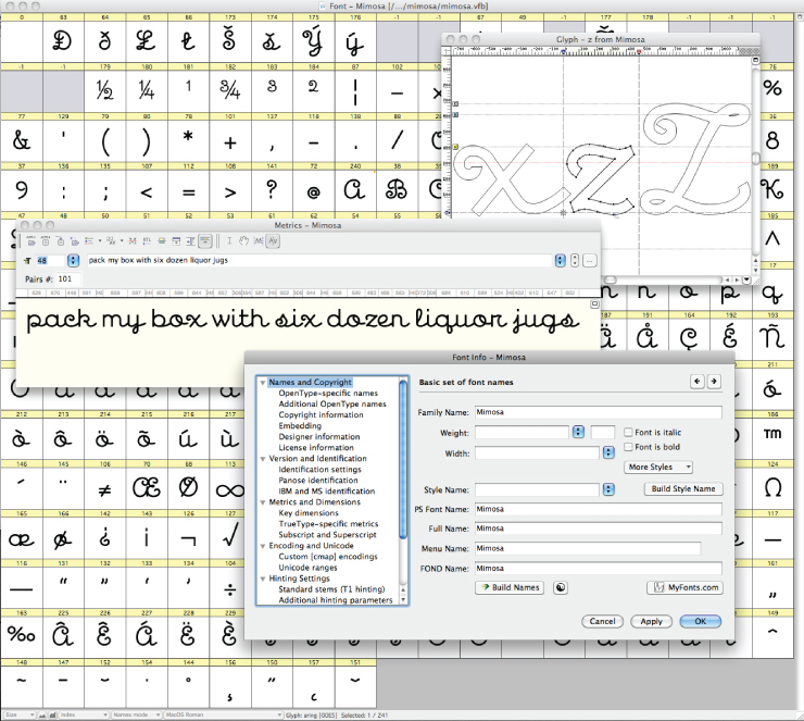
A few more of the dozens of Fontlab windows that allow you to adjust metrics (character spacing), test sample text and control a host of other attributes that make a font behave the way it should. One word of advice though: Don't trust Fontlab to automatically calculate values in the "most important measurments" window or you'll be sure to hear from some irate Windows user whose font doesn't display properly.
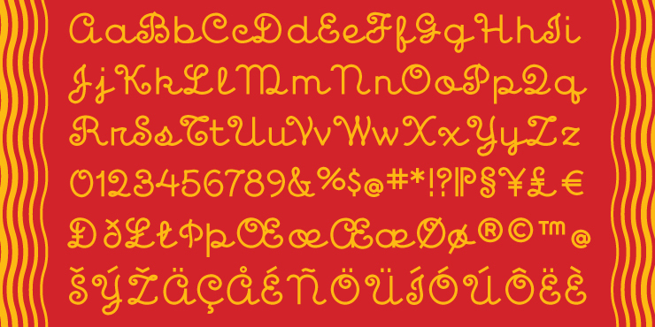
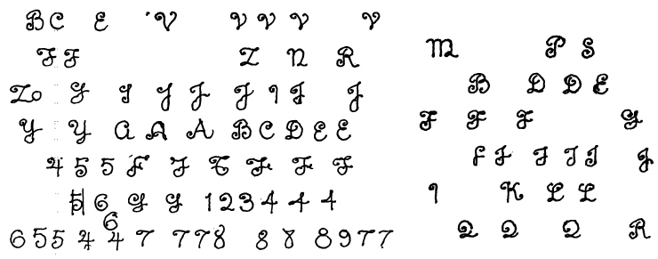
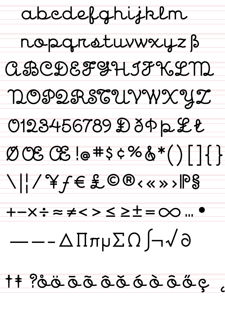
Pretty display of character set just for fun.
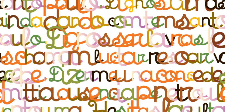
More pretty character patterns.
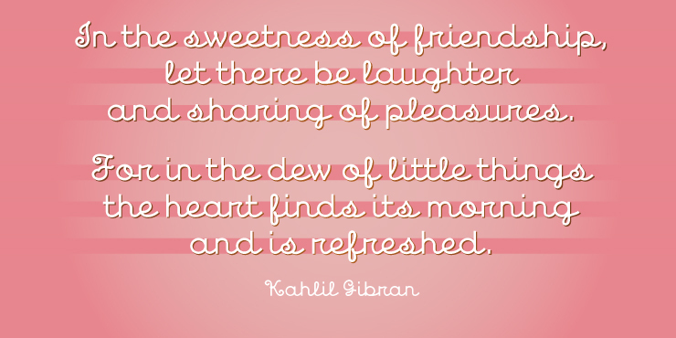
Good advice for all of us.
© 2024 Daniel Pelavin