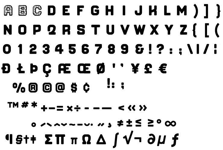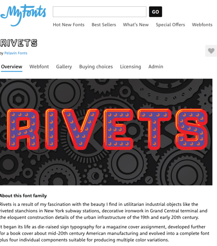
A new name for a (relatively) new font
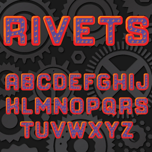
Originally named "Forgia" because of a name conflict, I recently changed the name to Rivets as more descriptive.
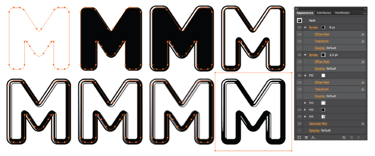
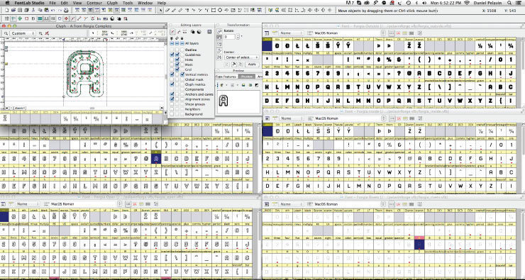
Spurred on by a pathetically noble urge to make my work "unique" and "distinctive", I rarely use fonts, instead preferring to make up my own characters and piece the words together letter by letter. The fact that I am passionate about letteforms and get a perverse pleasure from hours and hours of toiling over their intricacies is also a factor in this madness. The result is that I end up with lots of partially completed alphabets and use them in a repertory way, completing missing characters as needed.
The obvious next step in this progression is to convert them into fonts and finally, gather up all the courage I can to foist them on an unsuspecting public. In this way, I have sent nearly 20 fonts out into the world and have a dozen more waiting for me to decide that they don't suck. While font sales don't make up a huge part of my income, still, it's enormously satisfying to note an occasional sale and have the satisfaction of knowing that they are being used by designers across the US, in numerous countries around the globe and New Jersey.
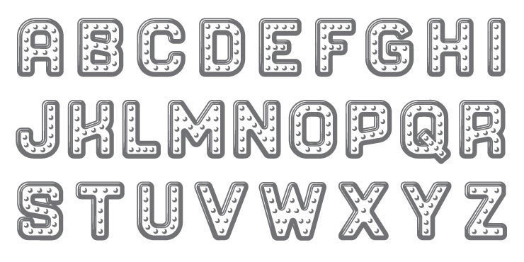
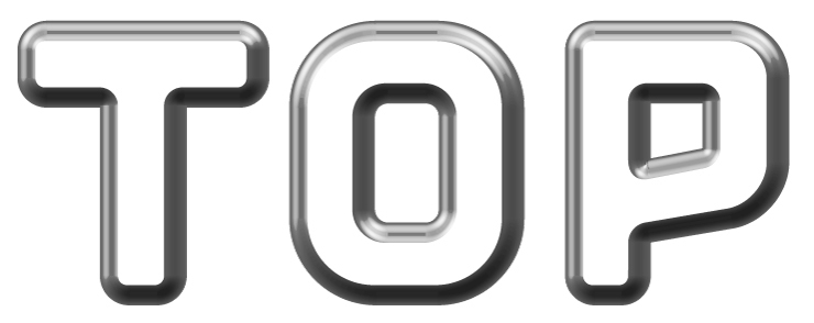
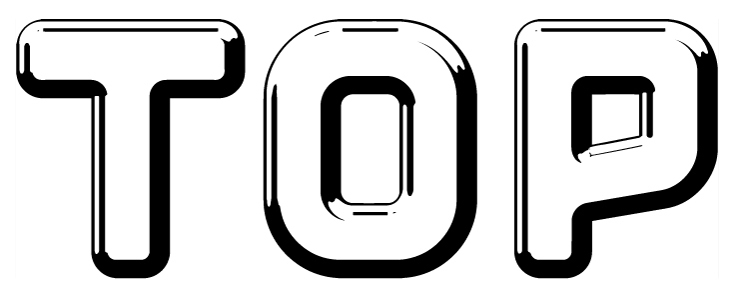
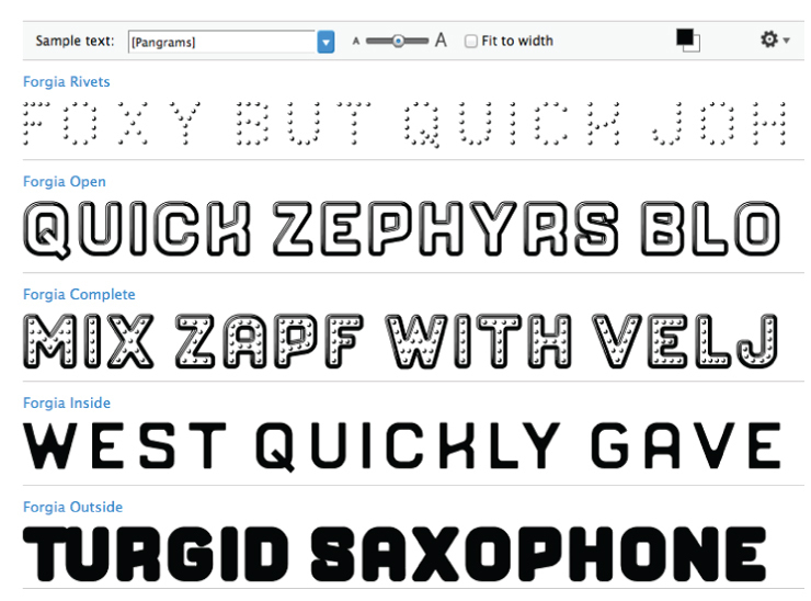
Another one of my obsessions (there are many) is with trying to emphasize a tactile sense in my work to enhance and strengthen the impression it makes. So, celebrating Apple's latest misstep in the introduction of new iOS icons and flying in the face of exaggerated rumors of the death of skeuomorphism, three of my last four fonts have been faceted or detailed to give them dimensionality.
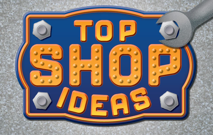
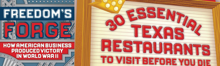
This is the meandering story of how my latest font came about, beginning its life as "Top Shop" based on a cover of Succesful Farming for Matt Strelecki, morphing into "Forge" after a book cover comp for Paolo Pepe at Random House, testing its mettle (no pun intended) on a cover of Houston Press for Monica Fuentes, spending 12 weeks being refined under the inspiring tutelage of James Montalbano of Terminal Design and ending up as "Rivets" (please forgive me) Louise Fili and, so as not to steal the thunder from an existing font by Rian Hughes of Device Fonts.