A font is born.
SEPTEMBER 18, 2020
What?
A tale that adds a new twist to the term "Font Family."
A guy who has two daughters and a very popular typeface named for one of them has his work cut out of him. My daughter's eponymous typeface, ITC Anna, has happily transversed the globe for many years and though I tried numerous times, I could not come up with a font I felt worthy of my equally beloved other child.
That all changed on a chilly winter evening when I first glimpsed the letterforms i felt could express my free-spirited Molly. Thus began a mind-numbing process of inner doubts, procrastination and starts and stops that led to an email from Monotype Foundry Support with subject heading "Hooray! Your family Molly Louie was approved!"
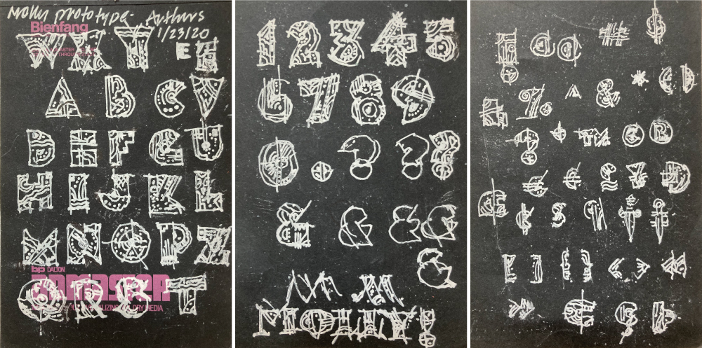
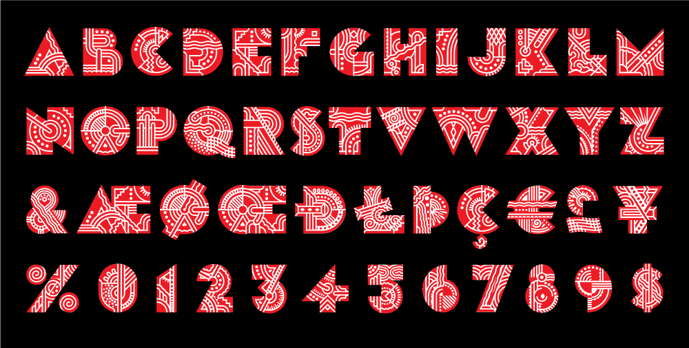
Mysterious and incomprehensible scribbles as the result of a Jazz-infused sketch session.
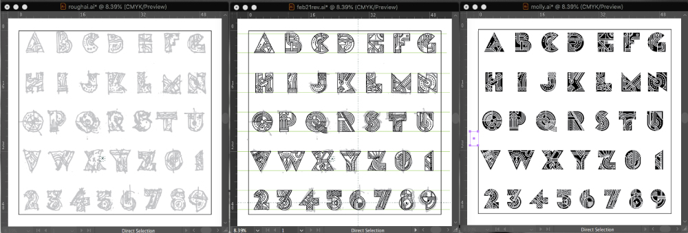
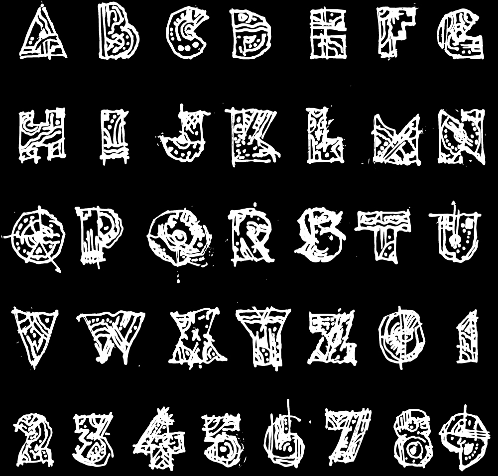
Neatly arranged, columns inverted, outlined in illustrator and inverted back to negative yielded the detailed characters.
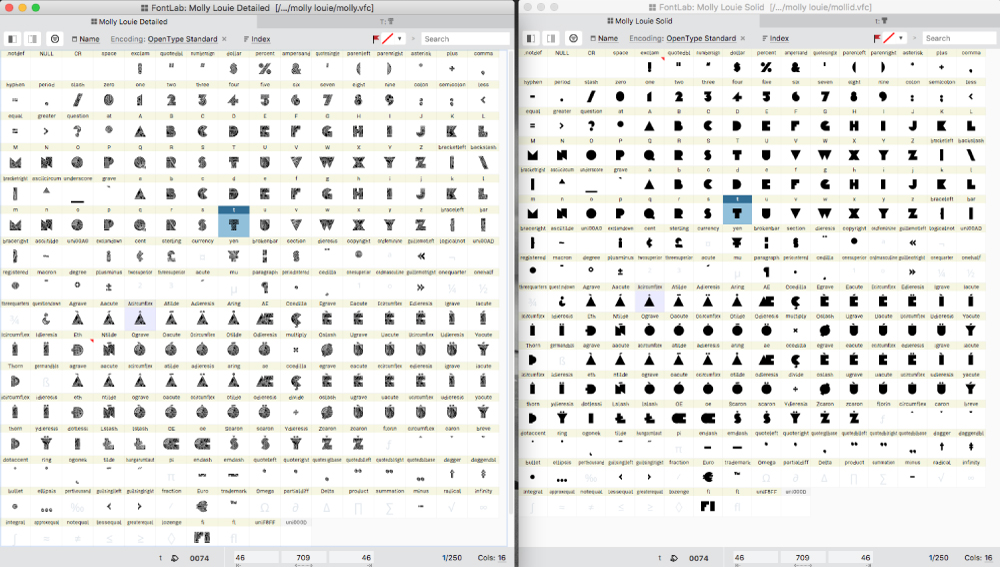
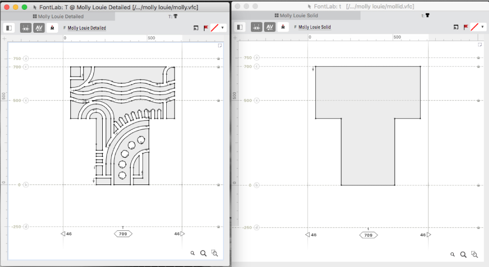
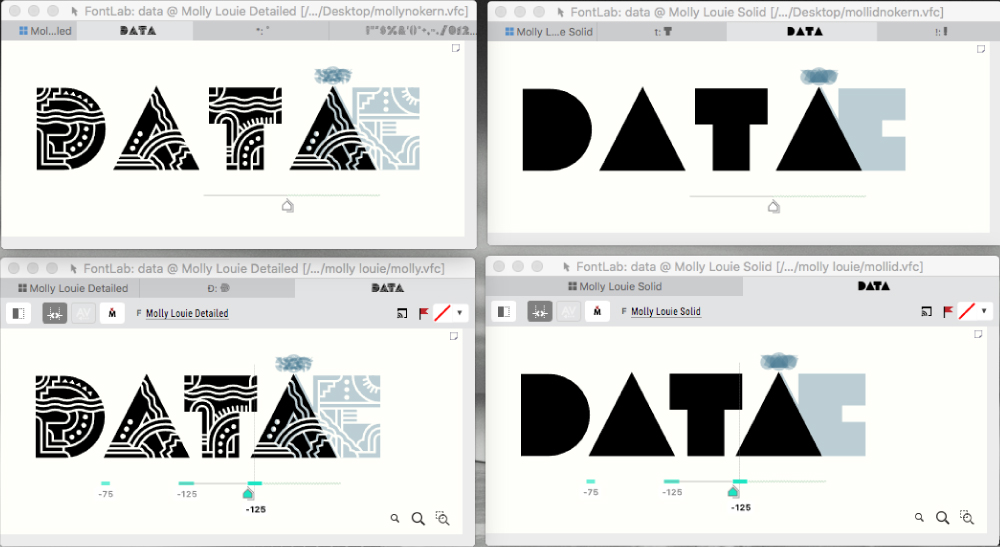
Two files were created in FontLab 7. One for the details and solid shape to help create multiple-color settings, shadows and a frightening array of possible variations.
Glyph tabs allow precision control over character fit and spacing.
Kerning tabs let you go one step further and assure that characters will combine neatly without odd spaces between them.
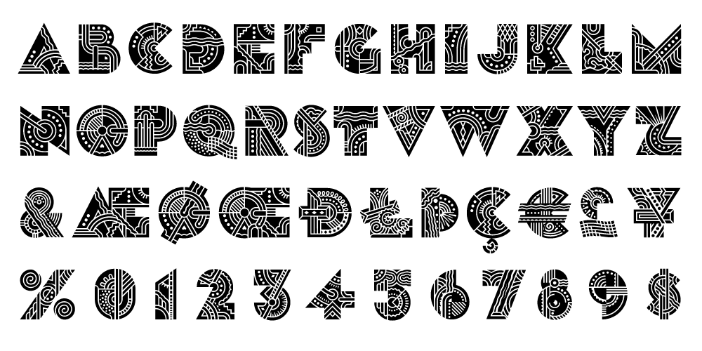
Detailed font - "very intricate, like a whole little world in each of them."
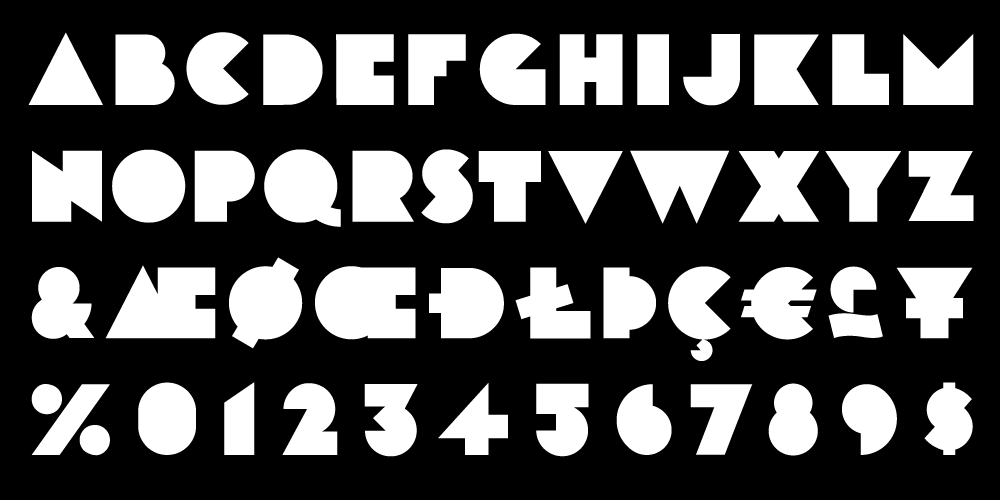
Solid font - "like little cut up sandwiches."
Multi-color settings can be achieved without converting to outlines so the type remains editable (because revisions).
© 2024 Daniel Pelavin