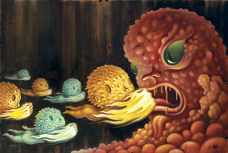
 Destroy Cancer
April 23
This painting was for Scientific American Magazine about an innovative medicine designed to supercharge a...
Destroy Cancer
April 23
This painting was for Scientific American Magazine about an innovative medicine designed to supercharge a...
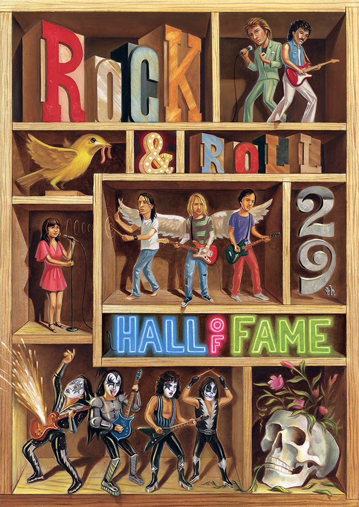 Rock & Roll Hall of Fame
April 11
I had the honor to illustrate for The Rock & Roll Hall of Fame 29th Annual Induction Ceremony. Every year an...
Rock & Roll Hall of Fame
April 11
I had the honor to illustrate for The Rock & Roll Hall of Fame 29th Annual Induction Ceremony. Every year an...
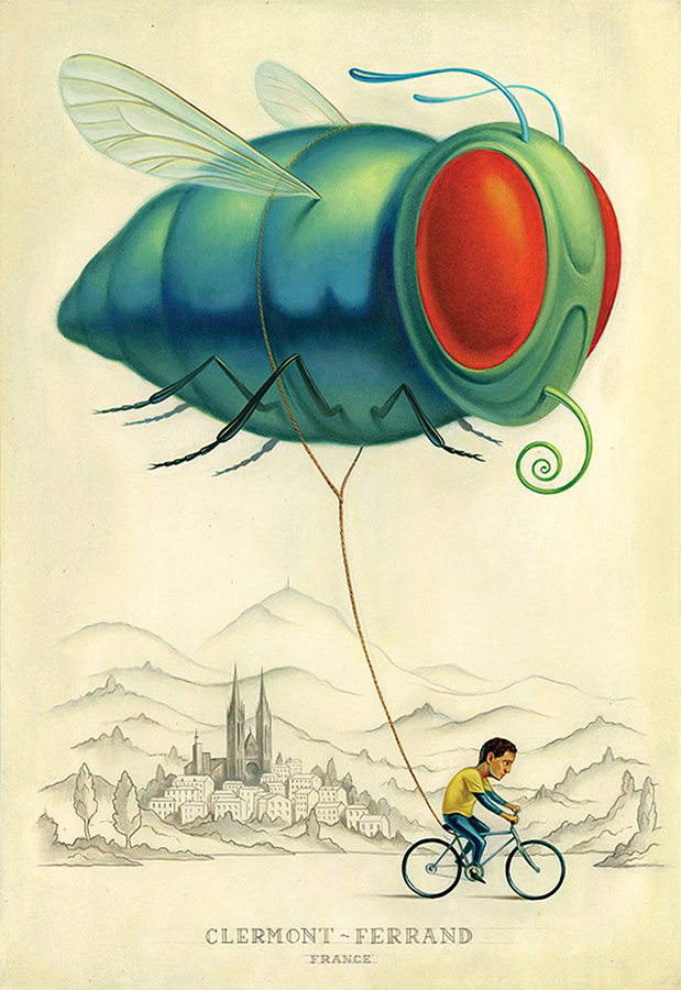 Clermont-Ferrand Short Film Festival Poster
March 8
I finally got a chance to sit down and post about my project in France. It took some time to edit and unpack the...
Clermont-Ferrand Short Film Festival Poster
March 8
I finally got a chance to sit down and post about my project in France. It took some time to edit and unpack the...
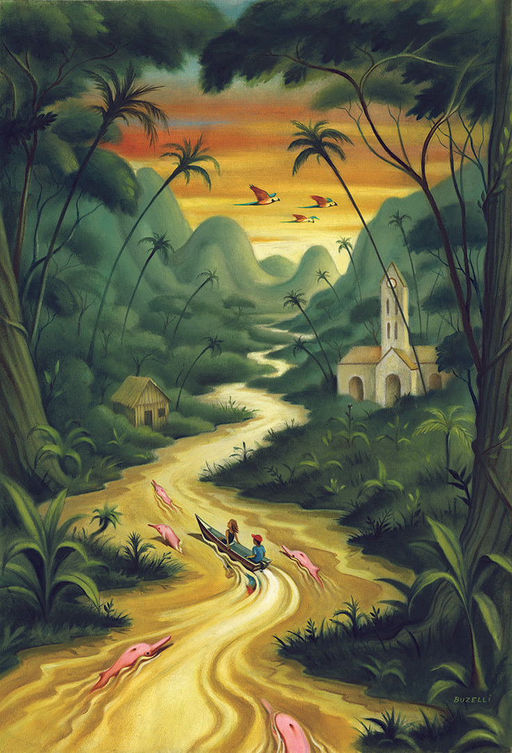 Amazon for NYTimes
September 15
I grew up to my Uncle Mike's stories of his travels to the Amazon. I'm not sure how much is true but his...
Amazon for NYTimes
September 15
I grew up to my Uncle Mike's stories of his travels to the Amazon. I'm not sure how much is true but his...
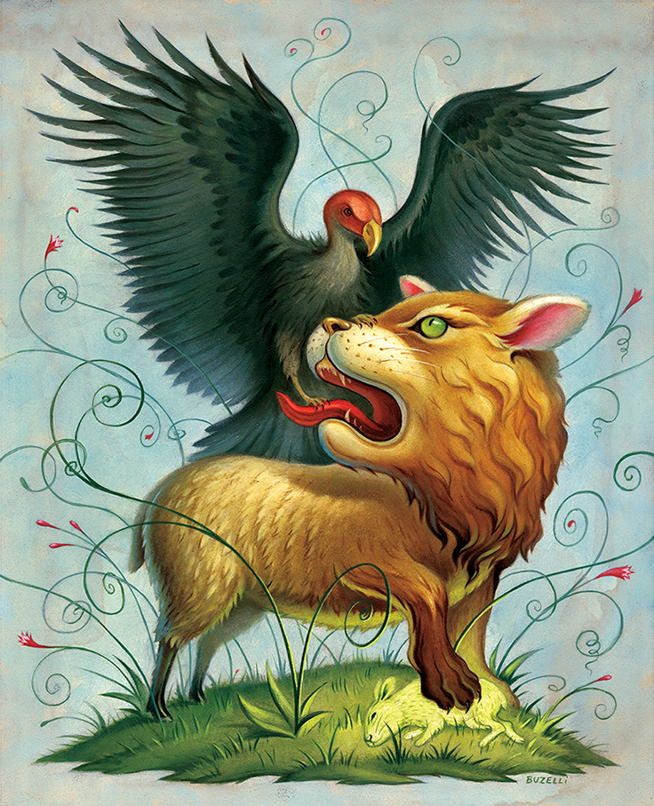 Maddaddam for NY Times Book Review
September 8
It was a pleasure illustrating Margaret Atwood's book, "Maddaddam" for The New York Times Book Review....
Maddaddam for NY Times Book Review
September 8
It was a pleasure illustrating Margaret Atwood's book, "Maddaddam" for The New York Times Book Review....
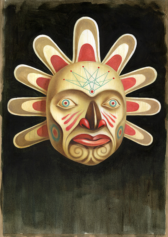 Indigenous Philosophy
July 9
I've admired the power and uniqueness of Global Brief's illustrated black covers for a while....
Indigenous Philosophy
July 9
I've admired the power and uniqueness of Global Brief's illustrated black covers for a while....
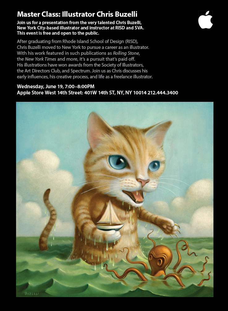 My talk at the Apple Store NYC
June 18
I'll be giving a talk at the Apple Store on West 14th Street this Wednesday June 19th from 7 - 8pm. The event is...
My talk at the Apple Store NYC
June 18
I'll be giving a talk at the Apple Store on West 14th Street this Wednesday June 19th from 7 - 8pm. The event is...
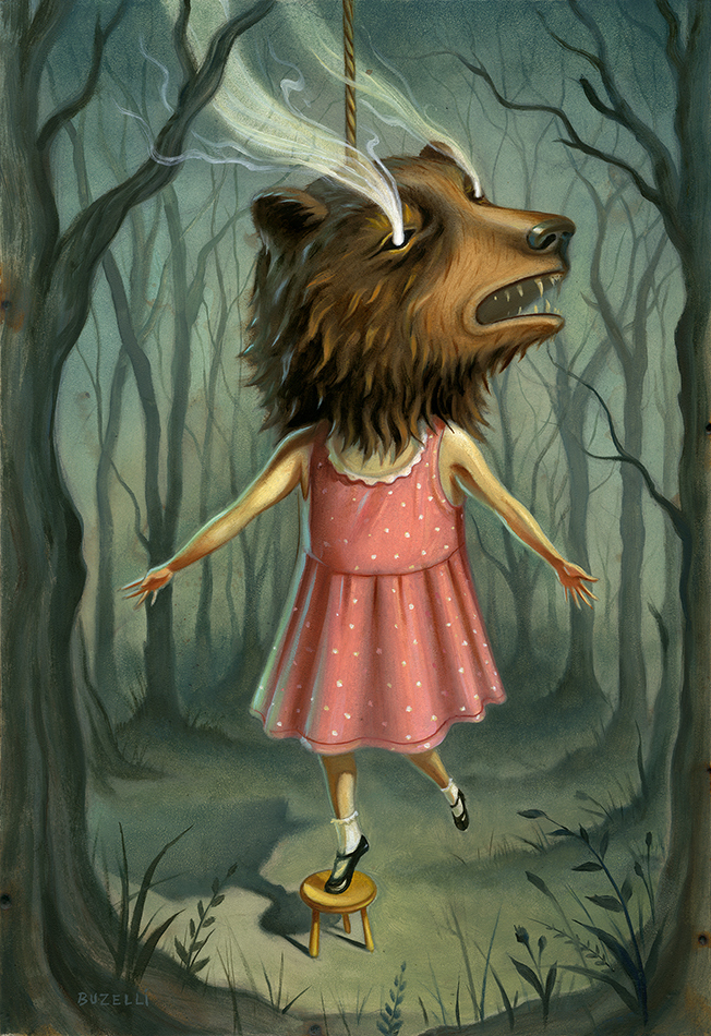 The Hanging Game and The Birdwing Butterfly
March 14
I literally felt my throat close while reading this story. Thanks to Irene Gallo and Tor for trusting me with...
The Hanging Game and The Birdwing Butterfly
March 14
I literally felt my throat close while reading this story. Thanks to Irene Gallo and Tor for trusting me with...
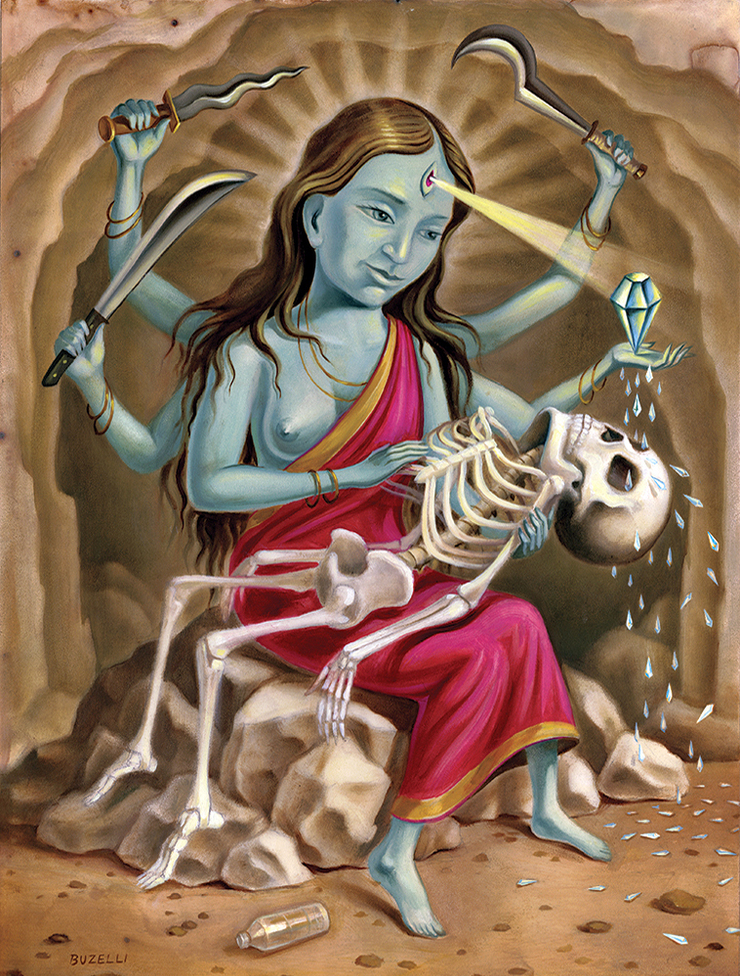 Death and Madness at Diamond Mountain for Playboy
February 27
Here's a piece for a recent article in Playboy magazine called "Death and Madness at...
Death and Madness at Diamond Mountain for Playboy
February 27
Here's a piece for a recent article in Playboy magazine called "Death and Madness at...
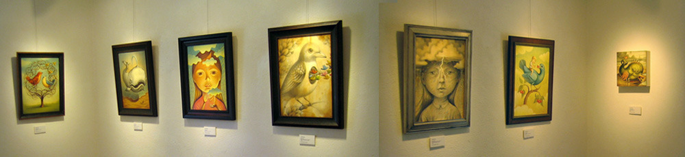
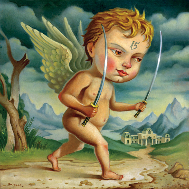 Samurai Cherub and Realms
January 13
My painting for the Sundance Film Festival A to Z Book designed by Todd Oldham Studios. This book was made...
Samurai Cherub and Realms
January 13
My painting for the Sundance Film Festival A to Z Book designed by Todd Oldham Studios. This book was made...
© 2024 Chris Buzelli