Bill Mayer
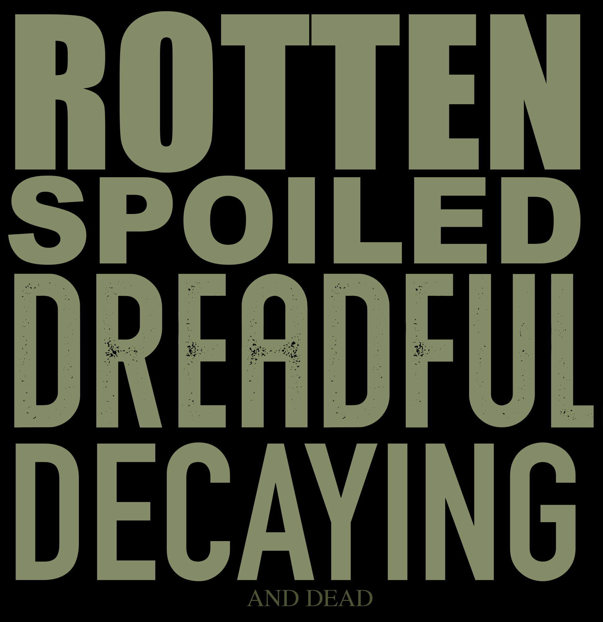
ROTTEN TO THE CORE
NOVEMBER 2, 2022
Lee and I were on a hiking trip in Scotland when Forest texted me about a super cool job for the New York Times kids. A Halloween “ROTTEN” issue. One of those dream jobs you'd die for. That seems like the perfect little saying because the entire issue is filled with decaying and dead stuff. Debra Bishop is one of the most talented art directors and it's always such a a joy to collaborate on these projects...
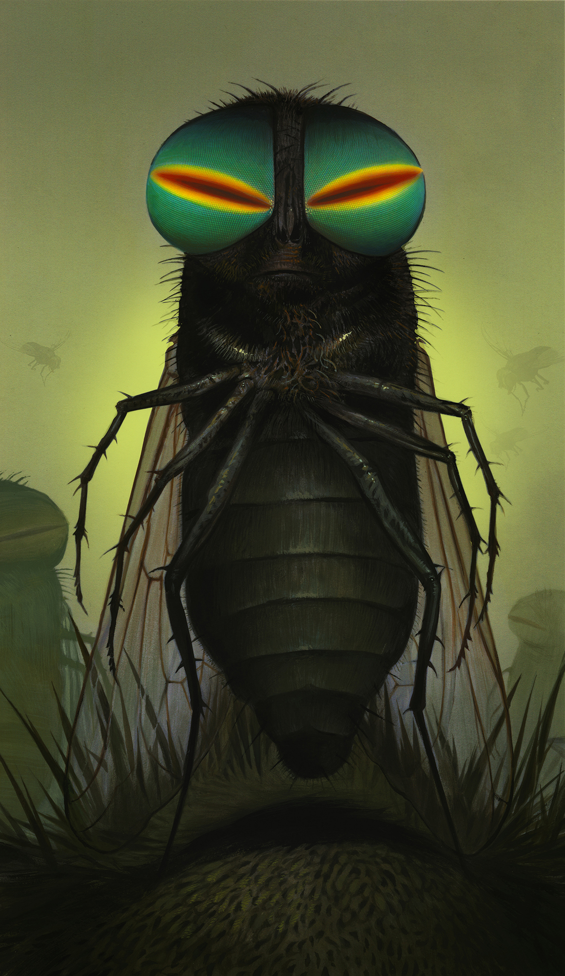
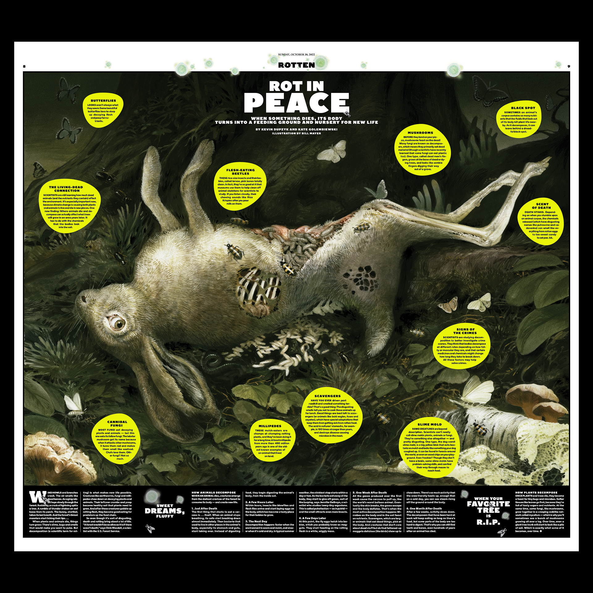
There were several pieces she wanted me to do...A giant fly standing in the grass, zombie-like eyes staring out at you. Spooky is the key word on that one.A scene looking down on a forest floor at a dead rabbit in the four stages of decay. Including a cast of mold, fungi, carnivorous beetles, maggots, and even butterflies that will be helping the whole process along. (apparently butterflies like to drink up the deliquescing liquid from rotting carcasses)
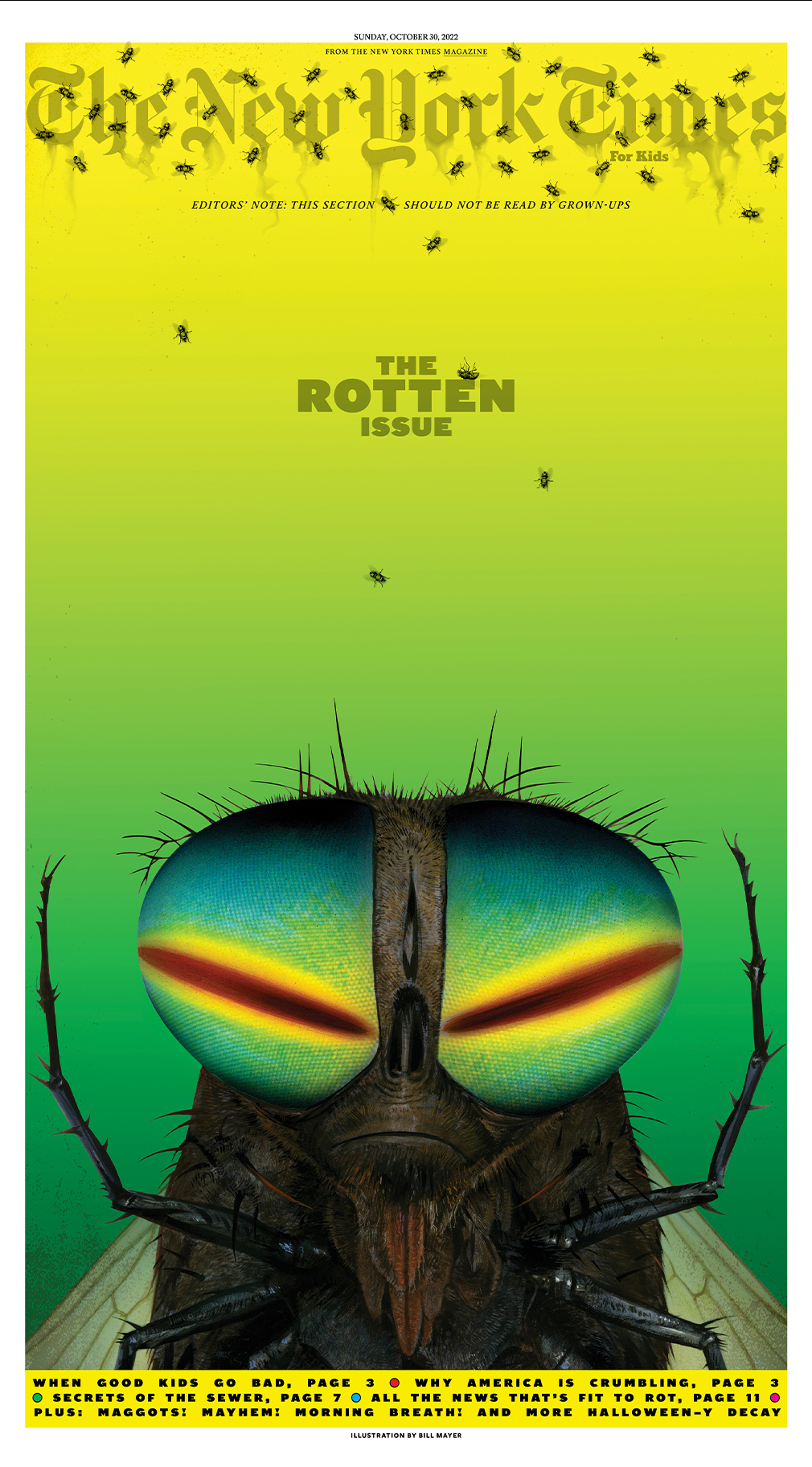
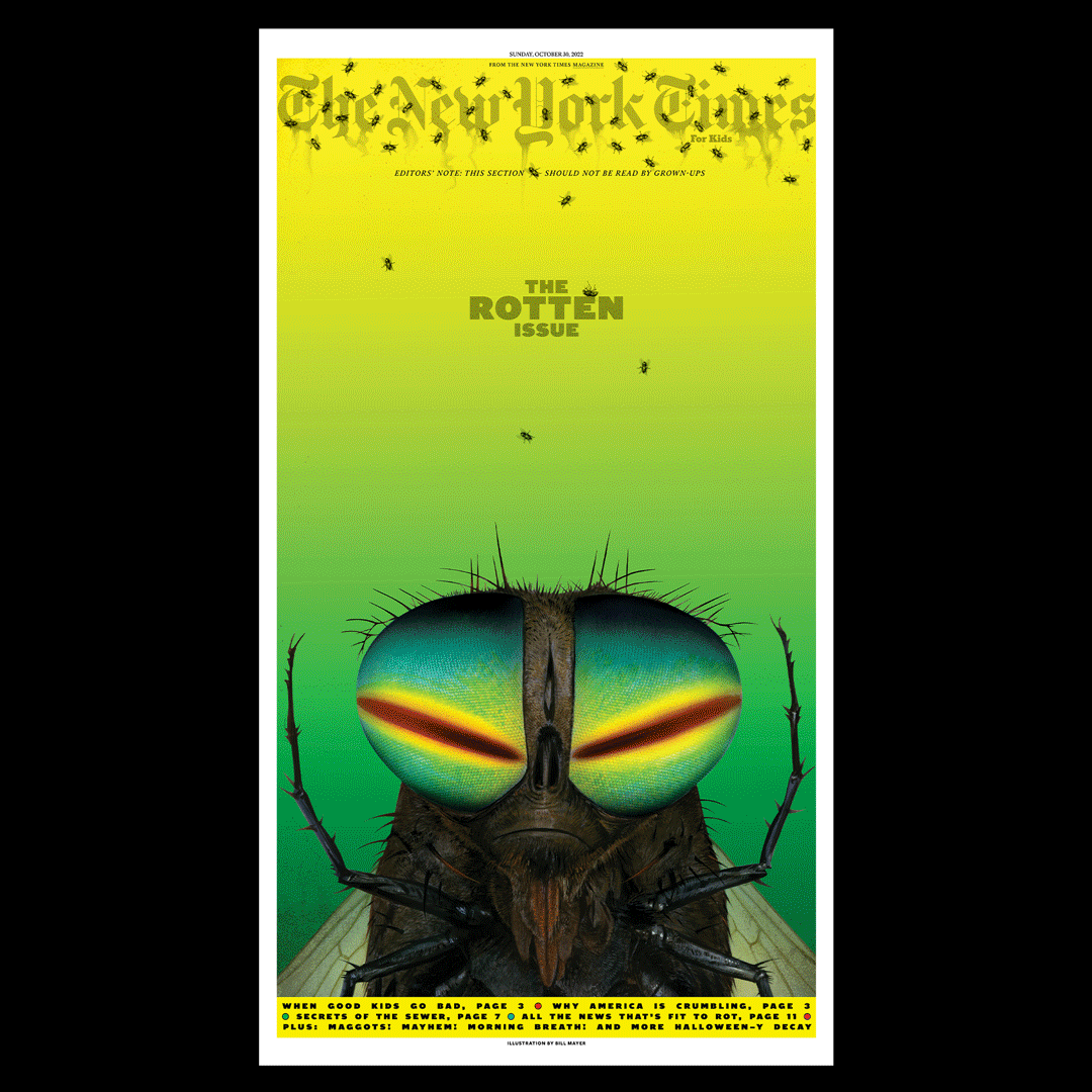
On the cover, her idea was to do a bunch of life-size flies that would look like they're crawling around on the paper.
And a dead and decaying cast of little things to “sprinkle” though out the section of the paper as well. Quite the order! When I returned from Vacation I dove right in to the Rot.
They had a kind of ghastly palette that we wanted to keep throughout the section, so most of the art would be muted and slightly greenish. There were several directions she had us working in as alternates, trying to figure out the best solution.
The cover illustration of the giant fly came late in the process. We tried a couple variations of more life-like flies but she decided to keep close to the same character as the spooky full-page fly.
The full-page fly went through some variations as Debra had a vision and it kept getting darker and creepier with each evolution. I love how the painting turned out. The silly grumpy face was an accident that just evolved out of the fly's face but it was the perfect grumpy attitude that it needed.
There were several pieces she wanted me to do...A giant fly standing in the grass, zombie-like eyes staring out at you. Spooky is the key word on that one.A scene looking down on a forest floor at a dead rabbit in the four stages of decay. Including a cast of mold, fungi, carnivorous beetles, maggots, and even butterflies that will be helping the whole process along. (apparently butterflies like to drink up the deliquescing liquid from rotting carcasses)
On the cover, her idea was to do a bunch of life-size flies that would look like they're crawling around on the paper.
And a dead and decaying cast of little things to “sprinkle” though out the section of the paper as well. Quite the order! When I returned from Vacation I dove right in to the Rot.
They had a kind of ghastly palette that we wanted to keep throughout the section, so most of the art would be muted and slightly greenish. There were several directions she had us working in as alternates, trying to figure out the best solution.
The cover illustration of the giant fly came late in the process. We tried a couple variations of more life-like flies but she decided to keep close to the same character as the spooky full-page fly.
The full-page fly went through some variations as Debra had a vision and it kept getting darker and creepier with each evolution. I love how the painting turned out. The silly grumpy face was an accident that just evolved out of the fly's face but it was the perfect grumpy attitude that it needed.
With the spread I wanted to create an elegant, sophisticated painting while working the list of mushrooms and maggots and beetles she gave me into it. The first take was more brilliant and glowing with color, but to make it more somber and creepy we pulled back on the saturation and tinted it green, and it seemed to fit better with her overall design for the section. I did the painting about 7.5” wide, large enough to get all of the detail into it, and it blew up perfectly to the 17”x23” size it printed. Had to reduce the rabbit's size to give some adequate space for all of the type. SO thrilled with the way Fernanda Didini put this together. Beautifully designed...
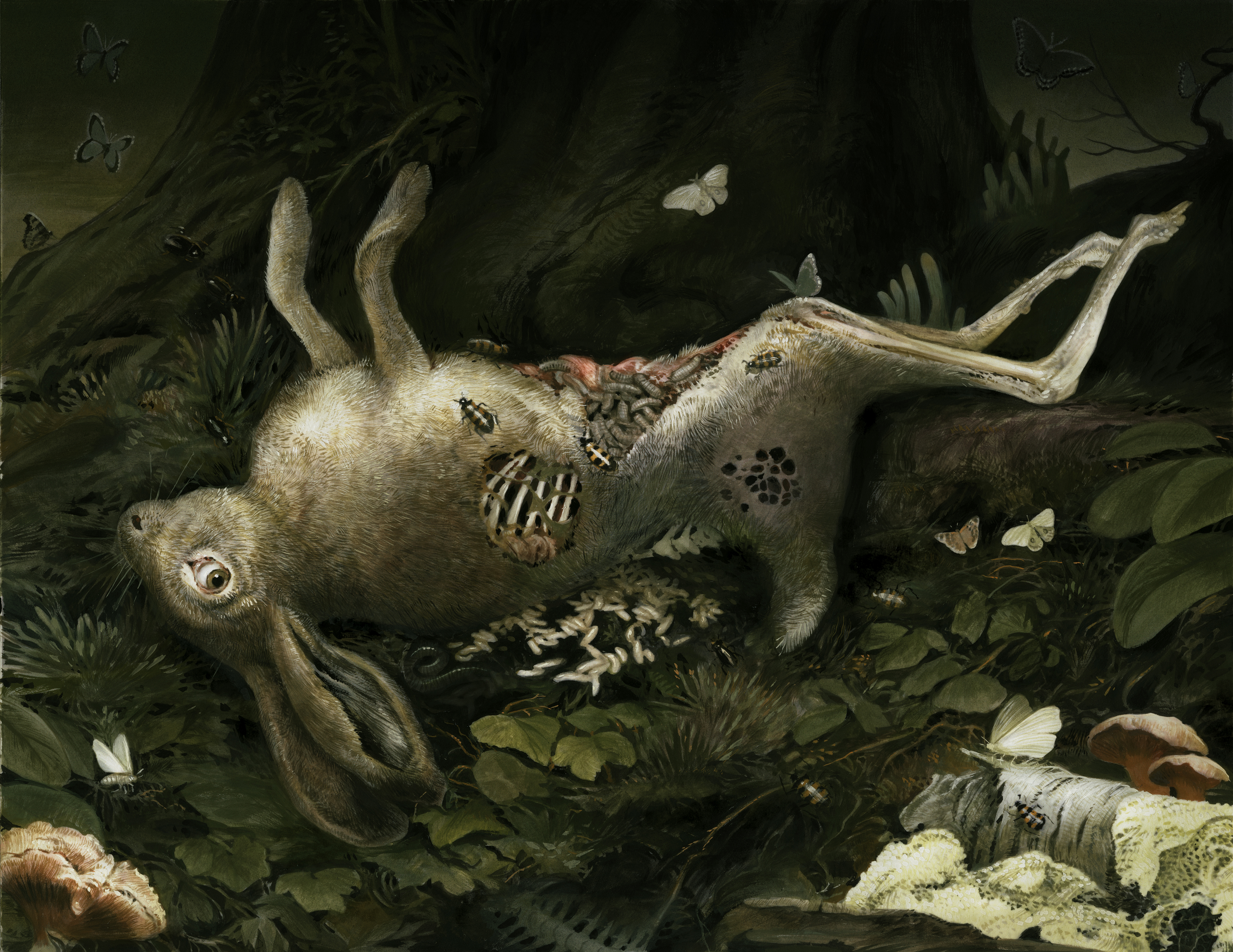
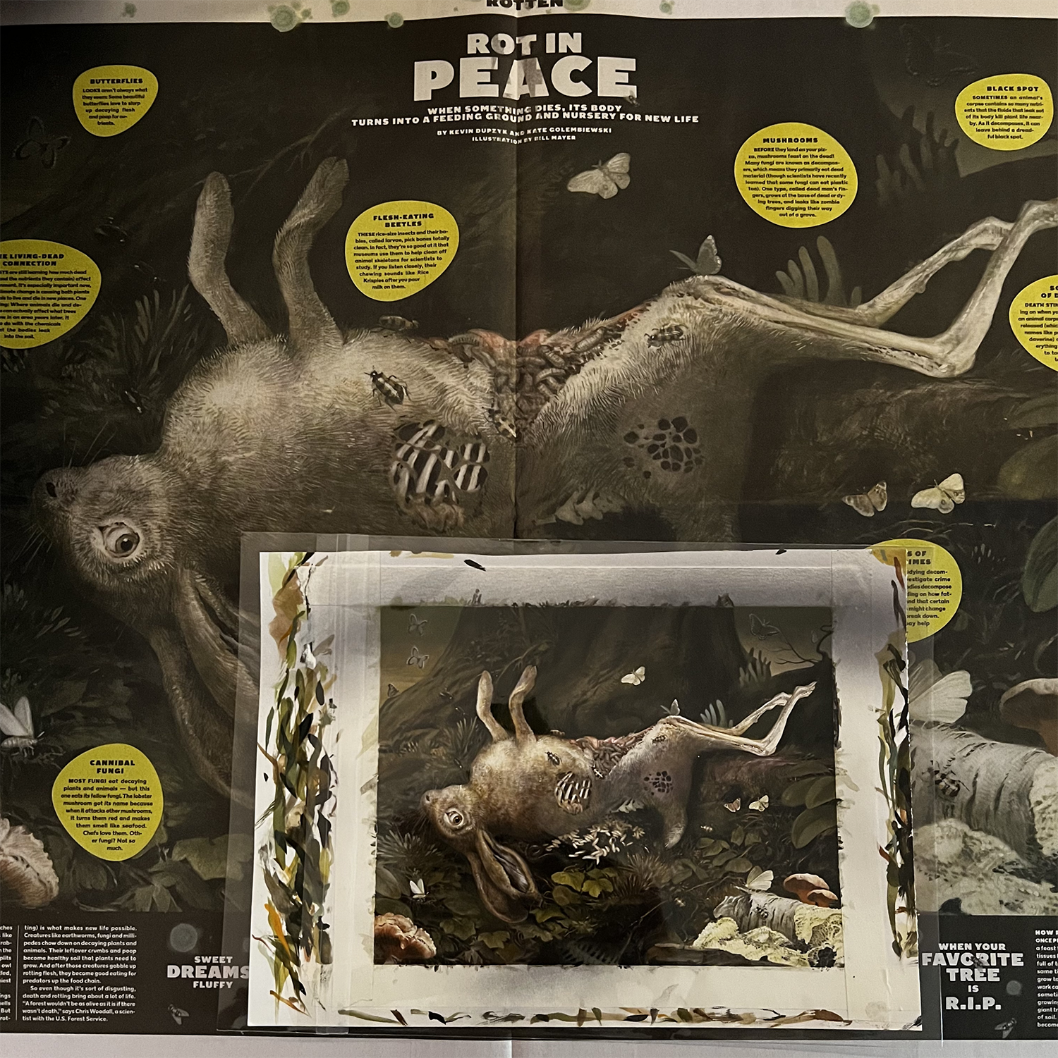
Hare today gone tomorrow... actual gouache painting on top of 17"x23" printed spread.
When we finally saw the images all pulled together in the paper it was such a delight. Although the roaches in New York must be a lot smaller than our roaches here in Georgia… I put one into the layout to compare sizes.
All in all, it was such a delight working with Debra and Fernanda on this. SO much fun with the Rotten Issue of New York Times For Kids. I just didn't want it to end...Big Thanks to all of the contributors, designers, writers, illustrators, and 1000 other people that make a newspaper like the New York Times possible.
Topical: JUST WORK THEMS POKEMONS IS DEVILS
© 2024 Bill Mayer