Bill Mayer
50th Anniversary MLK
OCTOBER 8, 2019
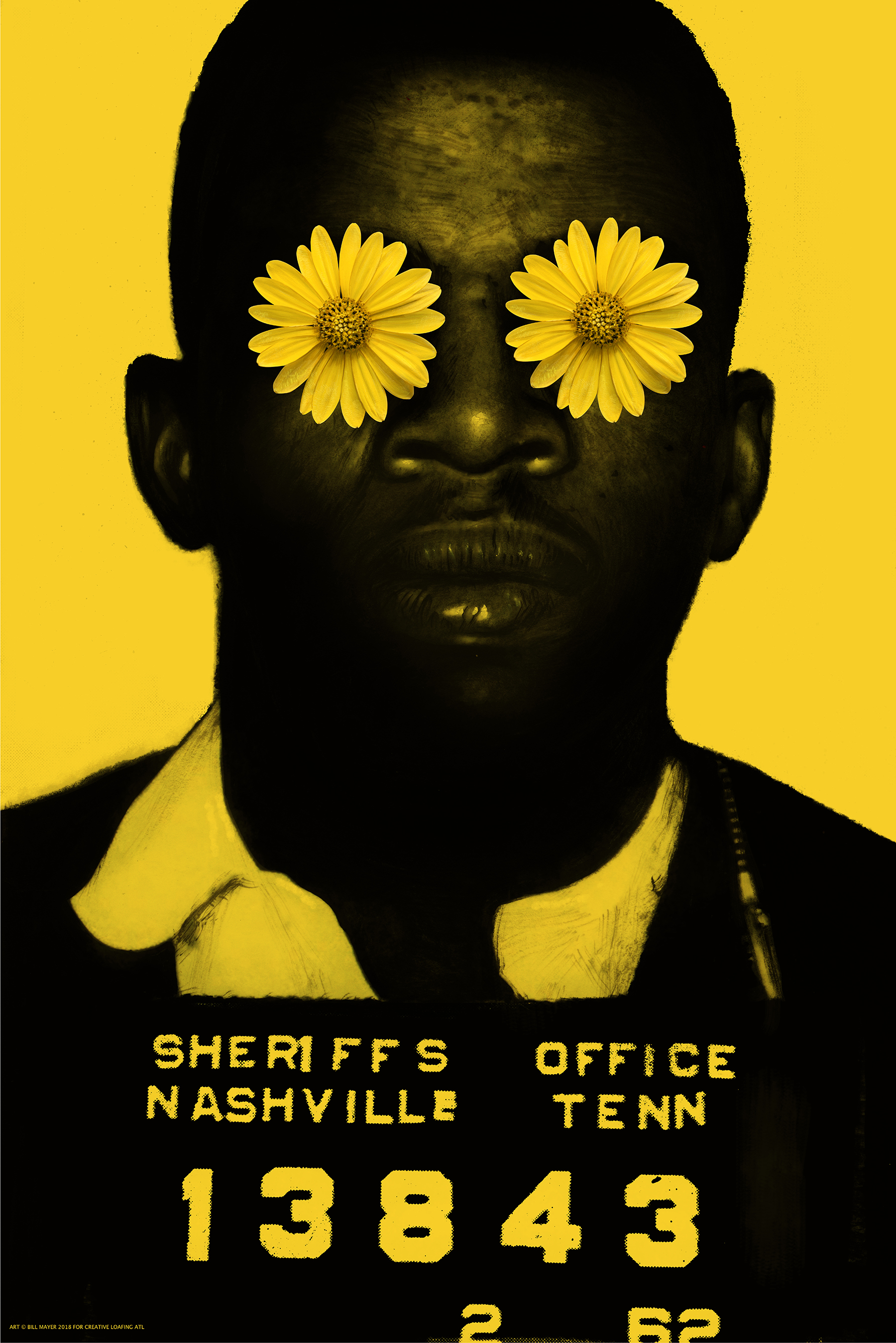
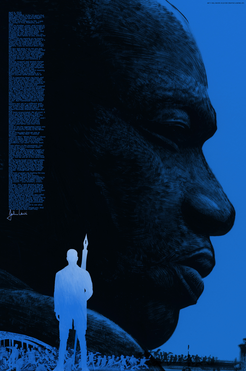
I got call from an old friend and fabulous art director BA Albert asking if I would do a quick turn around poster for the 50th anniversary of Martin Luther King’s murder. A local underground newspaper wanted to do a special promotional issue. They were going to print a letter our Senator John Lewis had recently written to MLK about what it had meant to him as a 16-year-old meeting with him, and how it had changed his life and path to the future. The wanted me to do a 24 x 36 poster that would be folded into the paper.
It was Monday, and posters due Friday. Seemed tight, because I was in the middle of a large publishing project and that would have to be set aside to make room.
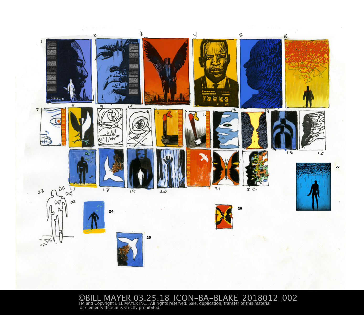
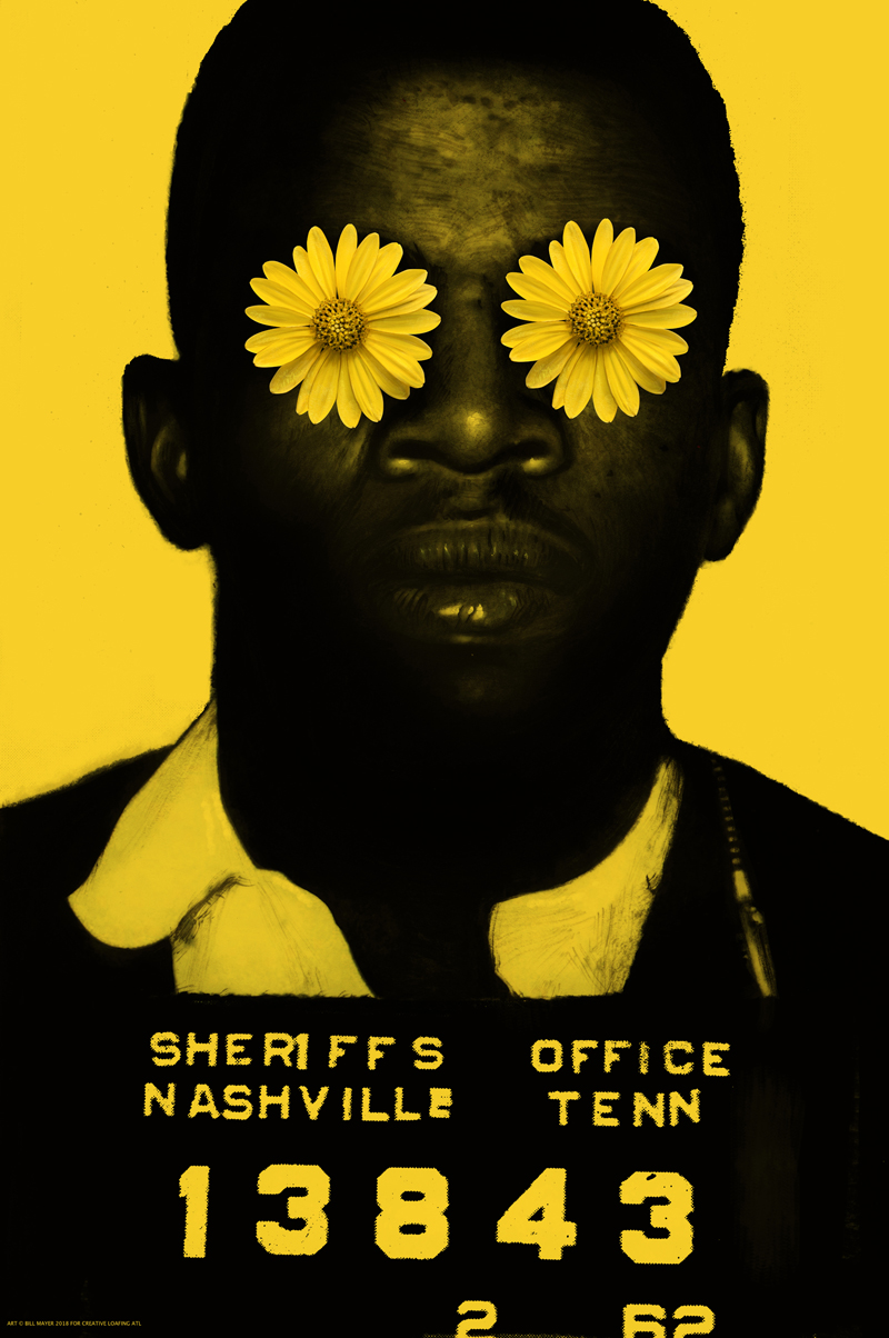
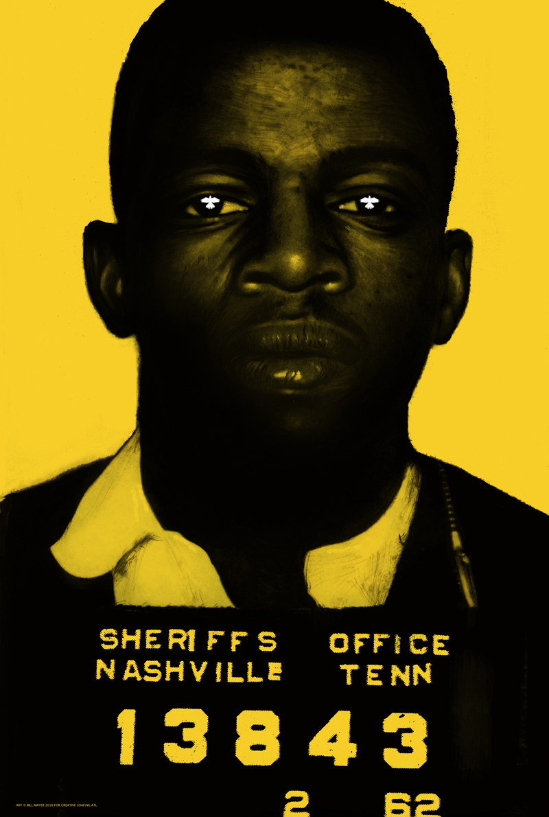
It felt like something that needed to be done with the right tone and feeling. I had a short conference call with BA and Blake Tannery, the art director at ICON. pulled together some reference on JL, and MLK and started on thumbnails. There was a police photo from John Lewis's past that just struck me as such a strong photo.
I always love the beginning of a job, conceptually somewhat open and direction not tied down. It’s just a visual stream of ideas that sometimes play off one another. Sometimes when I do a poster I add color to my thumbnails. It’s important perceptions that sometimes help things read. There were some great ideas. We hashed them out in a conference call and they suggested the possibility of doing a two-sided poster. I decided to do three of the posters. They loved the idea of the police photo but we all agreed it needed some conceptual element to make it work.
Things didn’t really go that smoothly. I have a hard time with portraits and I must have started over four or five times, finally stayed late and got one that seemed to have the right feeling. The mug shot of John Lewis was painted in Gouache, the type at the bottom a combination of blown up digital print and bad Xerox copy. But I loved the weird way it distorted the type.
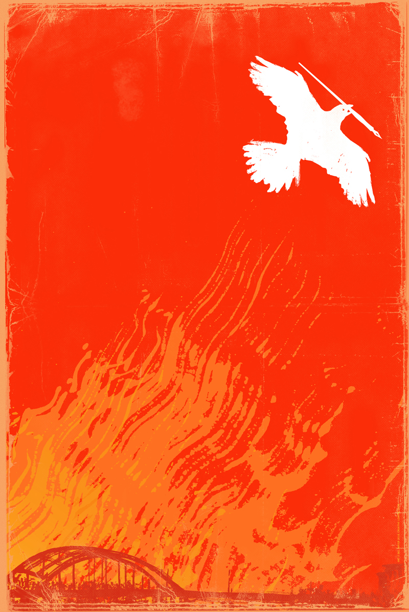
In my initial thumbnails I had tried a cople of variations with hand written type that seemed problematic with my spelling and the time for editing nonexistant.
The three posters were designed to have the letter included on the front in a column. The yellow poster to have the Letter on the back. I thought the yellow poster was by far the strongest direction.
Much thanks to Creative loafing, the folks at ICON, my old friend BA and Blake Tannery. Much fun working with you guys.
© 2024 Bill Mayer