Streamline/Looking Glass. Analytical software for healthcare systems. © Bill Mayer 2014

"Patient Care." Streamline/Looking Glass. Analytical software for healthcare systems. © Bill Mayer 2014

Streamline/Looking Glass. Analytical software for healthcare systems. © Bill Mayer 2014
I have been thinking a lot lately about how many thumbnails to share with clients. In fact, Rick Anwyl and I were having a conversation about this very thing. He cited two examples of photographers he had worked with in the past. Both of them really top-of-their-game shooters who had very different approaches. They both worked with Rick, for a couple of weeks flying all over shooting hundred of photos. When they delivered, each of their final shots came in very different.
The first, Jay Maisel, sent a heavily edited selection of maybe a dozen shots. When Rick called him to ask where the rest of the shots were. Jay cut him off by saying, "I know what you're calling about, You want to know where all of the other shots are. You'll never see them." When he loaded the film in to review every shot was a beautifully designed. The quality of each shot was so definitive.
The second example was different. The photographer sent over pretty much everything he had shot... All good work but it took Rick a lot of time to sort through and edit them down to what he actually needed.
Is it better to show a few ideas or send the whole kitchen sink? I had always in the past shared everything with the art directors I work with but is that really the best way to present your ideas. As I told Rick, sometimes I wonder if providing so many examples for them to choose from is somehow cheapening the really good ideas. After all, they would be just as happy to get five really strong ideas to pick from as thirty. Or would they?
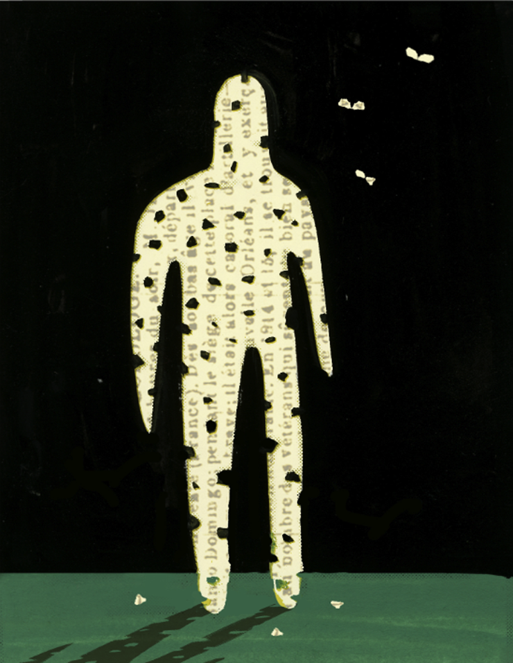
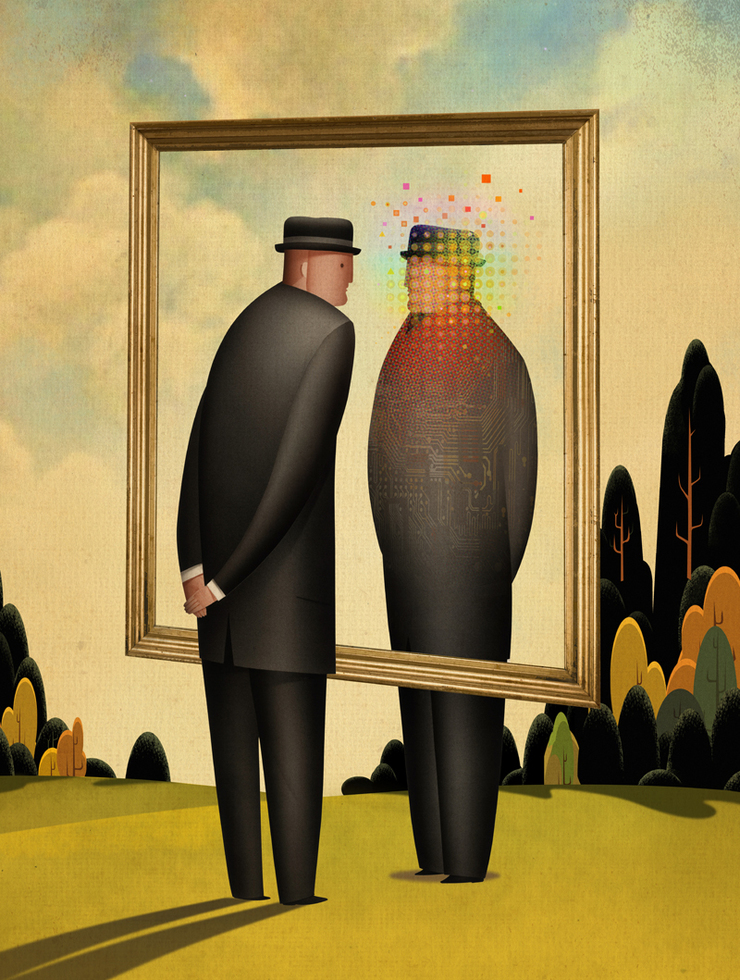
When I started this project with Rick, the assignment was to create some visual, supportive illustrations for Streamline, to help illustrate the application of analytical software in healthcare systems. Really dry stuff, but a perfect place to try some abstract ideas. Part of the direction was to try to incorporate a visual looking glass into the visuals that would show how using the software would help to reveal information not readily visible and give the user an advantage toward making the care they provide better for the consumer. Looking Glass reveals new information, new knowlege- It reveals what you would otherwise would not have seen.
Now the search was on for the perfect metaphor to magically capture this idea...
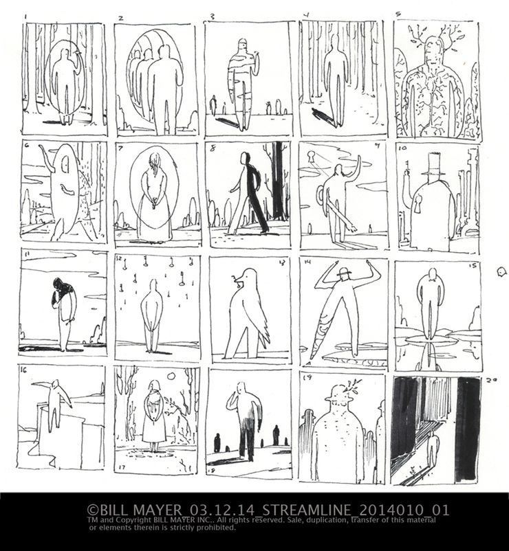
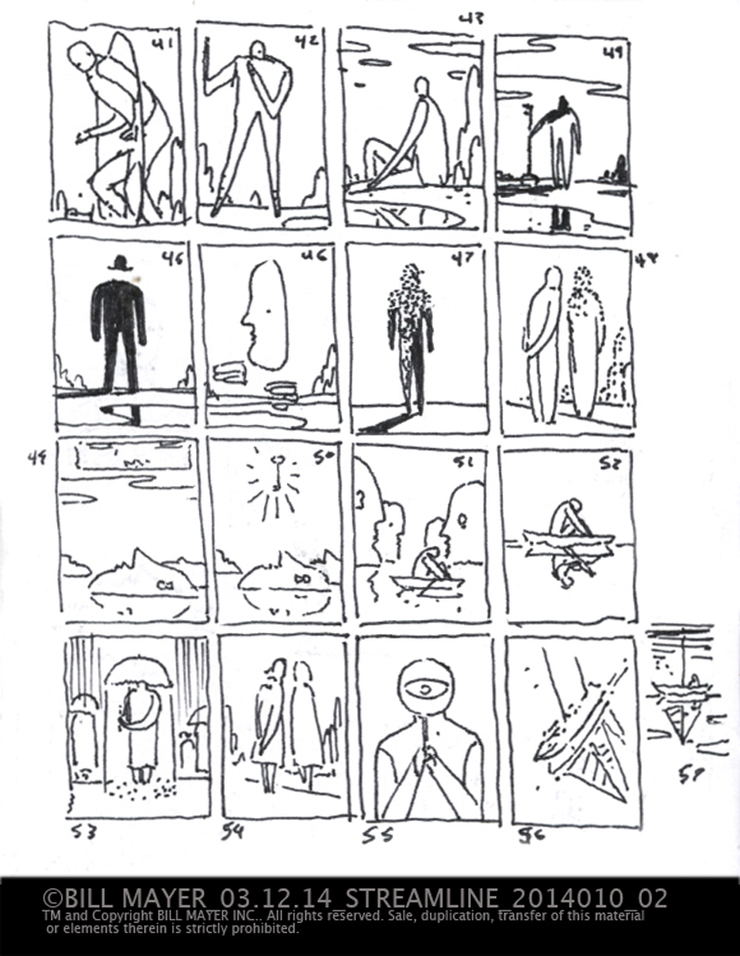
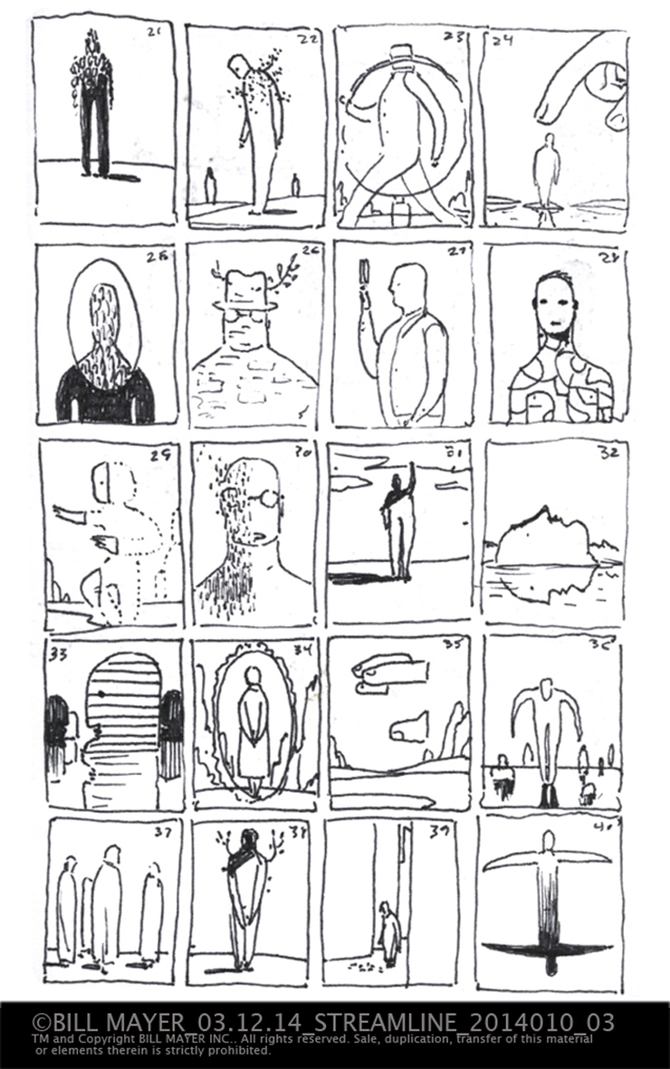
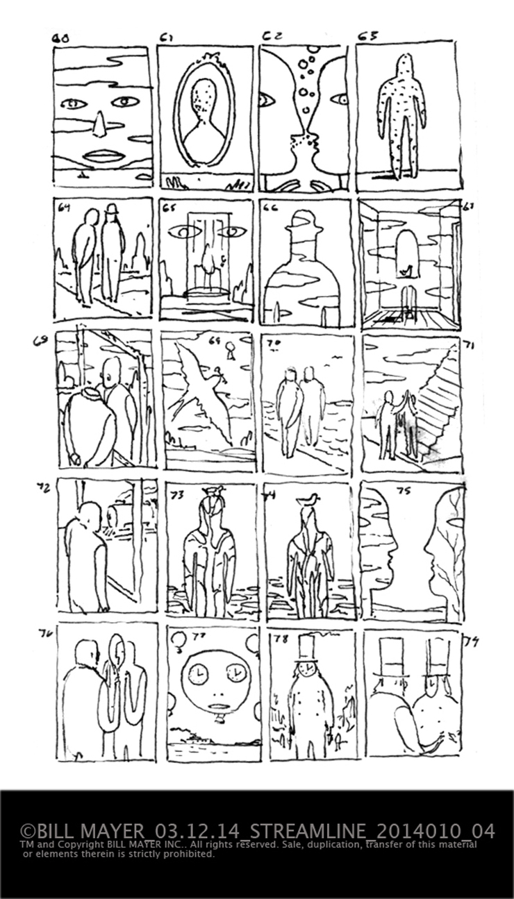
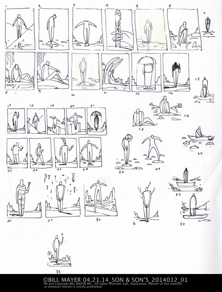
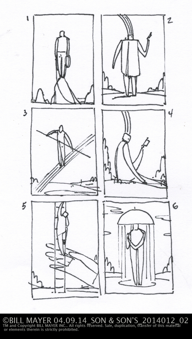
The first round of thumbanils seemed a little off target to Rick. They did not really show the reveal aspect so back to the drawing board. I think part of my problem is i enjoy these little ideas so much I just keep going and going. I did a few more that night in a sketchbook; sent them all off to get feedback .
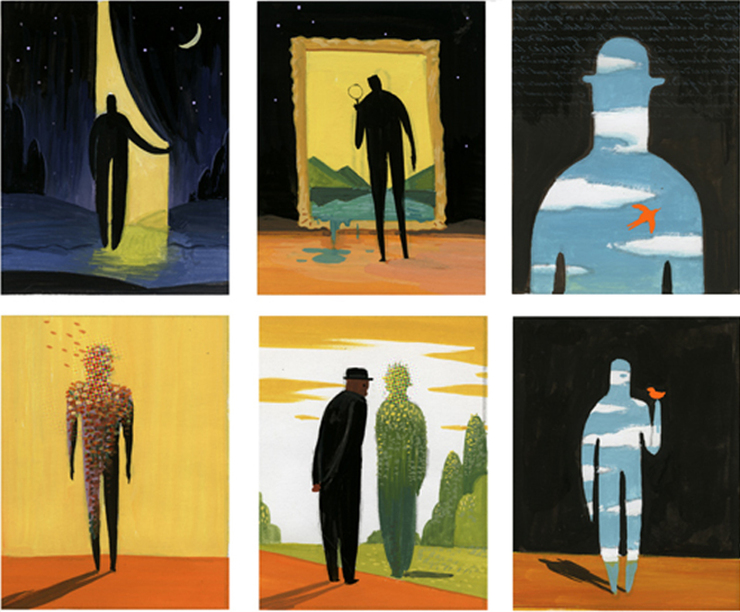
Rick and Courtney picked thier favorites. I know sometimes it's difficult for people to get the ideas clearly from just a little thumbnail so i did some little color gouache studies to help explain where I saw the finals heading. I had some good ideas I thought were working in these. Some strong contenders in this little group of color studies. I think they already had the more direct "looking glass" in mind, so not surprising it came to the top as a favorite. they picked two, but wanted to blend the ideas together. I wanted to stay away from the obvious; data, zeros and ones; and use a blend of digital elements and colors to imply the information.
these are the little gouache thumbnails for the first illustration. I do love the roughness and spontaneity of the color studies.
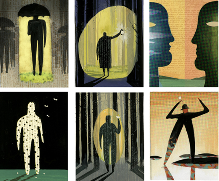
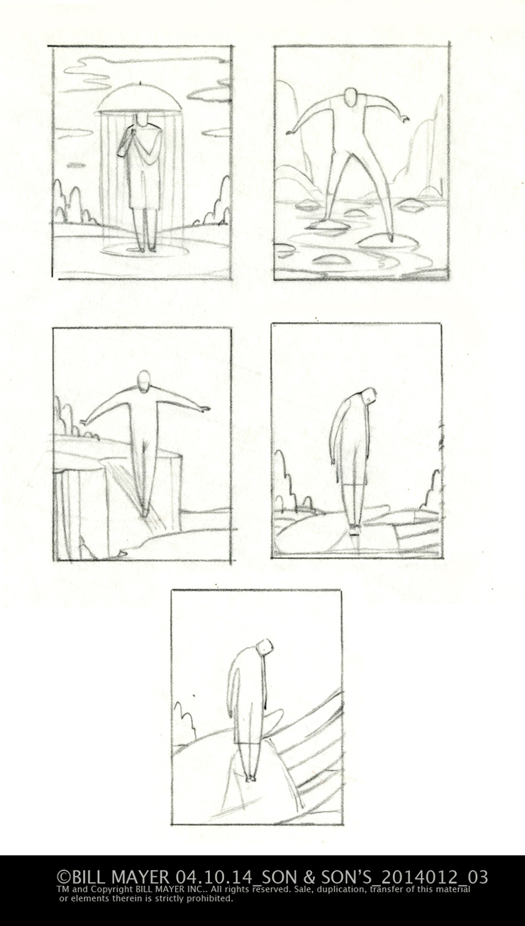
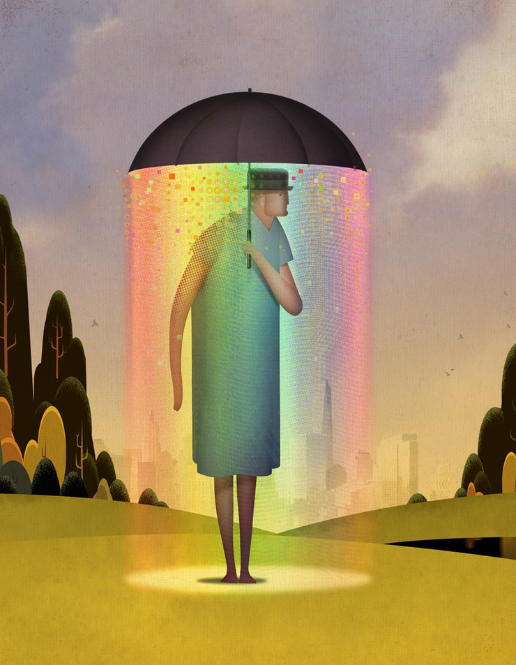
The second Illustration was supposed to be about enhanced patient care. So Rick liked the umbrella but wanted to make it more direct by putting our "everyman" in a hospital gown... Not a great color to work around. He also liked the idea of the hand. I tried a couple of variations, different poses in a tight thumbnail. I felt like the illustration idea worked with the man dressed normally and made it more versatile but they felt it needed that connection to the healthcare industry.
The third concept was really about risk management. Rick and Courtney liked the aerialist, as well as the one with the everyman stepping on stones. They picked the version showing the cliff and the aerialist because it seemed to read as "riskier" faster..
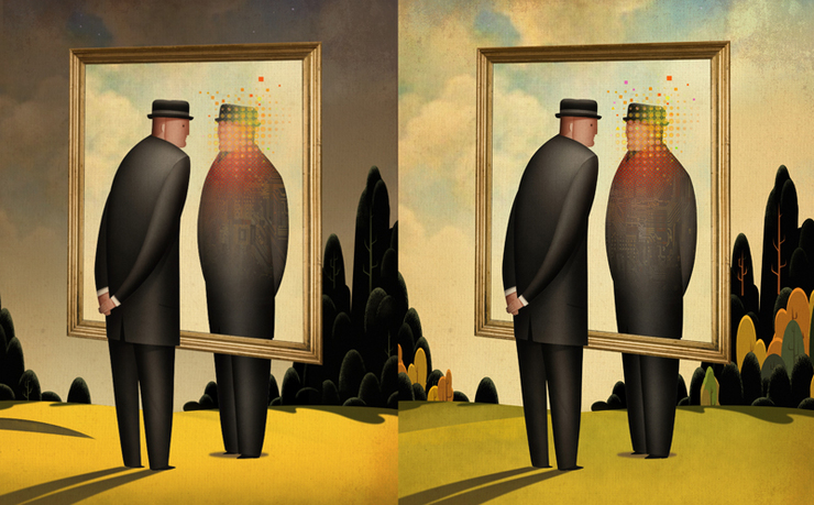
The final three illustrations went through a bit of changes and editing, but overall I was, and I think the client as well, very happy with the results. Some of the changes were in the overall mood of the illustrations. Something that would not be a problem in edtitorial illustration, but can be a little different in advertising work for a client. Sometimes they identify with the illustration; or maybe don't want the tone to be moody or dark. I can show both of these illustrations to show the changes. The first being the original coloring, the second lightened up.
Streamline/Looking Glass. Analytical software for healthcare systems. © Bill Mayer 2014
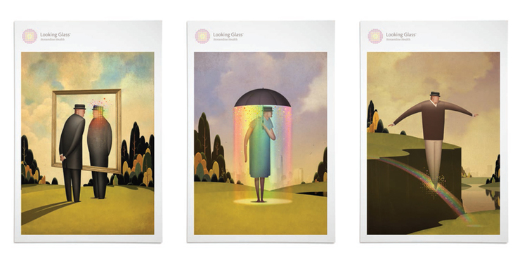
"Looking Glass" Streamline/Looking Glass. Analytical software for healthcare systems. © Bill Mayer 2014
"Enhanced Patient Care" Streamline/Looking Glass. Analytical software for healthcare systems. © Bill Mayer 2014

"Risk Reduction" Streamline/Looking Glass. Analytical software for healthcare systems. © Bill Mayer 2014
Big thanks to Rick Anwyl and Courtney Garvin at Son & Son's and The client Streamline for giving me the opertunity to do these little illustrations.
Instead of the typical; data, ones, and zeros; we settled on pixellation and shapes to echo the logo. This seemed to work perfectly. Here are some of the rough layouts for the covers Courtney was designing. Simple and elegant design. beautiful job Courtney.
Self edit thumbnails or show them all?
I have asked several art directors I have been working with, and they all said they would rather see all of the sketches. They understand about showing so many... One said, "I like seeing all of the ideas...I totally get it. It's like going into a meeting with 10+ page designs for a single feature article... I only show maybe two, but I still like seeing all of the Ideas."
Maybe the better idea is to only show "good" ideas....