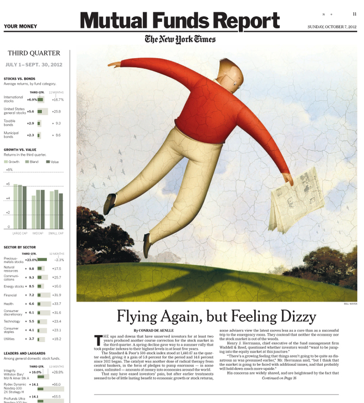
Bill Mayer
New York Times... MFQ Review
OCTOBER 17, 2012
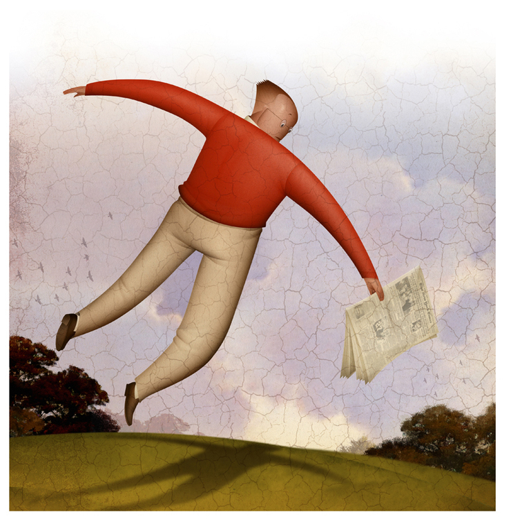
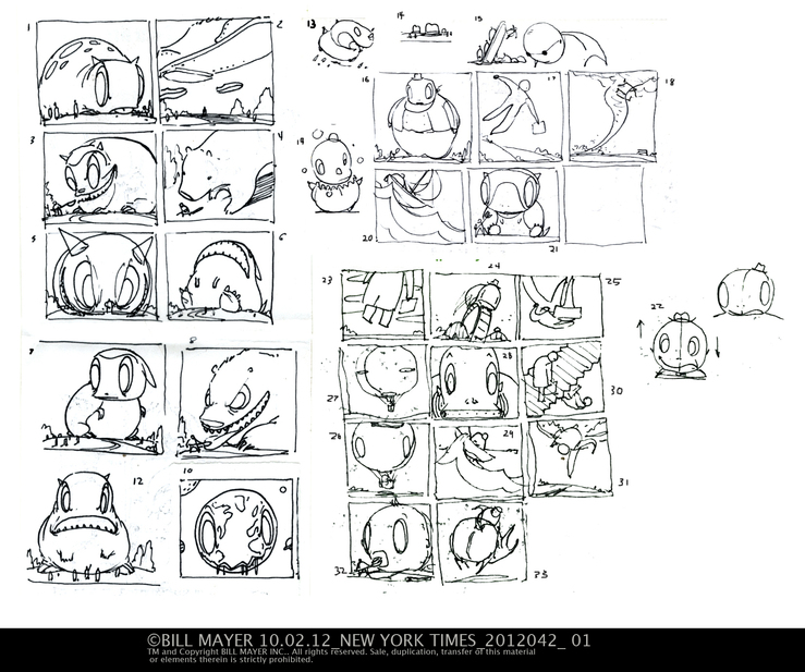
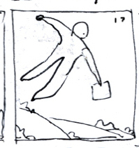
I got an email from Minh while we were out on the country... A little piece for The New York Times. My first stab at the thumbnails, I was trying to force it into another little beastie direction but he just wasn't buying it. so back to the drawing board; Actually, even before he had contacted me. We were in Candada closing up the cottage for the winter. So the second bunch I did on the plane home, Scanned them in the next morning and waited for feedback.
It was Mihn's Idea to fade the drawing out at the top. I think this worked pretty well. Again the personal little pieces (Beasties) have influenced the look of the final but I think it gave the whole illustration a nice neutral pallet.

Topical: JUST WORK
© 2024 Bill Mayer