Bill Mayer
New York Times
SEPTEMBER 14, 2011
Final illustration for The New York Times © Bill Mayer 2011
I got an email from Minh at New York Times about a little spot illustration for a story he said he would love for me to do. I can remember reading it, thinking, "Edel must be on vacation…" Anyway, a great little story about how “we seem to be losing the digital right to be forgotten or deleted." In Europe, there are legislations for consumers (if they wish) to have their personal information be deleted from company data banks. In the US, there’s no such thing. These companies need to keep your info so they can sell you stuff and trade it w/ others. Seemed pretty straightforward, so I shot him an email back and we chatted. He told me I could work in any style I wanted. We decided to let the thumbnails lead us in a direction for style.
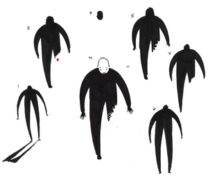
I started off with a few random thumbnails of a man erasing himself and variations on other disappearing acts and these seemed like they were going no where. Then I stumbled on the idea of having the words coming out of the figure. This series of thumbnails are all loosely based in that same direction. A pretty good bunch of thoughts and some great little drawings in there so I sent them off to Minh to get his response.
I started off with a few random thumbnails of a man erasing himself and variations on other disappearing acts and these seemed like they were going no where. Then I stumbled on the idea of having the words coming out of the figure. This series of thumbnails are all loosely based in that same direction. A pretty good bunch of thoughts and some great little drawings in there so I sent them off to Minh to get his response.
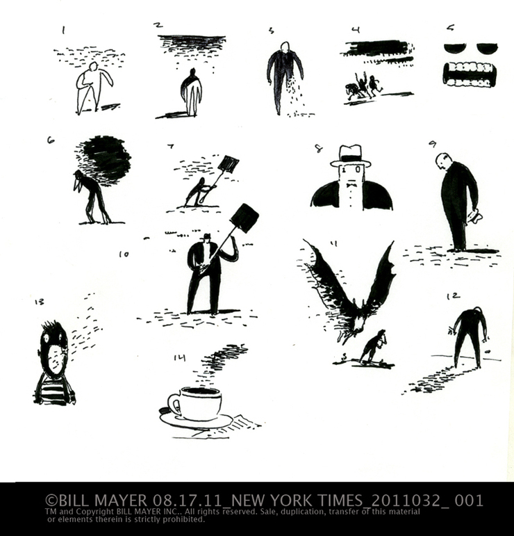
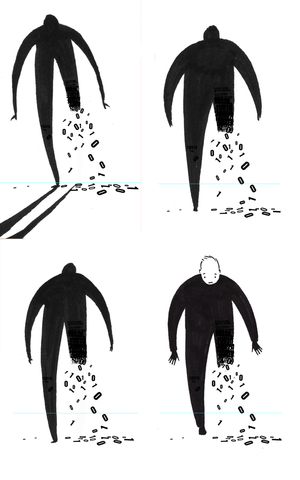
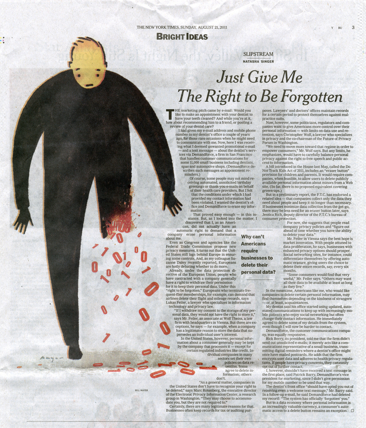
A little side note, I always ask my wife Lee to pick her favorite. Without fail, she will always pick the same as Mihn. Number 3. He liked the simplicity of #3 and how it got the idea across without adding any other comments into the illustration. Simple is good… We talked about style and decided that the airbrush style was not right for this one. He had seen some of the little three-color line things I had been playing around with. After all this great direction we’re off and running.
Sketches for the illustration© Bill Mayer 2011
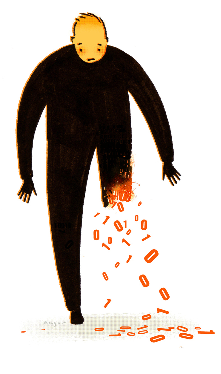
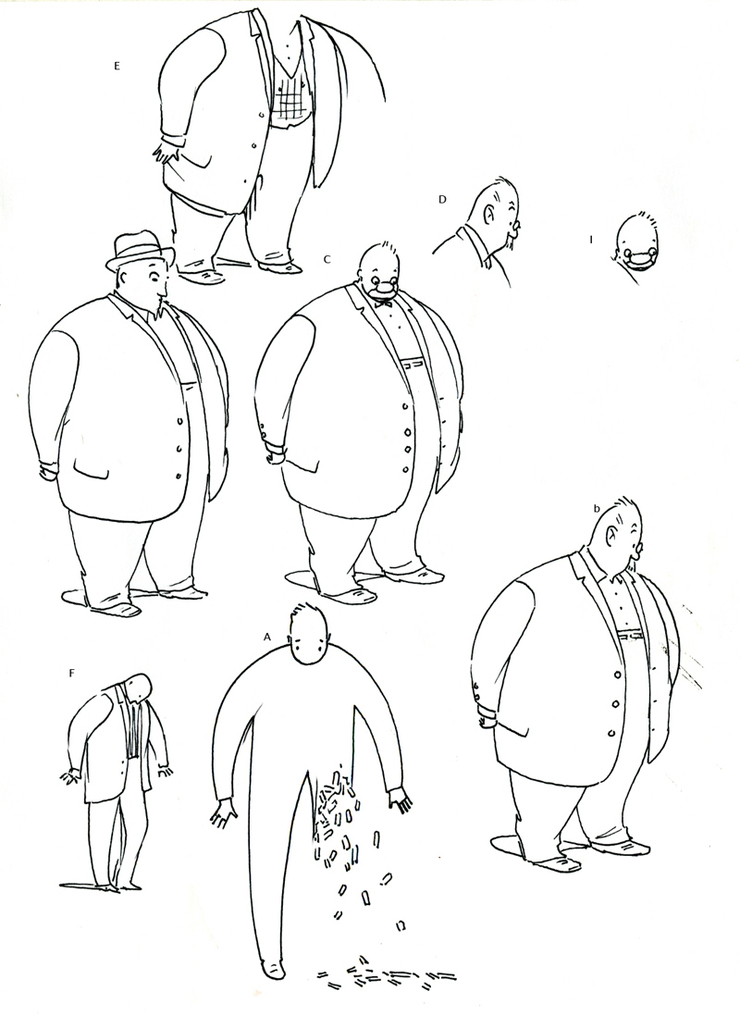
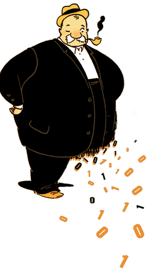
After lunch I started drawing the idea. It was so simple, and i was having a great deal of trouble keeping it that way. I started trying to add more character into the drawing and I stumbled on a couple of great character studies, one of a kind-of heavy guy that I fell in love with and desperately wanted to make work. But rather than sending a sketch, I put it together in color and sent it off to show Minh.
I had two contenders in the end that I felt strongly enough about to offer them up for consideration. I think they both had things that worked really well so I would not be unhappy with either direction.
Minh called me and said he and the writer had gone over both of them. It’s funny how drawing can sometimes have a feeling that may seem to add something intended or not. Ultimately he said he felt the one with the face had more empathy. The dark figure looked too evil. I guess it was those glowing eyes.
Minh called me and said he and the writer had gone over both of them. It’s funny how drawing can sometimes have a feeling that may seem to add something intended or not. Ultimately he said he felt the one with the face had more empathy. The dark figure looked too evil. I guess it was those glowing eyes.
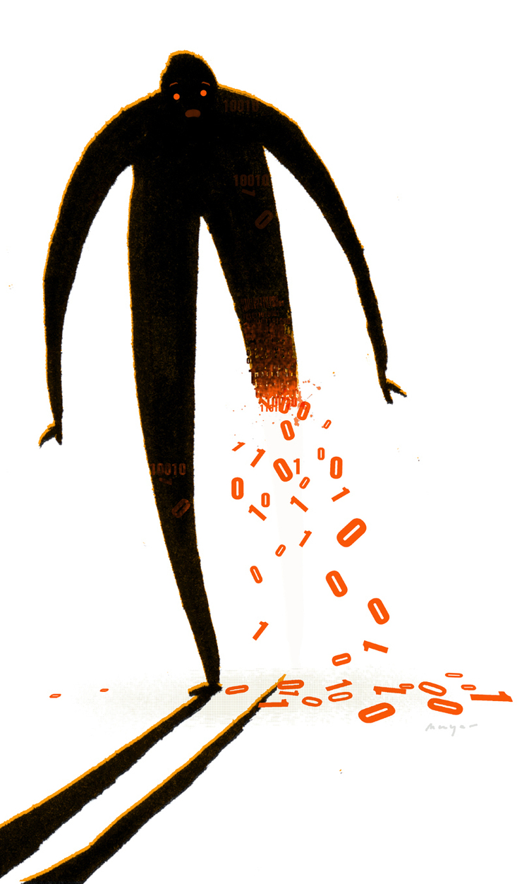
Alternate illustration. Not used © Bill Mayer 2011

final illustration.The New York Times © Bill Mayer 2011
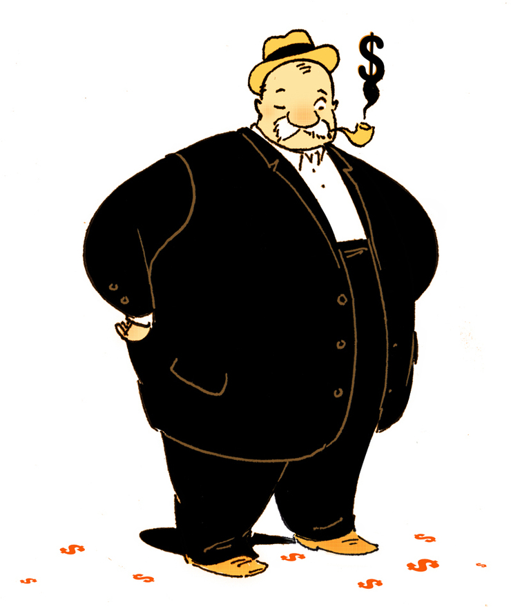
I took the character and took the numbers off that fat man and as Minh suggested he made a pretty good “Fat Cat.” Just not right for this story. I am sure he will find his way to resurface somewhere.
Alternate illustration. Not used © Bill Mayer 2011
Anyway great fun working on this project with Mihn and a big thanks to him for keeping me on track and to Edel for taking the week off and giving me a chance to do one of these little gems. Much fun…
The printed page from the paper....It is still a big thrill to see my work in the Times....I know pretty silly but I can't help it.
© 2024 Bill Mayer